Interactive chart: what drove your local economy in 2018/19?
With newly-released local area economic data now in our local area economic profiles (economy.id), Keenan Jackson provides some commentary and insights to help you understand what factors influenced the performance of your local economy in 2018/19, along with an interactive chart to help you see the story for your Local Government Area.
Skip to:
Interactive chart: Components of economic growth in your LGA
For in-depth analysis: learn more about our economic health checks
The macro picture
We have recently released updated 2018/19 economic data in our economic profiles for all subscribing local government clients. You can now compare how your LGA’s economy performed over the last year to other areas, the state and nation as a whole.
We know from the national accounts that many areas in the country have experienced weak growth. The Australian economy expanded by 1.9% in chain volume terms in 2018-19, the lowest growth experienced since the GFC and growth in GDP per capita was only 0.3%. Labour productivity in the market sector fell (-0.2%) for only the third time in the last two decades.
The state story
However, Australia is a big country and the story is different depending on where you live.
On a state basis, Tasmania led the way, growing at an estimated 3.6% over the year to June 2019. This correlates with Glenn’s recent blog highlighting the rise in population growth there in recent years.
In contrast to Tasmania, the Northern Territory economy was estimated to have declined by 1.5%. This is no surprise to anyone who read my blog last year documenting the fall in economic activity resulting from the completion of the construction phase of the large Ichthys Gas Project.
Gross State Product annual growth, 2018-19
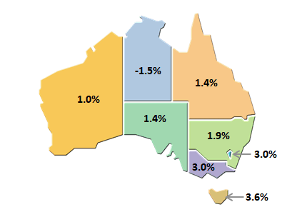
Source: ABS Cat: 5220.0 – Australian National Accounts: State Accounts, 2018-19
Working at .id and dealing with local councils over Australia we also know that states are very large – local and regional economies are often running at different speeds.
We can see from the chart below that most of Tasmania’s growth was driven by Hobart, and most of the decline in the NT by Greater Darwin. The chart also highlights the impact of the droughts on Agriculture in many regional areas.
The local level
Each year National Economics (NIEIR) provides us with annual economic estimates that allow us to explore change at an even smaller level.
We have used this data and broken it into different components to explore what is driving each LGA’s economy in Australia. It is based on an expanded three P’s disaggregation of growth. It allows you to see whether last year’s growth was driven by:
- Population – more people moving to the area;
- Participation – more people working;
- Productivity – local workers generating more value. Or
- Employment Capacity – more people working locally;
Use the chart below to take a look at your area, or open the economic profile for your council to explore in more detail.
A more in-depth analysis
If you’re involved with economic development at the local government level and would like a more in-depth analysis of what has driven your local economy over the last year, our economic health checks provide a comprehensive overview of recent trends and identify the key challenges and opportunities for your local industries, so you can prioritise programs and investment in the right areas. Learn more here or call to speak with our economics team for more information.
Keenan - Economic Development Specialist
Keenan is an economic development specialist who has worked extensively analysing and developing economic programs, strategies and policies to help local communities. Keenan works with our local government clients to help them explore and understand how their regions are changing over time to help them make better decisions and create evidence-based strategies related to local economic development.