Where do older people live?
One of the more powerful aspects of Census data is the ability to analyse population characteristics at small areas of geography.
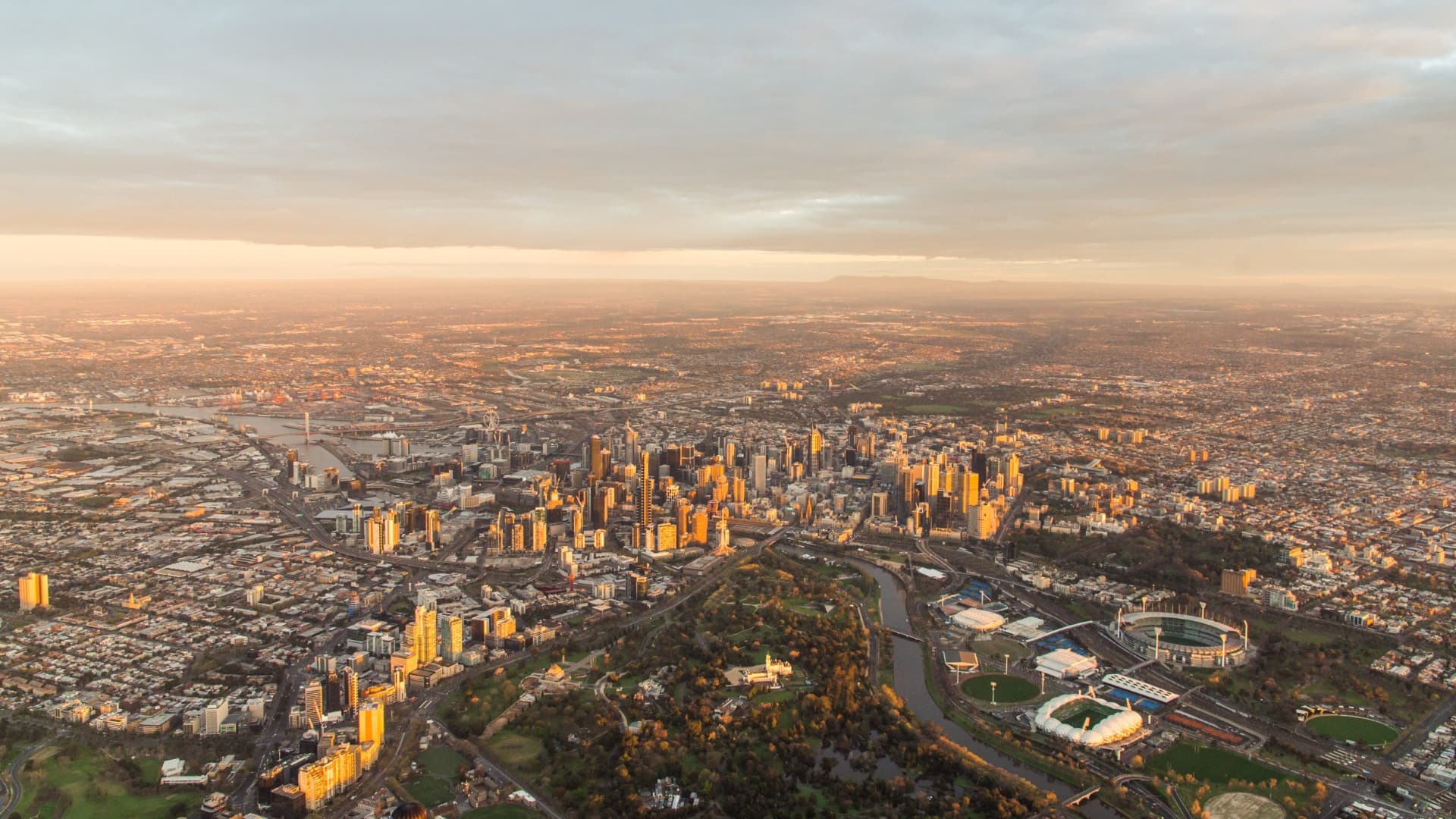
It never ceases to amaze me that two neighbouring suburbs can have very different demographic characteristics. This is particularly visible when the population of a place is shown through thematic mapping and spatial analysis.
In the last few decades, it’s no secret that Australia’s population has been slowly ageing, as evidenced by an increasing number and proportion of people at the upper end of the age spectrum (we’ve recently blogged about Australia’s changing age structure).
This blog will look at where elderly people (defined here as those aged 75 years and over) live in Australia.
How many elderly people are there?
The 2016 Census counted just over 1.6 million elderly persons in Australia, representing 6.8% of the population.
This compares with 1.38 million – or 6.4% of the population – in 2011. The volume of elderly persons increased by around 215,000 over the five years, but there was little change in the proportion of elderly people (as a percentage of the total population) due to the high volume of net overseas migration to Australia over this time – most overseas migrants being young adults.
In addition, persons aged 75 years and over in 2016 were born in 1941 and earlier, so this generation includes the cohort of persons born in the 1930s when fertility rates were relatively low.
Where do elderly people live?
There’s a big difference in the answer depending on whether you look at numbers or proportions.
Given the dominance of the state capitals in Australia’s settlement pattern, it’s no surprise that most (59%) elderly Australians live in these cities, making up 6.3% of the population (which is similar to the national figure).
Regional Australia, however, reveals a different picture. This is where 41% of Australia’s elderly population live, but here they comprise 8.1% of the population.
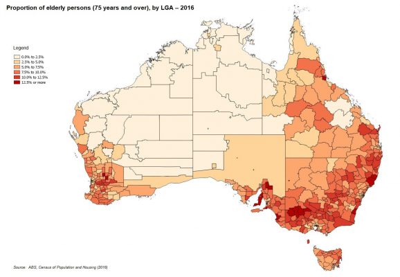
The map below shows the proportion of elderly persons in each LGA in Australia. There are 97 LGAs where the proportion of elderly persons comprises more than 10% of the population and most of these are in regional Australia.
The Borough of Queenscliffe, located on the Bellarine Peninsula east of Geelong, has the highest proportion of elderly persons of any LGA in Australia (19.1% – almost one in five). This is followed by Victor Harbor in South Australia (17.7%) and Buloke Shire in north western Victoria (14.8%).
Generally, however, the map shows that LGAs with the highest proportion of elderly persons are concentrated in coastal areas (particularly in NSW and South Australia) and dryland farming areas in parts of north western Victoria, Western Australia and Central-Western NSW.
A challenge for service delivery
While regional Australia has a diverse range of settlement patterns – from regional cities to remote rural areas – the service demands of an elderly population can have a disproportionate impact on smaller and dispersed populations.
This is one of the major challenges facing health professionals and social planners in regional areas of Australia.
The impact of internal migration
One of the major drivers behind ageing populations is internal migration, and this creates an important distinction between coastal areas and dryland farming areas.
In regional Australia, migration profiles are dominated by out migration of young adults seeking education and employment opportunities in larger cities.
This exacerbates an ageing population simply because these young adults are moving elsewhere, leaving behind a population that is older, with little momentum for further population growth. This pattern is notable in north-western Victoria.
In contrast, while young adults also leave coastal areas, this out migration is often countered by the in-migration of family-age groups, while at the same time, older populations in these coastal areas are bolstered by retirement migration, which typically doesn’t occur in dryland farming areas.
Elderly populations in Metropolitan areas
Metropolitan areas generally have a younger age profile but there are still concentrations of elderly persons. In the state capitals, the Town of Claremont in Perth’s western suburbs has the distinction of having the highest proportion of elderly persons (12.1%), followed by the City of Holdfast Bay (11.8%) and the Town of Walkerville (11.5%), both of which are in inner Adelaide. Hunters Hill, a small municipality in Sydney’s north, also recorded 11.5% of elderly persons in their population.
The LGAs with the lowest proportions of elderly persons are found across the Northern Territory and much of Western Australia. In many of these LGAs, elderly persons comprise less than 1% of the population. A key reason for this is the higher proportion of Indigenous persons, who have a younger age profile. Their lower life expectancy and poorer health outcomes also mean that fewer Indigenous Australians reach the upper end of the age spectrum.
In addition, coastal and remote areas across northern Australia are not favoured destinations for retirement migration, so their elderly populations are not influenced by this trend.
Elderly persons in Adelaide
South Australia is one of the older States – population wise – and Adelaide is no exception. The map below shows the spatial pattern of elderly persons in Adelaide and surrounding area.
There is a distinct concentration of LGAs in the eastern suburbs with higher proportions of elderly persons, but as mentioned the City of Holdfast Bay recorded one of the highest proportions of all metropolitan councils in Australia.
At the other end of the scale, the proportion of elderly persons in the City of Adelaide was 5.1% – a testament to the student and young adult population in and around the CBD.
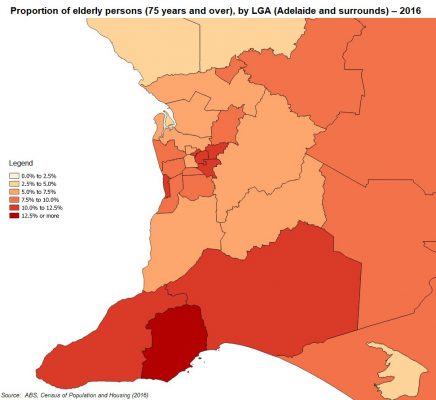
To the south of Adelaide, there is a group of coastal councils on the Fleurieu Peninsula with a high proportion of elderly persons.
As mentioned above, Victor Harbor has one of the highest proportions of elderly persons in the country, and the proportions for Alexandrina Council and the District Council of Yankalilla are 11.9% and 10.6% respectively. The Fleurieu Peninsula has long been a popular retirement migration destination due to its high level of amenity and proximity to Adelaide.
A distinctive feature of Adelaide’s greenfield LGAs is the higher proportion of elderly persons compared to similar LGAs in Sydney, Melbourne and Perth.
For instance, the proportion of elderly persons in Adelaide’s greenfield LGAs (Cities of Onkaparinga and Playford) was 6.9% and 5.5% respectively.
These LGAs have migration profiles similar to those in other greenfield areas (significant in-migration of young couples and families), but the proportion of elderly persons is higher due to a combination of lower growth and an older existing population, which impacts on the momentum for further growth.
The overwhelming majority of LGAs in greenfield areas in Sydney, Melbourne and Perth had far lower proportions of elderly persons – generally less than 5% of the population. For example, Camden Council, on Sydney’s southwestern fringe, was the fastest growing greenfield LGA in the country between 2011 and 2016, but the proportion of elderly persons in Camden was just 4.2%.
How to see your area spatially
Does your council area have a high proportion of elderly persons? How do you use Census and other data to plan for an increasing number of elderly persons?
.id’s suite of tools for local government is currently being updated with 2016 Census data.
Our latest update includes the 2016 Census release for all councils who are subscribed to our social atlas tool. The social atlas is an interactive map of your area, that lets you visualise demographic and social characteristics of your area spatially.
If you’ve found an interesting population cluster in your community using the social atlas, let us know in the comments!

.id are population experts who analyse, enhance and present Census data through demographic web tools and consulting services. You can access our free social atlas tools online to see how the results from 2016 Australian Census relate to your local area.
Simone - Myth Buster
Simone has a rich background in human geography, demography and urban planning – a background that was useful in her previous roles in the Commonwealth and State Governments, and now as part of the forecast team at .id. From the Queensland coast to the southern suburbs of Perth, Simone produces population and dwelling forecasts that help local governments make informed decisions about future service and planning needs. She is a regular contributor to .id’s blog and has spoken at several conferences on how our cities and regions are changing. She is a big advocate of evidence-based planning and how Census and other data can inform this. Outside of work Simone is a keen traveller and photographer – interests that tie in well with her professional life and help her to understand “place”.