Understanding places: How to tell a demographic story
Australia is a diverse country which varies greatly from state to state, suburb to suburb and even between neighbouring neighbourhoods. One way of understanding a place and the people who live there is to use demographic information to tell a story about the area you are interested in. Read more on the importance of storytelling here.
Location-based data
In Australia, we are lucky to have a national data source that tells us about the characteristics of people who live in different places. The Census provides a comprehensive source of location-based demographic information. Many businesses, organisations, governments and communities use this data to understand the make-up of places so they can plan and deliver facilities, infrastructure and services to reach different types of people in different places.
Practical uses for Census data
Demographic characteristics can be used to find types of people in the population that are more likely to use different types of services, facilities or infrastructure. Characteristics such as age, gender, income, ethnicity, education level, employment type, or the need for assistance can be used as parameters. Quantifying where different types of people are present in the population is an efficient way of allocating resources to reach the right people in the right place.
Understanding the age structure of a population will be particularly important for many service providers. For example, as an education provider planning for the delivery of schools to metropolitan communities, you would be required to know how many 5-17 year olds live in each residential area. Using this information as a starting point, you can then delve deeper into the demographic characteristics of this area, investigating the socio-economic status of families living there, their methods of travel and religious affiliation. Painting an accurate picture of the size and character of your target market is critical to effective locational decision-making.
Quantifying demand
You can easily find population numbers in our community profiles for around 300 Local Government Areas and suburbs across Australia and New Zealand. Working in conjunction with local governments, we create information tools that are used as online public resources to help councils and the community base planning decisions on demographic evidence.
To divide the population into groupings that align to common segments of people that consume services, we use ‘service age groups’ such as primary schoolers (aged 5 to 11), young workforce (25-34), or empty nesters and retirees (60-69). This can be used to show ‘demand’ for services in different areas. For example, the number of babies and pre-schoolers (aged 0-4) residing in an area can indicate demand for kindergartens or early learning services and facilities.
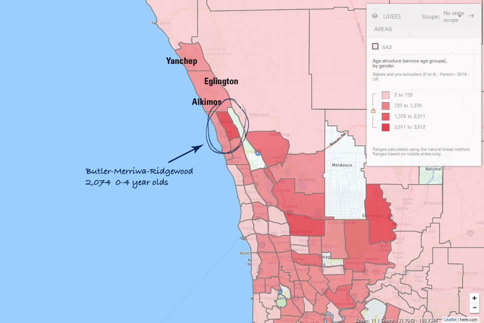
To understand where a service cohort of people is located, it is useful to visualise the spatial distribution of demographic data through a thematic map. In the below example of Wanneroo, a fast-growing LGA to Perth’s north, it is possible to see a high concentration of babies and pre-schoolers around the suburb of Butler. There are 2,074 0-4 year olds in the SA2 of Butler – Merriwa – Ridgewood, to be exact!
Thematic map of 0-4 year olds in the City of Wanneroo by SA2
Beyond numbers – storytelling
So now you have found out the number of school-aged children or retirees in a suburb, or the population of overseas-born people in a regional city.
Numbers are a good starting point, but rarely paint the full picture of demand.
It’s important to put it the data in perspective – what story does it tell you? Is this level of demand typical? Is it growing or declining? How does it compare to other areas?
Telling a story helps puts the numbers in context. We can find context by understanding how the number is changing, in relation to other places as well as over time. This provides important perspective to help you understand the significance of the number and create a narrative about the place.
Drawing comparisons using benchmarking
To know if the number is typical or comprises a high/low proportion of the population, it’s helpful to use a benchmark. Choosing a related place as a geographic benchmark helps you understand the change in relation to a comparable place. State, capital cities, the broader metropolitan or regional area are often used to compare and understand differences.
Say for example, you are looking at household income. When compared against a relevant benchmark, this dataset can be a useful measure of the level of socioeconomic advantage in a city or region. In the Shire of Inverell in north-western NSW, 39.1% of the population earn incomes in the lowest income quartile. This is a high proportion, but how do we know whether the prevalence of low incomes in Inverell is particular just to that shire, or reflective of a broader trend across the state?
Using .id Placemaker’s reporting tool, we can compare Inverell to Regional NSW, where incomes are more evenly distributed with just 30.6% of household incomes in the lowest quartile. This comparison helps tell a story and gives us reason to consider the underlying factors that might be influencing low incomes in that LGA; perhaps it has an ageing population, declining industries or poor educational attainment.
Household income equivalised, Shire of Inverell benchmarked against Regional NSW
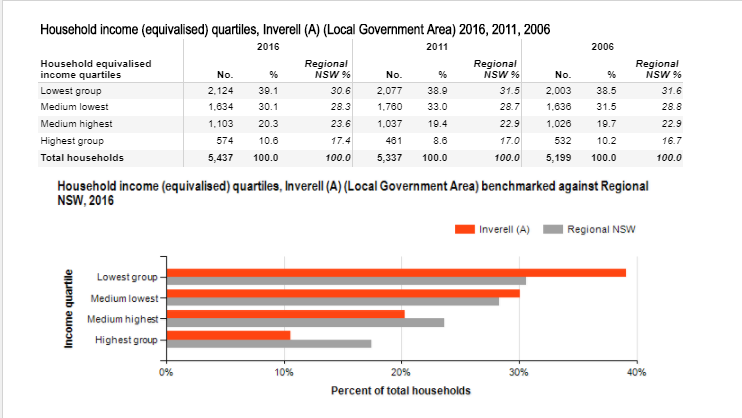
Source: ABS, Census data 2016. Report generated using .id Placemaker
See how .id Placemaker can help you tell a demographic story
When using a benchmark, it is most useful to compare the indicator as a percentage rather than as an absolute number. Benchmarking the share of people in a particular group shows us the character of a place, putting it on an ‘even footing’ with the benchmark area, even if the total population is much smaller. If the proportion we are comparing is significantly greater than the benchmark, we can refer to the group as ‘dominant’.
Understanding change over time
Another way of understanding demographic indicators is to look at how a number is changing over time. Is it in growth or decline? What base is the growth or decline coming from?
Change can be measured in absolute terms and as a proportion of the population. Understanding change over time can show trajectories or trends that can be used to anticipate change and shift priorities to respond accordingly.
Census data lets us look back in time to the last 5 year Census period to understand how things are changing. For even better understanding and perspective, we suggest going back at least two Census periods see trends over at least a decade.
Comparing apples with apples
As you look to understand change over time or compared to a place, it’s important to make sure you are using consistent information. Boundaries for suburbs and LGAs change over time, as do ABS statistical geographies, so make sure the places you are comparing haven’t changed.
.id tools do this automatically for you – we prepare data to make sure it is presented for the current boundary, even when you look back over time.
Using the right geography
Visualising data using a map helps reveal patterns and stories that can often be hidden in spreadsheets or tables. As you look at information spatially, it’s important to use the right level of geography to suit your needs. Looking at places using different levels of granularity can reveal different stories.
Let’s consider a Melbourne organisation providing disability services to people with a need for assistance. Planning a new support centre, the organisation may want to begin by gaining a big picture perspective on how need for assistance is distributed across the metropolitan region. Visualising their target market at SA3 level, for example, they can see that greatest number of people with a need for assistance live in the SA3 of Brimbank (see Map 1).
Map 1: Need for assistance across metropolitan Melbourne by SA3
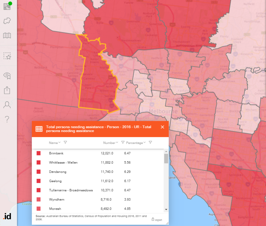
Source: ABS, Census data 2016. Map created using .id Placemaker.
Drilling down to SA2 level can provide the organisation a more detailed understanding of the local context. Given that a large number of people with a need for assistance live in the SA2s of Sunshine West and Deer Park – Derrimut, it would appear sensible to locate the support centre between those two areas, compared to neighbouring Ardeer – Albion (see Map 2).
Map 2: Need for assistance in Brimbank (SA2) |
Map 3: Need for assistance in Brimbank (SA1) |
|---|---|

|

|
| Source: ABS, Census 2016. Maps created using .id Placemaker. | |
However, to ensure the centre provides maximum benefit a more granular perspective is required. Zooming in to view this data at SA1 geography, it is clear that while there are almost no people with a need for assistance in the south-western part of Derrimut, a large concentration live to the north of Ardeer station (circled in Map 3). Separated by a major road and railway line, this group will face diminished access to the support services they need. This highlights that using the right geographic scale is crucial to uncovering practical demographic inisights.
Can .id Placemaker help you tell a story of place?
Gaining broader context
To properly understand the story of a place, you may also need to gain broader context to understand what’s driving or underlying the change. There are often many factors at play including migration patterns, dwelling consumption trends, or where the place is at in its lifecycle.
Places often have complex relationships with each other too, where they influence each other in different ways or play a particular role within a region, so it’s important to understand some broader context such as the role and function of the place.
Bringing together all these factors into cohesive narrative can often be a complicated job. If your analysis could do with some help from the population experts, talk to our team of consultants.

.id is a team of population experts, who use a unique combination of online tools and consulting to help organisations decide where and when to locate their facilities and services, to meet the needs of changing populations. We provide free resources to help you make the most of demographic data. Access .id’s demographic resources here.
Victor Fisher
Victor comes to us as an outstanding graduate via .id's Graduate Development Programme after completing his Master of International Urban and Environmental Management at RMIT University. He is particularly interested in how population dynamics are used to inform planning processes and understanding the importance of place.