Animated population pyramids – now in community profile
The population pyramid, or age-sex pyramid, is a frequently used tool in demographics. It shows the distribution of the population across age groups and between males and females, and is a well known and standard way of representing population and looking at demographic shifts over time and between areas.
The idea of an age-sex pyramid is to show the proportion of population in each age group, with the ages on the y-axis, males to the left, females to the right. It can show a skew between the sexes, and show at a glance where the bulk of the population is in age terms, and how it’s changing.
Age-sex pyramids are often used to compare the demographic composition of countries. The term pyramid comes from the traditional pyramidal shape of the chart, where the population features lots of children, and relatively low life expectancy. This is the shape of many developing countries with high growth rates. As populations mature, the pyramid develops more of a column shape, while eventually places like Japan develop a reverse pyramid, with very low births and large numbers of elderly with a long life expectancy.
Here is Australia’s age-sex pyramid in 1991.
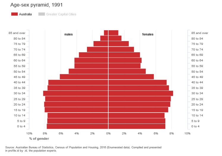
You can see that the lower parts of the pyramid are roughly column-shaped, with the population producing a fair number of children at that time, but a bulge through the 30s and 40s which are the baby boomers, and relatively few elderly. Of the 85+ population, there is a heavy skew to females, due to longer life expectancy.
Now fast forward 25 years to 2016.
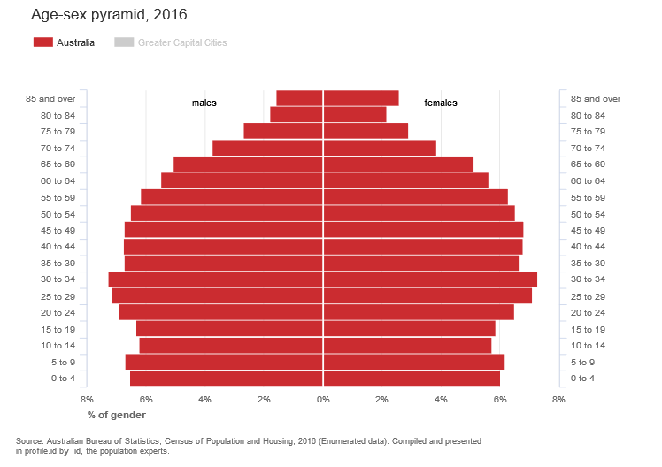
You can see the baby boomer bulge has moved forward to 55-74, but there is a new bulge, at the base, with more children, due to the most recent millennial baby boom, and a bulge from 20-34, due to high migration (this is the peak age for migrants). It’s also quite heavy on the elderly numbers as we’re all living longer (particularly females, who outnumber males 3:1 in the 85+ group).
Animated population pyramids – now in your community profile
Age-sex pyramids aren’t just for countries! They are also very useful to visualise the age and gender population structures for smaller areas like Local Government Areas, suburbs, towns and districts.
So we’re pleased to announce this feature is now a standard part of the community profile tool for all our Australian subscribers (New Zealand coming soon). You can access it from the left-hand menu under “How old are we?”:

Understanding the age structure of the population is important for planning future services for a population. The new age-sex pyramid in the community profile uses animation to show how the population has changed over many years (there are currently six Census periods in community profile, going back to 1991!).
The animated population pyramid helps you see, at-a-glance, how a population is distributed across the age brackets, and how it compares to a benchmark (eg. the greater region), between the sexes, and over time.
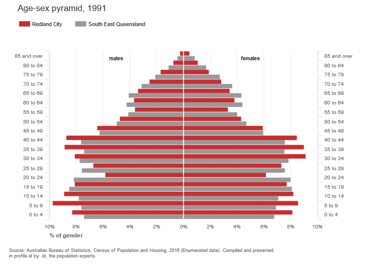
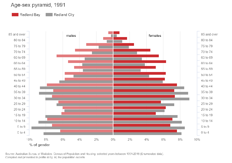
For instance, have a look at this chart for Redland City, south-east of Brisbane, in Queensland. In 1991, it was full of people aged between 30 and 45, and
In 1991, it was full of people aged between 30 and 45, and 0-14-year-olds, and it was a significantly younger population than South-East Queensland. These were baby boomer parents with children who bought houses in the area during the 1980s.
Watch the animation below, and see how these groups move through the years to reach 2016.
Can’t see the animation? Watch it in the community profile for Redland City.
In 2016, those parents are in their 60s and their kids have mainly left home, or are in their late teen to early 20s years. There is a distinct skew towards females, particularly in the older groups.
This can be applied to any area in any community profile. Hit the little play button in the bottom left to animate, or select any individual year from the bottom of the chart. The benchmark can be turned on or off by clicking on the legend.
Within this new feature, we’ve also added the ability to compare between any two small areas on the community profile tool (for example, one suburb or district to another). The full list of areas now appears under “Benchmarks” for all the age group pages now. We will be rolling out this functionality across all community profile topics in the coming weeks.

.id are population experts who analyse, enhance and present Census data through demographic web tools and consulting services. You can access our free community population profiles online to see how the results from 2016 Australian Census relate to your local area.
Glenn Capuano - Census Expert
Glenn is our resident Census expert. After ten years working at the ABS, Glenn's deep knowledge of the Census has been a crucial input in the development of our community profiles. These tools help everyday people uncover the rich and important stories about our communities that are often hidden deep in the Census data. Glenn is also our most prolific blogger - if you're reading this, you've just finished reading one of his blogs. Take a quick look at the front page of our blog and you'll no doubt find more of Glenn's latest work. As a client manager, Glenn travels the country giving sought-after briefings to councils and communities (these are also great opportunities for Glenn to tend to his rankings in Geolocation games such as Munzee and Geocaching).