Australia’s life expectancy ranks 6th in the world
The latest release of Life Tables shows life expectancy in Australia continues to grow, despite the COVID-19 pandemic. Glenn looks at how Australia compares with other countries and revisits his personal life expectancy calculation based this new data.
The new 2020 Life Tables were released this week by the ABS. I’ve blogged about this a few times before. 8 years ago, with the 2013 release, I calculated how long I had left to live; I updated my predictions in 2019. Since then we’ve had two years of a worldwide pandemic. Despite this, the 2020 figures for life expectancy (which are published each year in Life Tables, derived from deaths statistics) show a spectacular increase in this key demographic measure of progress.
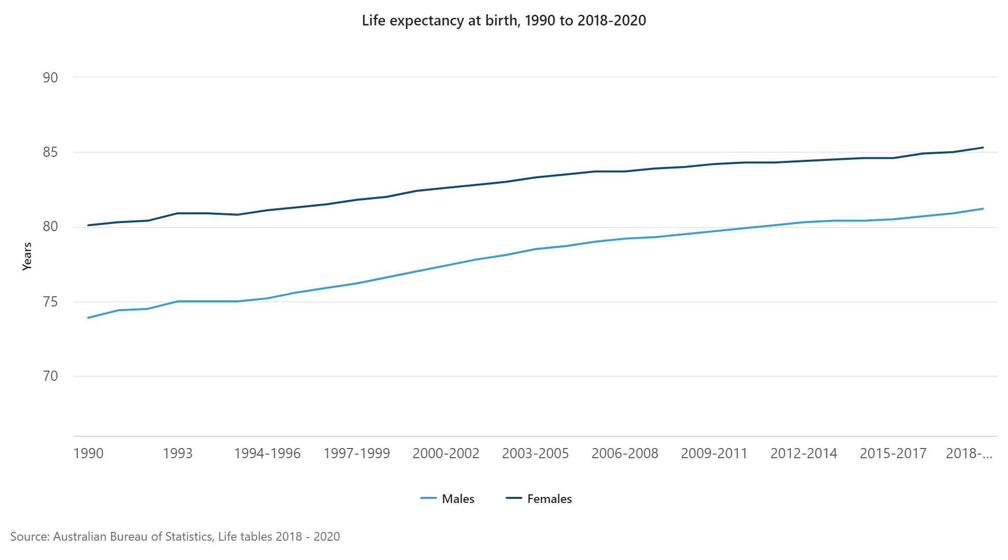
Based on the average of the 2018–2020 period, life expectancy for males was 81.2 years (up 1.7 years in a decade) and for females it was 85.9 years (up 1.3 years in a decade).
This chart from the ABS shows the continuous uptrend since 1990, and even a slight acceleration in the trend over the past few years.
Weathering COVID-19
This continued increase in life expectancy is despite the COVID-19 pandemic, which has killed millions worldwide and resulted in declines in life expectancy in many countries. Most notably, the USA – one of the hardest hit worldwide in the pandemic – has seen life expectancy fall to 74.5 for males and 80.2 for females, down by 1.5 years overall (77.3 averaged across the sexes). This represents the biggest drop since World War II. The USA already had a low life expectancy for a developed country, but this is a large hit. Drops in life expectancy are also being seen in other heavily affected countries, like the UK, many European nations and Brazil. It was recently announced that there were 3/4 of a million excess deaths in Russia. (Excess deaths are deaths over and above what is expected in a normal year based on the age structure, and can indicate unreported COVID deaths.)
This is clearly not the case in Australia. Though we’ve had a significant COVID-19 wave in NSW and Victoria this year, it hasn’t translated into high death rates and is now unlikely to lower our life expectancy when the 2021 data are out. The current figures are to the end of 2020 only though.
International life expectancy rankings
Australia’s life expectancy has increased to the point where it is now the 6th-longest lived country on Earth! Here is another ABS table showing where we rank. (Australia figures are marginally different to those quoted above due to differing time periods for comparison with other countries.)
So we’re actually 5th worldwide for male life expectancy, and 8th for females. I knew Japan was the longest-lived nation, but what surprised me here is that this is entirely based on their very long female life expectancy, 1.4 years longer than the closest country (Spain). For male life expectancy, Australia is approximately equal to Japan.
This is all really good news. We’re living a bit longer every year. It’s important to note this point, up front on the ABS website:
Life expectancy at birth estimates represent the average number of years that a newborn baby could expect to live, assuming current age-specific death rates are experienced through his/her lifetime.
How does life expectancy vary across Australia?
The life tables also give a remaining life expectancy for every year of age in every state and territory of Australia. These generally rosy figures do hide significant inequities between states. The Northern Territory consistently has the lowest life expectancy. The ACT closely followed by Victoria the highest. More on this in another blog.
Calculating how long I have left to live
Traditionally I use the state and age breakdown to look at how long I have left to live as well. When I did this the first time, I had just turned 40, and had 41.8 years of life left, on average. I did this exercise again in 2019 – 6 years later, and I had 37.2 years left.
Two years and a pandemic later, looking up the life tables again for a 48-year-old Victorian male reveals that I have 35.5 years to live.
This is depressing in a way – but on the other hand I have lived 2 years (admittedly much of it in lockdown!) and only lost 1.7 years of life expectancy. The difference is due to the advances in life expectancy (accounting for about 0.2 of the 0.3 years gained), as well as the fact that I survived another two years. Over the 8 years since my first blog on this, I’ve only lost 6.3 years of life expectancy. But I still can’t expect to be immortal yet – that would happen when life expectancy increases by 1 year every year. Might be a while…
You can do this yourself, using the detailed life tables in the publication – you’ll need to download the first Excel spreadsheet in this link.
A longer-term view of life expectancy
It’s also worth taking a longer-term view. The ABS has life expectancy data going back to the late 1800s in their Historical Population Statistics publication, which is always an interesting read. Based on this, my life expectancy when I was born in 1973 was about 69.4 years. (They actually have only 1971 and 1976 figures, but I’ve interpolated.) This illustrates the dramatic increase in life expectancy we have seen in relatively recent history.
As the chart at the beginning shows, there is no sign of this increase slowing down. Life expectancy in Australia continues to increase.
This is all very interesting, but it is also important for .id’s work. Our population forecasters use life expectancy and age-specific death rates to calculate future populations, it’s one of the inputs along with births and migration, as well as new dwelling development of course, which help us provide accurate population forecasts to over 100 Local Government Areas across Australia. In my next blog I’ll look at some of the substantial geographic differences in life expectancy which inform the forecasts.
Glenn Capuano - Census Expert
Glenn is our resident Census expert. After ten years working at the ABS, Glenn's deep knowledge of the Census has been a crucial input in the development of our community profiles. These tools help everyday people uncover the rich and important stories about our communities that are often hidden deep in the Census data. Glenn is also our most prolific blogger - if you're reading this, you've just finished reading one of his blogs. Take a quick look at the front page of our blog and you'll no doubt find more of Glenn's latest work. As a client manager, Glenn travels the country giving sought-after briefings to councils and communities (these are also great opportunities for Glenn to tend to his rankings in Geolocation games such as Munzee and Geocaching).