Death and life expectancy
Around this time each year, the ABS releases its detailed data on births and deaths in Australia. As we’ve blogged previously, this data is critical for forecasting as it provides the evidence base for small geographic areas. It might seem a bit macabre, but there are a number of ways you can analyse data about deaths. This blog will look at some of the key numbers from the Deaths Australia release, and then look at how we treat this data in our population forecasts.
Key statistics
In 2012, there were 147,098 deaths recorded in Australia. This is the highest number recorded, just pipping the 146,932 recorded in 2011. Similar to the trend with births, since 2009 the number of deaths has increased. This is partly due to an increasing population but because most deaths occur at the upper end of the age spectrum, it is also a function of an ageing population. The median age at death in 2012 was 81.7 years, and about two in three deaths were persons aged 75 years and over.
The numbers and rates of course differ by State and Territory. The Northern Territory, with its higher proportion of Indigenous people, has a lower life expectancy – the median age of death is just 59.8 years.
Life expectancy
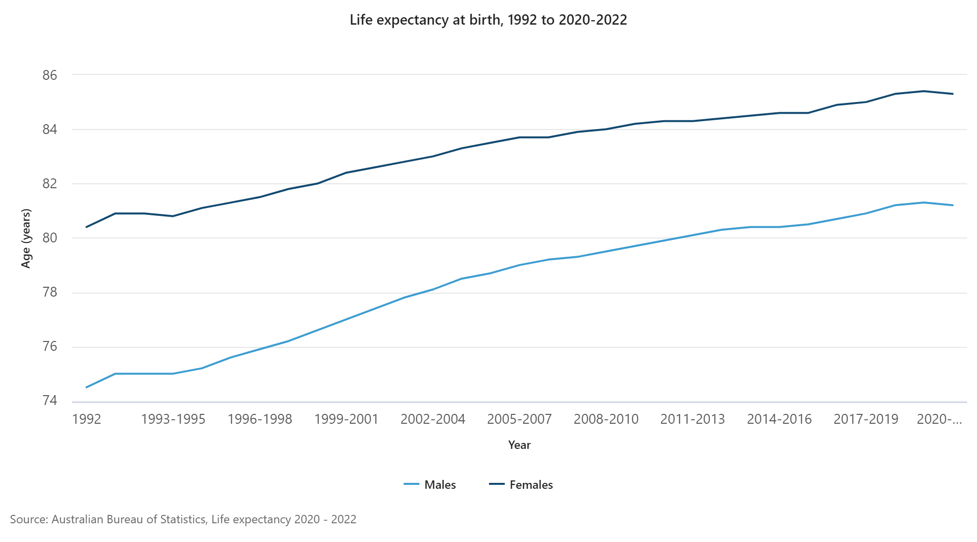
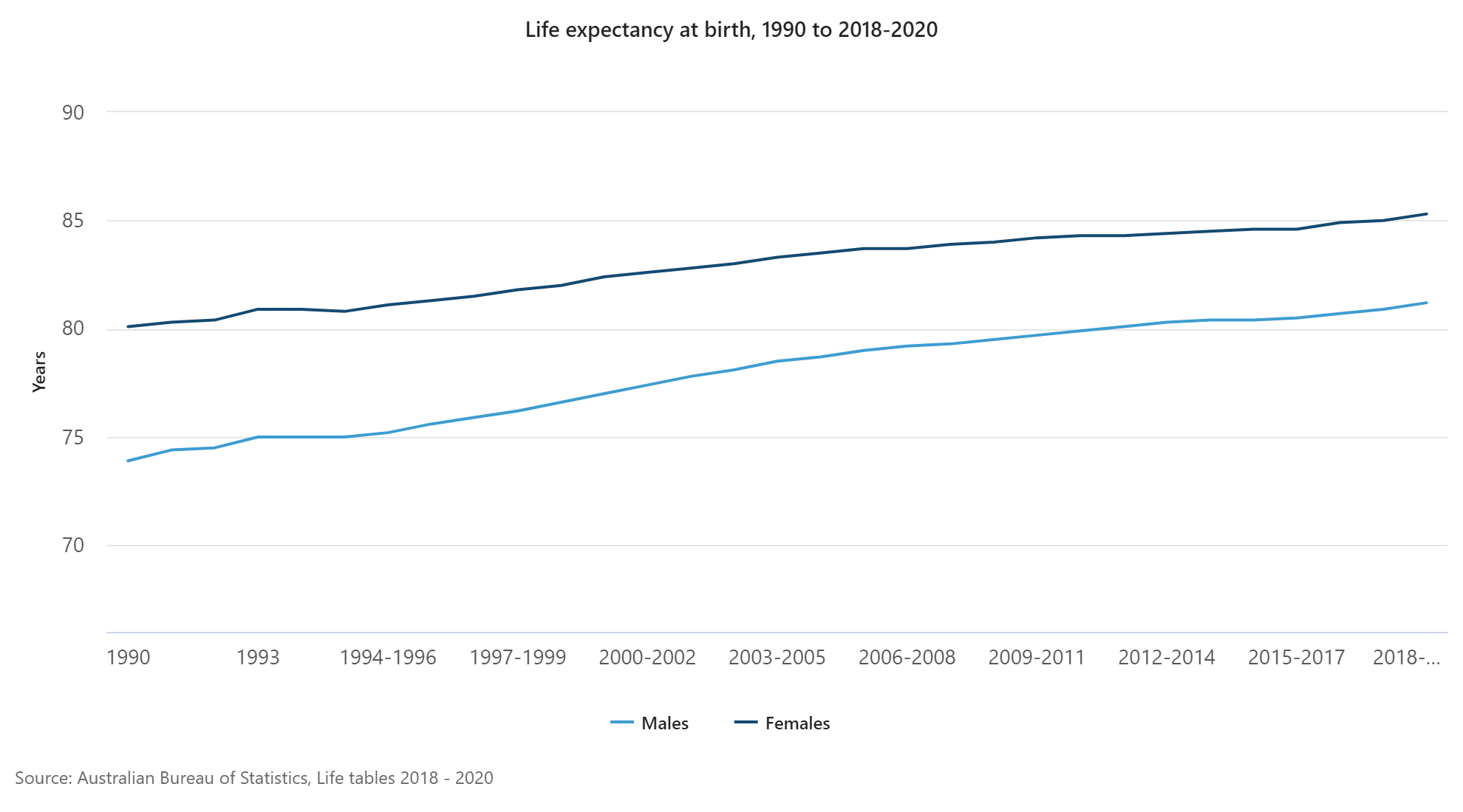
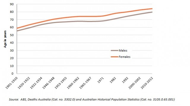
Australia has one of the highest life expectancy figures in the world. In 2010-2012, males born in Australia had a life expectancy of 79.9 years, and females 84.3 years. Life expectancy has increased over the last 100 years, particularly through improving health (eradication of many infectious diseases, lower infant mortality). From a demographic perspective, it means that more people survive to reach the middle and upper ends of the age spectrum. The graph below shows how life expectancy has increased over the last century. At the beginning of the twentieth century, males could expect to live 55.2 years, and females 58.8 years, so there has been an increase of around 25 years of life for each sex in the 110 odd years since. Please take care when interpreting this graph, because the scale on the x-axis is not consistent.
The future of life expectancy
In terms of population forecasting, assumptions around the future direction of life expectancy can be contentious. There tends to be two schools of thought – those that think that improvements in life expectancy will continue, and those that think we are reaching our biological limits. As shown in the graph above, the twentieth century saw large increases in life expectancy. So have we picked the proverbial low hanging fruit, or are there bigger fish to stir fry in the life expectancy wok?
The latest projections produced by the ABS appear to indicate that they think there will be continued improvements in life expectancy, but it does depend on the series used. For example, their high series assumes a life expectancy of 93.9 years for males and 96.1 years for females at 2056. The lower series have assumptions of 85.0 years and 88.0 years respectively. Importantly, many of the State governments follow the lead taken by the ABS and make similar assumptions. For example, Victoria In Future 2012 has used the life expectancy assumptions for the lower series produced by the ABS.
The ABS may also be following the lead taken by the United Nations, who also assume future increases in life expectancy. But there is some evidence that life expectancy may have reached a natural limit, and that life style factors may be playing a greater role. For example, obesity levels in parts of the western world are reaching very high rates. This obviously increases the risk factors for heart disease and diabetes, two of the leading causes of death in Australia. To take an example from another country, life expectancy in Russia went backwards in the 1990s, and this was attributed to life style factors such as alcohol and smoking. The Population Reference Bureau have an interesting article on the future of life expectancy which you can read here.
Personally, I tend to think that you have to die of something. As a young demographer I was fascinated by the causes of death data and how this has changed over time. In the nineteenth century many people died from infectious diseases, which have now largely been eradicated. But while this clearly improved life expectancy, other causes of death associated with advancing age have come to the fore eg cancers, stroke and heart disease. So I do wonder about population forecasts that assume life expectancy will reach 90 plus years in a few decades time, because even if we find a cure for cancer tomorrow, the reality is that you will still die of something else. I mean, it is said that death is one of the certainties of life. But I’m a forecaster…..so I could be wrong!
How do we treat life expectancy in our forecasts?
The forecasts prepared by .id for our local government clients include assumptions about future mortality. We assume a rate of mortality based on the deaths data released for LGAs by the ABS. This is part of our “bottom up” approach to forecasting. Because there are generally a very small number of deaths at the LGA level, we tend to approach mortality assumptions from a regional perspective ie groupings of LGAs, in order to provide more statistical robustness to the process. For example, this might mean we approach our assumptions for Inner Northern Melbourne, rather than just Moreland or Darebin on their own. Our mortality assumptions are not static, rather they assume a small rate of future increase across the forecast period. So while our forecasts don’t assume specific rates of future life expectancy, they do consider that mortality will improve steadily across the forecast period. Moreover, there are different rates applied across the age spectrum, and these rates differ according to the small area evidence base provided by the ABS.
Visit our demographic resource centre if you would like more information about the population characteristics of Australia. You may also wish to subscribe to our newsletter so that we can keep you updated on the latest demographic trends in Australia. For any enquiries about population forecasting, visit our website or drop us an email.
![]()
Simone - Myth Buster
Simone has a rich background in human geography, demography and urban planning – a background that was useful in her previous roles in the Commonwealth and State Governments, and now as part of the forecast team at .id. From the Queensland coast to the southern suburbs of Perth, Simone produces population and dwelling forecasts that help local governments make informed decisions about future service and planning needs. She is a regular contributor to .id’s blog and has spoken at several conferences on how our cities and regions are changing. She is a big advocate of evidence-based planning and how Census and other data can inform this. Outside of work Simone is a keen traveller and photographer – interests that tie in well with her professional life and help her to understand “place”.