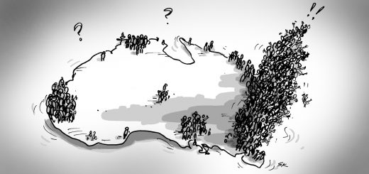
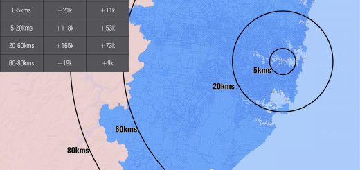
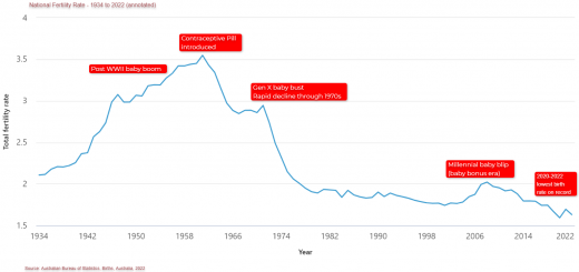
Inner city areas of Australia are booming – regional population growth 2022-23 update
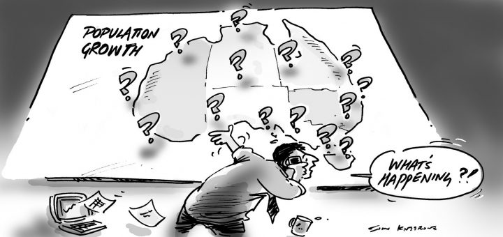
A return to the cities? The latest population figures from the ABS allows us to see how the record growth we know happened in 2022–23 at State and National levels was spread around the...