Using JobSeeker data to understand changing disadvantage in a COVID-19 world
In our latest enhanceent to our community profiles (profile.id), we have recently launched a new page which looks at JobSeeker recipients within your Local Government Area. In this article, I demonstrate how to find and analyse JobSeeker statistics to provide extra insight into the socio-economic characteristics of your place – in particular, how those characteristics have changed with COVID-19.
Jump ahead: how to find and analyse JobSeeker data in your Local Government Area
What is JobSeeker?
JobSeeker is the new name for Newstart, (and prior to that JobSearch allowance) or more broadly unemployment benefits (and colloquially known as “the dole” – the most recent update to the change was in March 2020).
This dataset – which includes the number of registered recipients of this government benefit – has started to be updated monthly during the COVID-19 pandemic, and in a much more timely manner. Previously, and continuing, data on all benefit recipients was updated quarterly 4 months after the reference quarter. The release of JobSeeker and Youth Allowance numbers on a more timely basis (2-3 weeks after the end of each month) is part of an ongoing government program via ABS and other departments to provide more timely statistics related to the pandemic.
JobSeeker and Youth Allowance are government benefits paid for those looking for work, depending on their age (Youth Allowance is a benefit which covers those studying and those looking for work under the age of 22 – but we’ve included only the component for those looking for work which is effectively the youth equivalent of JobSeeker).
During the pandemic, criteria requiring recipients to be actively seeking work have been relaxed, and the rate of payment has been temporarily doubled – and with these changes and many job losses due to business closures in the lockdown, JobSeeker numbers have been increasing.
JobSeeker vs JobKeeper
Note that although they sound similar, JobSeeker is quite different to JobKeeper.
JobSeeker is an allowance paid directly to people who are unemployed through the social security system.
JobKeeper, administered via the ATO, is a payment to businesses to enable them to continue paying staff during the downturn, who might otherwise have lost their jobs (and ended up on JobSeeker). We do have estimates of JobKeeper payments and their effect on employment in the COVID-19 outlook pages in our economic profiles, which also looks at broader economic impacts of the shutdowns.
Where can I find JobSeeker data?
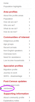
JobSeeker data is now available in our community profiles (register here to find one in your area). You can access the JobSeeker page here, in the menu on profile.id, under “Post Census Updates”.
To offer you a good time-series comparison, we’ve included the past year of data, which has been provided quarterly and will now update monthly as long as the ABS continue their special releases.
We take the JobSeeker numbers directly from data.gov.au, where they are provided by the Department of Social Services, calculate a rate to enable comparison across geographic areas and show them for the regions within your area plus benchmarks on profile.id. This complements the Census data on our community profiles, enabling you to compare the JobSeeker rates for your area with other characteristics like income and education levels on profile.id.
While JobSeeker recipients have increased pretty much everywhere since March – they haven’t been increasing uniformly, and JobSeeker numbers in your area can tell you a lot about the nature of the workforce in your area and the level of disadvantage in the place. It’s been well publicised that nationwide, job losses have hit hardest on the young, casual lower-paid workers, and women, due to the nature of industries such as Tourism and Hospitality, which have been mostly shut down.
How to analyse JobSeeker data
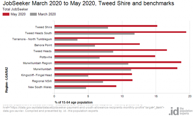
Here is an example for the Tweed Shire in Northern NSW.
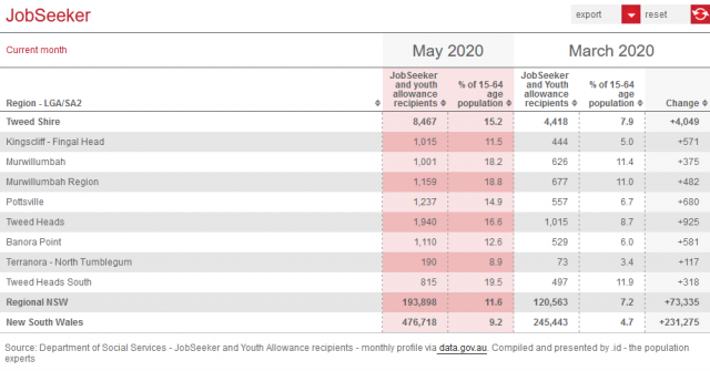
You can see an estimate of the latest month’s (May 2020) JobSeeker recipients in the LGA, compared to an earlier month, which is selectable for the past 2 years from the menu. In this case, I’ve selected March 2020, because the March-May two month period is when most of the job losses occurred. But you can compare any combination of months on the system.
How has the number of JobSeeker recipients changed in your area?
Looking at the example of Tweed Shire, we see that the Shire has 8,467 JobSeeker recipients in May, up by 4,049 since March – it has pretty much doubled in that time. The rate of 15.2% is significantly higher than the NSW average of 9.2%, but has approximately doubled statewide as well. So Tweed Shire has been hit harder than the state or Regional part of NSW in these two months.
The JobSeeker rate shown is not the same as the unemployment rate. While it will be a similar figure, unemployment has a very specific definition, which is used on our employment status page (for 2016 and earlier). The percentage shown for JobSeeker is simply the number of recipients as a percentage of the latest year available (currently 2018) population aged 15-64. The 15-64 age population is not the same as the labour force, as some people are not looking for work. However it does enable the comparison between areas.
Most commentary around JobSeeker in the media has been just showing the published raw numbers. If you say that the largest number of JobSeeker recipients is in Suburb X – but Suburb X has a very large population, this isn’t really saying much – always calculate a rate. 15-64 year olds represent the widest age group who are eligible for JobSeeker if they are not employed.
A better view of ‘unemployment’
It’s also possible that JobSeeker numbers may be a better handle on the unemployment than the official unemployment rate. With the relaxation of the need to look for work, many people who consider themselves unemployed may not be actively seeking work at the moment, and in the Labour Force Survey from which the unemployment rate is derived, these come up as “Not in the Labour Force”.
This is why April and May national unemployment figures have shown a big decrease in the “Participation rate” which measures the proportion of the population working or looking for work. But if you’ve given up looking for work, you may still at present be on JobSeeker, so this gives another insight. In any case, local unemployment rates are not yet available for the COVID-19 period.
Correlations between JobSeeker and disadvantage
Within Tweed Shire, we can see that the highest rate is 19.5% in the Tweed Heads South SA2, with the Murwillumbah area being between 18% and 19%. The SEIFA index from the 2016 Census tells us these are among the most disadvantaged areas in Tweed Shire. At this rate, almost one in five residents of these areas are on unemployment benefits. They tend to have lower incomes and education levels as shown in the Census characteristics. Potentially more vulnerable populations on a range of economic measures live here, but you’d need to explore further using the measures in profile.id.
While these areas are the highest rates, the largest increase over 2 months was in the Pottsville SA2. This is from a lower base in March, when it had a 6.7% recipient rate rising to 14.9%, almost equaling the Shire average. Though not exactly the same as the small areas on profile.id, this SA2 covers the South Coast-Pottsville and Cabarita small areas on the profile. These are middle range socioeconomic areas within Tweed (not extremely high on a national level but less disadvantaged than much of Tweed Shire). And one characteristic of these areas is that they have a higher rate of employment in tourism and accommodation/food services industries. Although these are not as disadvantaged as other areas, their JobSeeker numbers have increased the most here due to the high percentage of jobs in affected industries.
This is a common theme in many areas – the highest rates of JobSeeker are found in disadvantaged places (consistently over time), but the largest increases are in those with a lot of employment in the hard-hit industries due to COVID-19 lockdown. Rob’s blog on Friday shared some great tips to help you identify the industries that employ your local residents, and how those industries have been impacted by Covid-19.
A note about geography and table totals
We have derived Local Government Areas by stitching together the SA2s we’ve mentioned above, but some SA2s cross LGA boundaries, so the numbers may not add up exactly. Also, note that the SA2s are often not exactly the same as the small areas on profile.id (which usually have more detail).
You can explore this via the new page for your area. This page will continue to be updated monthly while the datasets are available, so keep an eye on this for the most recent updated changes in your area. Note that future eligibility and composition of JobSeeker may change, so these datasets will track these changes as well.
If you have any queries about the new datasets and how to use them, please get in touch with us at demographics@id.com.au.
Glenn Capuano - Census Expert
Glenn is our resident Census expert. After ten years working at the ABS, Glenn's deep knowledge of the Census has been a crucial input in the development of our community profiles. These tools help everyday people uncover the rich and important stories about our communities that are often hidden deep in the Census data. Glenn is also our most prolific blogger - if you're reading this, you've just finished reading one of his blogs. Take a quick look at the front page of our blog and you'll no doubt find more of Glenn's latest work. As a client manager, Glenn travels the country giving sought-after briefings to councils and communities (these are also great opportunities for Glenn to tend to his rankings in Geolocation games such as Munzee and Geocaching).