Unemployment rises to 6.2%. But less than expected.
The ABS releases Labour Force data every month, from its largest ongoing survey, of around 25,000 households each month. The April 2020 release, on May 14th, 2020 was the most closely watched for some time, as it was expected to show the impacts of the COVID-19 economic shutdown which took effect in the second half of March, after the March survey was run. The March data only showed a 0.1% increase in unemployment, and this was one was widely tipped to be in the 7-8% range, on its way to around 10% in the coming months.
In fact, the unemployment rate for Australia was 6.2%, up by a full 1.0%, a big increase, but not as large as was expected.
Why would this be? Everyone knows about the huge job losses that have been experienced recently, due to the virus shutdown.
The answer is in the other figure, less quoted, but equally important, from every Labour Force survey – the participation rate. This fell substantially, from 65.9% to 63.5%.
Some definitions
Source: ABS 6102.0.55.001 – Labour Statistics: Concepts, Sources and Methods
Remember that unemployment does not necessarily include everyone who is receiving a JobSeeker payment, and it may also include people who are not on JobSeeker at all. It’s an interview based survey (now 100% phone interviews), so it depends on how the respondent answers the questions. Households are normally in the Labour Force Survey for 8 months, with 1/8th of the sample rotated in and out each month. A lot of people think the unemployment data comes from Centrelink, but it’s not directly associated with any government payments.
So, while the survey found a decline of 594,000 jobs (4.6%) in a month, the number of unemployed “only” increased by 104,500, because many of those who lost jobs weren’t actively seeking more work. This resulted in a large drop in the participation rate.
This doesn’t include JobKeeper – those employed by a business receiving this payment are still classified as employed because they are being paid via their employer, and the government pays the employer.
The survey also records “underemployment” which is a measure of those who were working less hours than they would like to, and this showed a large increase, to 13.7% of the labour force, up by over 600,000 people, and the highest ever recorded. This will include many of those on JobKeeper, who may be working less hours, but whose wages are supplemented by this program.
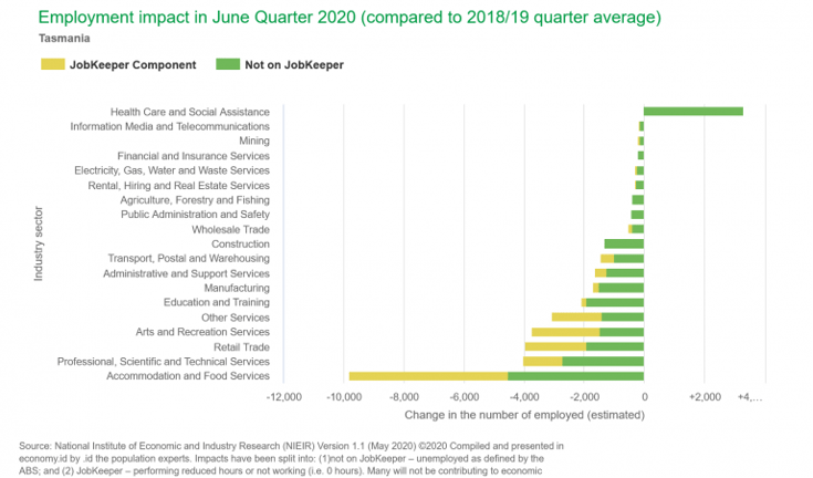
This is a really important distinction – JobKeeper recipients aren’t part of the unemployment rate, but they may be included in underemployment, if they’re working less hours. This difference is shown clearly in .id and NIEIR’s new COVID-19 pages on economy.id, which outline the expected effects over the June 2020 quarter of the current economic shutdowns and stimulus, in your local and regional economy. In the chart, we clearly differentiate between expected job losses and jobs supported by JobKeeper, modelled via hours worked impacts. These are now available for every subscriber to economy.id.
So the unemployment rate, though it’s the most quoted headline figure, omits a lot of detail.
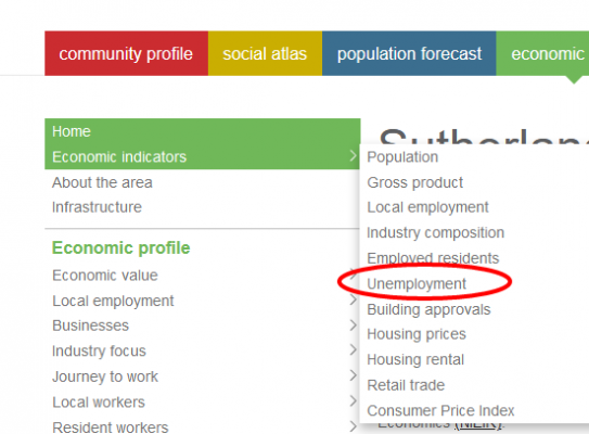
At .id, we know that employment data is a really important indicator of what’s going on in your community. As well as the new updated COVID-19 forecasts on economy.id, we have the quarterly updated unemployment rate for your local area on the site (under economic indicators at the top of the page). This is current to December 2019 at the moment, so it won’t show Covid-19 impacts just yet, but updates will be rolled out as soon as they’re available.
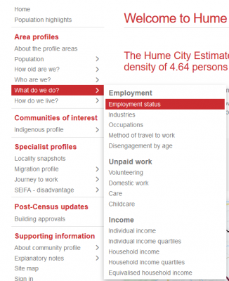
And in profile.id, you can see Census-derived estimates of unemployment and participation rates. While these are updated only every 5 years, and should not be seen as indicative of current conditions, they are fantastic for comparing across areas, so you can see the relative rates of unemployment as indicators of advantaged and disadvantaged areas, and these can also be mapped in the atlas (alongside youth and seniors unemployment).
Note that the participation rate shown in profile (derived from Census) will generally be a bit lower than the one shown in the Labour Force survey – that’s because about 7% of the population don’t answer the question on the Census form, so they appear in “Not Stated”. But it’s quite comparable across areas.
Also on profile and atlas, we include “Disengagement” – this is a measure of the proportion of each age group who are not employed or in education. This will be one to watch in future as the economic effects filter through the population, as it’s strongly correlated with social disadvantage.
There is more information on the Labour Force Survey and how it’s being conducted during the Covid-19 crisis at the ABS website. Eg. They have moved to entirely phone-based surveying, and as previously reported, have dropped the “trend” series as current events are altering the trend dramatically.
If you need further analysis of these results, we’re always there to help.Contact .id via our website, or email info@id.com.au.
Glenn Capuano - Census Expert
Glenn is our resident Census expert. After ten years working at the ABS, Glenn's deep knowledge of the Census has been a crucial input in the development of our community profiles. These tools help everyday people uncover the rich and important stories about our communities that are often hidden deep in the Census data. Glenn is also our most prolific blogger - if you're reading this, you've just finished reading one of his blogs. Take a quick look at the front page of our blog and you'll no doubt find more of Glenn's latest work. As a client manager, Glenn travels the country giving sought-after briefings to councils and communities (these are also great opportunities for Glenn to tend to his rankings in Geolocation games such as Munzee and Geocaching).