BLOG
How does where you live affect how long you live?
How does where you live affect how long you live?
Last week, Glenn wrote about the positive trajectory of life expectancy in Australia, following the ABS’ release of updated Life tables. In today’s blog, he shares a more sobering story of inequality, in a piece that shows the significant differences in average life expectancy between different parts of our country.
If you’re interested in learning more about the demographic discrepancies between different groups in your population (between age groups, indigenous and non-indigenous, and other population groups) learn more about our Communities of Interest module here – it’s an optional add on that local governement subscribers can make available as part of their subscription to our community profiles.
New data on life expectancy were published in October by the ABS, and Australians are living longer than ever before! Life expectancy at birth currently stands at 82.8 for Australians, an increase of 0.8 years in the past 6 years. The one of the biggest factors in life expectancy is seen between the sexes, with females living to 84.9, while male life expectancy is 80.7. However, in the past 6 years, male life expectancy has closed the gap a little with a difference of 4.2 years in 2018, down from 4.4 years in 2012.
But as well as this, not everywhere in the nation is equal. While Australia overall is one of the longest-lived countries in the world (ranking 5th highest for males and 8th for females), life expectancy varies by state/territory, and also within states.
It’s an unfortunate fact that socio-economic status is highly correlated with life expectancy. Higher socio-economic areas tend to live longer, having fewer deaths from disease and injury when compared to lower socio-economic areas.
Let’s see what the latest data says by State/Territory within Australia
| State or territory of usual residence | 2016-2018 | 2010-2012 |
Change – 6 years
|
|||
|---|---|---|---|---|---|---|
| Males | Females | Males | Females | Males | Females | |
| New South Wales | 80.6 | 84.9 | 79.9 | 84.0 | 0.7 | 0.9 |
| Victoria | 81.7 | 85.3 | 80.5 | 84.5 | 1.2 | 0.8 |
| Queensland | 80.2 | 84.7 | 79.5 | 84.0 | 0.7 | 0.7 |
| South Australia | 80.4 | 84.7 | 79.8 | 84.2 | 0.6 | 0.5 |
| Western Australia | 80.5 | 85.1 | 80.1 | 84.8 | 0.4 | 0.3 |
| Tasmania | 79.3 | 83.2 | 78.7 | 82.6 | 0.6 | 0.6 |
| Northern Territory | 75.5 | 80.2 | 74.7 | 80.0 | 0.8 | 0.2 |
| Australian Capital Territory | 81.2 | 85.3 | 81.2 | 85.1 | 0.0 | 0.2 |
| Australia | 80.7 | 84.9 | 79.9 | 84.3 | 0.8 | 0.6 |
Source: Australian Bureau of Statistics – 3302.0.55.001 – Life Tables, States, Territories and Australia, 2016-2018
We can see that Victoria is the longest lived state, with 84.5 years for females and 80.5 for males. The ACT is higher than this though, with 85.1 for females and 81.2 for males, though it was the only jurisdiction to record no increase in life expectancy for any cohort in the 6 year period, males life expectancy at birth being the same as it was in 2012. Victoria, on the other hand, had the biggest increase in male life expectancy, up by 1.2 years over 6 years.
Victoria also happens to be the fastest-growing state, over the past 6 years, and while much of this is due to international and interstate migration, there is a component of natural increase (births-deaths) – if the life expectancy is increasing, less people are dying, and this will also increase the population.
The Northern Territory has by far the lowest life expectancy, at 75.5 for males and 80.2 for females. While it is increasing, it lags almost 5 years behind the national average. This is due to some very low socio-economic areas, and a large Indigenous population.
Indigenous life expectancy
Indigenous Australians have the greatest divergence in life expectancy from the average, being significantly lower wherever they live. This is strongly correlated with Indigenous disadvantage. The ABS calculates life expectancy specifically for Aboriginal and Torres Strait Islander populations, and in 2015-2017 it was (nationally) 71.6 for males and 75.6 for females – about 9 years less than total population.
Part of this is an entrenched disadvantage, but part is also geographical – remote communities are more likely to be disadvantaged, and socio-economic status is correlated with life expectancy.
Regions of Australia with the highest life expectancy
The ABS also publishes life expectancy at SA4 level – these are broad regions within states, and do show the distribution of life expectancy.
These are the top 12 areas with the highest combined male-female life expectancy in Australia.
| SA4 region | Males | Females | Persons | SEIFA Index of Advantage/Disadvantage (2016) |
|---|---|---|---|---|
| Sydney – North Sydney and Hornsby | 85.3 | 88.1 | 86.7 | 1,145.2 |
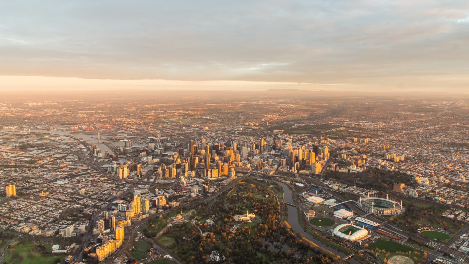
| Melbourne – Inner East | 85.3 | 87.5 | 86.5 | 1,094.6 |
| Sydney – Baulkham Hills and Hawkesbury | 84.6 | 87.5 | 86.0 | 1,118.8 |
| Sydney – Ryde | 84.8 | 86.8 | 85.8 | 1,103.7 |
| Sydney – Northern Beaches | 84.2 | 86.9 | 85.5 | 1,120.0 |
| Sydney – Inner West | 83.2 | 87.6 | 85.4 | 1,089.7 |
| Sydney – Eastern Suburbs | 83.4 | 86.9 | 85.1 | 1,122.7 |
| Sydney – Sutherland | 83.3 | 86.7 | 85.0 | 1,087.4 |
| Melbourne – Inner South | 83.4 | 86.7 | 85.0 | 1,092.2 |
| Brisbane – West | 83.8 | 86.2 | 85.0 | 1,101.1 |
| Melbourne – Inner | 83.2 | 86.7 | 84.9 | 1,080.3 |
| Adelaide – Central and Hills | 82.8 | 86.8 | 84.7 | 1,053.3 |
Source: Australian Bureau of Statistics – 3302.0.55.001 – Life Tables, States, Territories and Australia, 2016-2018
While these are broad regions, it’s clear that they make up some of the most well-off regions in the country. Topping the list is Sydney’s North-Shore area, the only place in Australia where female life expectancy tops 88 years! And with a SEIFA index of Advantage/Disadvantage of 1145, it is among the most socio-economically advantaged places in Australia. All those on the list are high SEIFA. Predominantly the more affluent areas of our capital cities – inner and north-shore Sydney, inner eastern suburbs of Melbourne, Adelaide Hills and Brisbane’s well off west.
For a refresher on SEIFA, see this blog from 2018. But generally, the higher the number, the more socio-economically advantaged an area (measured by income, education levels, housing size, types of occupations, etc), and the less disadvantage there is in the place.
Now if we do the same for the lowest life expectancy, a different pattern emerges.
| SA4 Region | Males | Females | Persons | SEIFA Index of Advantage/Disadvantage |
|---|---|---|---|---|
| Northern Territory – Outback | 72.8 | 76.2 | 74.5 | 851.4 |
| Northern Territory – Outback | 76.5 | 81.0 | 78.7 | 907.2 |
| Western Australia – Outback (North) | 78.0 | 79.8 | 78.9 | 967.9 |
| Far West and Orana (NSW) | 76.6 | 81.7 | 79.1 | 924.3 |
| Western Australia – Outback (South) | 77.6 | 82.4 | 79.9 | 958.5 |
| South Australia – Outback | 78.1 | 82.5 | 80.3 | 911.6 |
| West and North West (Tas) | 78.6 | 82.4 | 80.4 | 907.7 |
| Wide Bay (Qld) | 77.9 | 83.2 | 80.5 | 901.5 |
| Central West (NSW) | 78.4 | 83.0 | 80.6 | 951.1 |
| Murray (NSW) | 78.2 | 83.5 | 80.8 | 951.7 |
| Launceston and North East | 78.4 | 83.5 | 80.9 | 931.2 |
| Cairns | 77.7 | 84.3 | 80.9 | 953.1 |
Source: Australian Bureau of Statistics – 3302.0.55.001 – Life Tables, States, Territories and Australia, 2016-2018
The difference between the SA4 with the lowest life expectancy – Northern Territory Outback – and the highest (Sydney Northern Suburbs) is about 12 years across males and females. And all these areas have below average SEIFA scores – that is, they have higher levels of socio-economic disadvantage when measured across things like income levels, unemployment, education levels and types of occupations.
Northern Territory Outback has a large Indigenous population – indeed many (but not all) of these areas do. All but one of the lowest 12 life expectancy areas are outside our capital cities (the exception being the northern suburbs of Adelaide). They include Far Western NSW, the Bundaberg area of Queensland, North-West Tasmania (Burnie/Devonport), and more remote Outback areas in all states.
This shows very clearly that socio-economic status matters in the most fundamental way – how long people live. Maybe it’s access to health services – with remote areas topping the list, this is quite likely. Maybe it’s education levels leading to healthy life choices. But there is a clear distinction here. In lower socio-economic areas, people have higher death rates and shorter lives. This is not a new idea, but it certainly leads to some confronting realities about inequality in Australia, and challenges for planners.
Unfortunately, SA4 regions are fairly broad, and will mask significant differences within them. Life expectancy is not available at a lower level. But SEIFA is. And it shows nuanced levels of socio-economic characteristics in your local areas. If you’re interested in looking at how these patterns play out in your local area, check out the social atlas for your local governement area.
Glenn Capuano - Census Expert
Glenn is our resident Census expert. After ten years working at the ABS, Glenn's deep knowledge of the Census has been a crucial input in the development of our community profiles. These tools help everyday people uncover the rich and important stories about our communities that are often hidden deep in the Census data. Glenn is also our most prolific blogger - if you're reading this, you've just finished reading one of his blogs. Take a quick look at the front page of our blog and you'll no doubt find more of Glenn's latest work. As a client manager, Glenn travels the country giving sought-after briefings to councils and communities (these are also great opportunities for Glenn to tend to his rankings in Geolocation games such as Munzee and Geocaching).