The early warning signal for housing affordability pressure
There’s one piece of data that anyone with a community profile can check as an early indicator of housing affordability pressure. It’s a change in housing tenure – whether people are renting, paying off a mortgage, or living in public housing. It’s the canary in the housing affordability coal mine, and in this piece, Georgia maps where this indicator has changed the most and shows you where to find that datapoint for your Local Government Area.
Pre-register for your copy of the housing.id starter guide
Change in housing tenure is just one of 20+ indicators in our housing affordability framework – a report structure that identifies mismatches between housing supply and demand, to help councils address housing affordability. We will be sharing the full list of indicators (and where to find them) in the housing.id starter guide. (Update, 25 September: the Housing report starter guide is now published. Click here to register for your copy).
We’ve all heard the media stories about how rising house prices are affecting people’s ability to enter the housing market, especially first home buyers.
There are a number of ways to check whether this trend is affecting your local area. Many involve significant data analysis – and the expense of custom data orders. However, there is a fairly quick and simple way to see whether people in your area are feeling the pinch from high house prices – the change in the number and proportion of rental households.
As the number of people who can’t afford to purchase a house increases, many more people are funnelled into the private rental market. So understanding the change in the number and proportion of rental households in your area is important for understanding changing house purchase affordability.
As Glenn has previously written, the 2016 Census showed the proportion of households renting rose to 29.4% of households, up from 27.2% in 2006, a percentage point change of 2.2 points. This rise occurred during the same time period in which we saw significant increases in house prices, especially in our capital cities, but in many regional areas as well.
Which parts of Australia have seen the largest swing to renting?
The map below shows the percentage change in private rental households in each Local Government Area of Australia between 2006 and 2016.
Three-quarters of LGAs saw an increase in the proportion of rental households over the past 10 years. Areas with the largest increases include mining areas such as Port Hedland, Karratha and Roxby Downs, outer suburban growth areas such as Playford and Wyndham, and capital city LGAs Perth and Sydney.
Where to find ‘Change in housing tenure’ data
You can also find out more information about the changing tenure patterns in your local area on profile.id – including suburb level data.
Firstly, navigate to the ‘How do we live?’ menu, and choose ‘Tenure overview’ (click the screenshot below to enlarge).
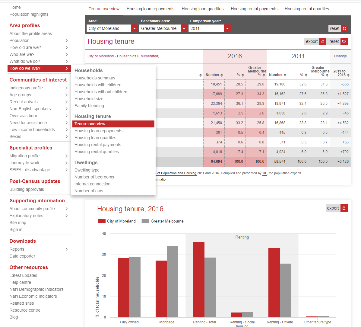
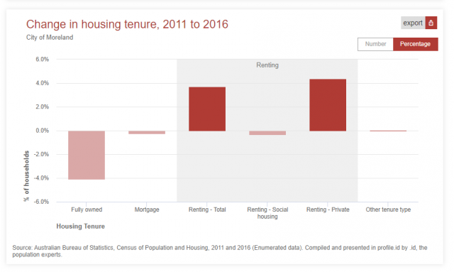
Then, scroll down to the ‘Change in housing tenure, 2011 to 2016’. Change the report to show Percentage, rather than Number, as this will show you how the relative share of each tenure type has changed over the past five years.
Tip: use the Area menu at the top to look at specific small areas within your LGA, as the story often varies in different parts of the community.
More from our housing team
If you’re interested in some of the other indicators that can be used to highlight housing affordability issues, pre-registrations are now open for the housing.id starter guide.
Or learn more about the work our team have done with local councils as they’ve built housing.id – a new tool that gives councils the evidence base to plan, monitor and advocate for affordable and appropriate housing in their communities.
Georgia Allan
Georgia completed a Masters in Population Studies and Demography at Flinders University in Adelaide. At .id, Georgia is a consultant in .id's housing team. She was heavily involved in the creation and continued development of housing.id, the online tool developed to give councils an accessible evidence base for planning and advocacy. Georgia has prepared housing demand and supply analysis for a range of councils, including those in inner-city, middle ring, growth and peri-urban areas. When not in the office, she is likely to be cooking, knitting, crocheting, or buried in a good book.