BLOG
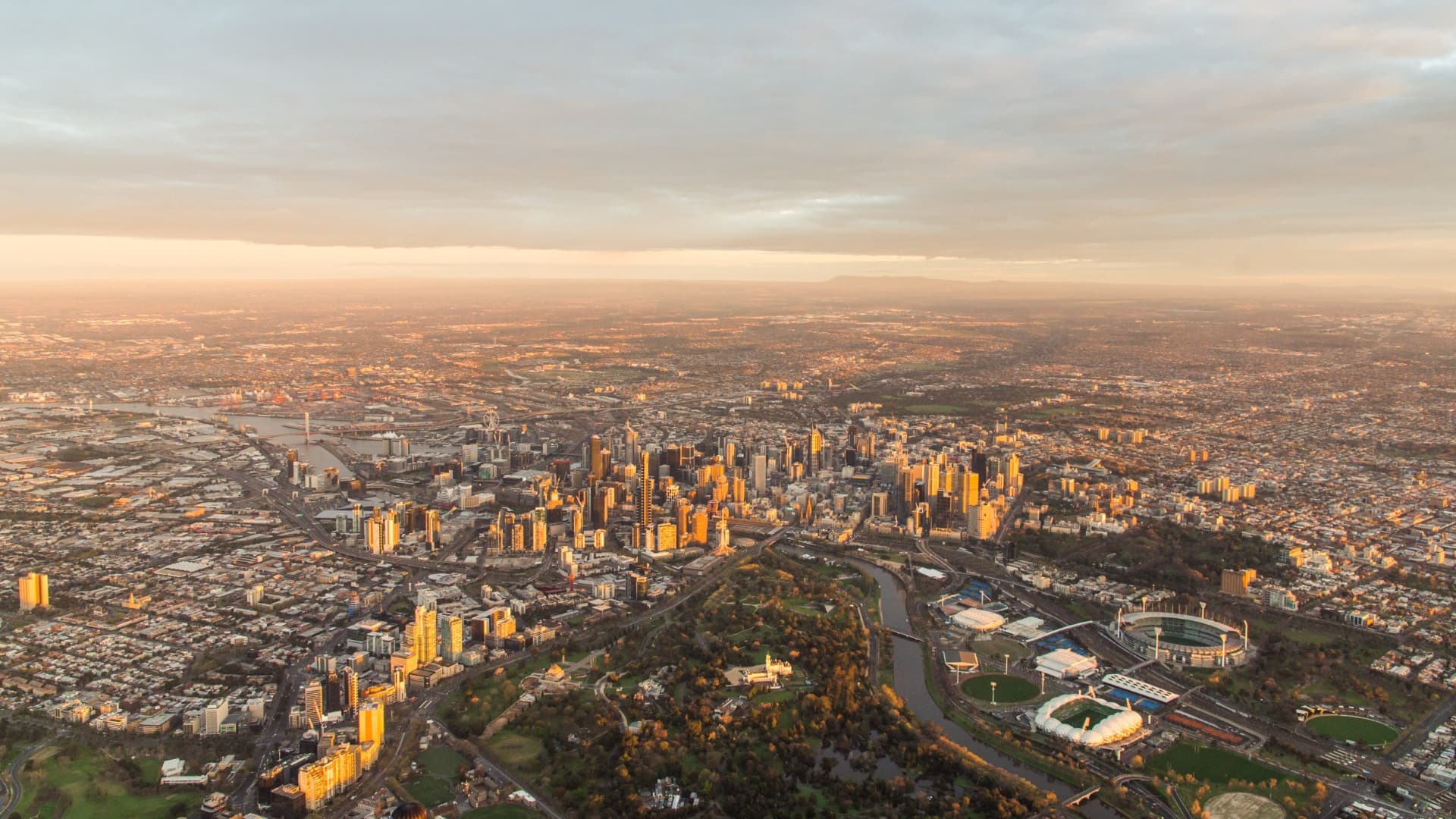
Where are all the jobs?
Where are all the jobs?
We hear a lot about the growth of jobs in Australia’s cities, but in this article, Keenan shows that’s only part of the story. This is a cautionary tale for anyone analysing how jobs growth in any part of Australia has changed over time. As always, experience and familiarity with the underlying data are critical to ensuring the whole story is told.
A closer look at employment data
When the second round of data from the 2016 Census was released recently, we were able to take a closer look at how employment trends have changed between 2011 and 2016.
Glenn, our Census expert, has already noted some preliminary findings from the data. However, in light of some recent articles about the growth of jobs in certain areas, I thought I would dig a bit deeper to explore some of these changes in greater detail (at smaller, more localised geographies), to counter some of the misstatements that have been made recently.
Some people have been reporting job change figures for regions by comparing the ABS Census numbers for 2016 with those reported for the 2011 Census. Unfortunately, this is a fundamentally flawed process that often results in misleading conclusions.
Why?
In 2011, a large number of people’s workplaces (621,676 to be exact) were unable to be coded to a Local Government Area (LGA) or region. In 2016, the ABS allocated those people based on an imputation methodology devised by the NSW Bureau of Transport Statistics, where locations are coded to a business based on associated data.
So, if you are simply comparing 2016 imputed data with 2011 non-imputed data you will get quite inaccurate results (probably leading you to think jobs in your region or LGA have exploded in the last five years!).
Considering this, and a number of other reasons for the Census undercounting job numbers, analysing change by comparing 2011 and 2016 Census jobs figures will likely yield inaccurate conclusions.
This is part of the reason we always recommend using Census data to explore worker characteristic trends (such as qualifications, income and method of travel to work), but NIEIR data, modelled using ABS Labour Force Survey data, for headline employment numbers.
Since it has been available, we have had 2011 (now 2016) Census data that was imputed to show jobs (by destination zone – a geography commonly used to analyse place-of-work data) freely available on our economic profiles under ‘employment locations’.
However, the imputed data does offer a more accurate picture of jobs changes between 2011 and 2016 at a regional or small area level because it’s comparing like with like (note: this comparison betweeen different time periods is not available on our sites, as inconsistencies in geographic boundaries make it likely that incorrect conclusions will be drawn).
So, what does it show?
Jobs change by region
As expected, jobs growth is being led by the large metropolitan areas with the 5 biggest capital cities adding just over half a million jobs.
However, there is a lot of variance between them. Jobs numbers in Greater Melbourne and Greater Sydney grew by around 10% in the five-year period. In contrast, Greater Adelaide grew by only 1.4%, below most regional areas.
While it appears that the non-metro areas are growing much more slowly, it should be acknowledged that the main working-age population (15-65 years) in metro areas grew by 9% between 2011 and 2016, compared to 3.1% in non-metro areas. So, a larger jobs growth should be expected.
ABS Census Imputed Jobs change by Region, 2011-2016
| Region | 2011 Census imputed Jobs | 2016 Census imputed Jobs | 2011 – 2016 Change (Numbers) | 2011 – 2016 % Change |
|---|---|---|---|---|
| Greater Sydney | 1,998,983 | 2,209,296 | 210,313 | 10.5% |
| Greater Melbourne | 1,868,693 | 2,046,163 | 177,470 | 9.5% |
| Greater Brisbane | 980,222 | 1,037,901 | 57,679 | 5.9% |
| Greater Adelaide | 552,433 | 7,883 | 1.4% | 1.4% |
| Greater Perth | 796,641 | 850,158 | 53,517 | 6.7% |
| Total Big 5 Metros | 6,196,972 | 6,703,834 | 506,862 | 8.2% |
| Rest of NSW | 980,268 | 1,005,430 | 25,162 | 2.6% |
| Rest of Qld | 949,056 | 993,925 | 44,869 | 4.7% |
| Rest of SA | 151,414 | 148,131 | (3,283) | -2.2% |
| Rest of Victoria | 548,725 | 564,984 | 16,259 | 3.0% |
| Rest of WA | 254,770 | 260,115 | 5,345 | 2.1% |
| Total Big 5 States Non-Metro | 2,884,233 | 2,972,585 | 88,352 | 3.1% |
| ACT | 210,695 | 220,645 | 9,950 | 4.7% |
| Greater Hobart | 97,564 | 99,361 | 1,797 | 1.8% |
| Rest of Tas. | 106,688 | 106,813 | 125 | 0.1% |
| Greater Darwin | 60,887 | 72,120 | 11,233 | 18.4% |
| Rest of NT | 37,773 | 33,860 | (3,913) | -10.4% |
| Other (territories and no fixed address) | 411,014 | 474,621 | 63,607 | 15.5% |
| Total Australia | 10,058,329 | 10,683,842 | 625, 513 | 6.2% |
Source: Australian Bureau of Statistics, Census of Population and Housing 2011 and 2016.
Inner city agglomeration benefits
Looking more closely at the largest metropolises we can explore how inner-city jobs are growing (it seems to be a popular topic). You could use SA3 geographies. However, they are difficult to compare as the area they encompass for each city is quite different. For example, Brisbane Inner is only 13.5km2 compared to Perth City at a whopping 43.5km2.
So, to generate better comparisons, I have compiled SA2 level data. For Melbourne, Sydney and Brisbane it is necessary to combine some SA2s to get a roughly comparative geography. The dominance of the Sydney central city area is obvious, and the jobs growth in both central Sydney and Melbourne is far above that experienced in other cities.
In contrast, the inner areas of the other big cities appear to have hardly grown much at all or in the case of Perth even declined. The structural transition in the resources states appears to have impacted professional services jobs in their CBDs.
(It should be noted that while all areas contain parkland, Adelaide SA2 contains 5km2 or more of parkland and therefore actually has higher job densities in the built-up area than it might appear.)
ABS Census Imputed Jobs change by Inner-city areas, 2011-2016
| Region | 2011 Census imputed Jobs | 2016 Census imputed Jobs | 2011 – 2016 Change (Numbers) | 2011 – 2016 % Change |
|---|---|---|---|---|
|
Sydney – Haymarket – The
Rocks; North Sydney – Lavender
Bay; Pyrmont – Ultimo; Surry Hills;
Darlinghurst; Potts Point –
Woolloomooloo (11.3km2)
|
398,109 | 463,460 | 65,351 | 16.4% |
|
Melbourne; Docklands; South Bank; South Melbourne; Carlton (12.2km2) |
311,617 | 359,141 | 47,524 | 15.3% |
|
Brisbane City; South Brisbane; Fortitude Valley; Spring Hill; Newstead – Bowen Hills (10.0km2) |
203,656 | 205,044 | 1,388 | 0.7% |
| Perth City (10.9km2) | 142,298 | 137,443 | -4,855 | -3.4% |
| Adelaide (10.5km2) | 105,634 | 107,612 | 1,978 | 1.9% |
Source: Australian Bureau of Statistics, Census of Population and Housing 2011 and 2016.
A good exercise would be to generate a definition of central cities based on combining Destination Zones (smaller than SA2s) and removing parkland/water from geographies (using ABS mesh block definitions). However, how do you define where central areas finish? Sydney’s business area effectively stretches across the harbour to North Sydney and beyond. Melbourne obviously includes Docklands and Southbank but also stretches north to Parkville and south down St Kilda road. Brisbane contains a number of high job density areas along the riverside in Milton.
Is it all about the central cities?
Clearly, not all inner-city areas are growing as strongly as others.
Looking at jobs growth across all SA2s in Australia, we can see again that inner Sydney and Melbourne created a large number of jobs during the intercensal period. However, out of the 25 SA2s with the largest jobs growth (number), only 8 could be classified as inner city or inner suburbs. Most of the jobs growth in Greater Perth and Greater Brisbane actually occurred outside the inner city.
While the jobs density may not be as intense in these other locations, it shows that other employment nodes such as Tech/Knowledge clusters (Macquarie Park, Parkville, Murdoch), Logistics/warehouse centres (Truganina), secondary metropolitan service centres (Parramatta, Chatswood, Dandenong), Regional cities (Geelong) and mining/resource areas (Ashburton, Weddell) all have a role to play. Many of them also don’t benefit from the scale of infrastructure investment (historical and current) that has gone into inner cities.
Top 25 SA2s for Imputed Jobs change (number), 2011-2016
|
Region (2016 SA2 Name) |
State | Region Type | 2011 Census imputed Jobs | 2016 Census imputed Jobs | 2011 – 2016 Change (Numbers) | 2011 – 2016 % Change |
|---|---|---|---|---|---|---|
| Sydney – Haymarket – The Rocks | NSW | Inner City | 270,223 | 320,829 | 50,606 | 19% |
| Docklands | Victoria | Inner City | 34,858 | 57,555 | 24,160 | 72% |
| Melbourne | Victoria | Inner City | 201,734 | 221,136 | 19,402 | 10% |
| Ashburton (WA) | WA | Remote | 12,055 | 23,540 | 11,485 | 95% |
| Macquarie Park – Marsfield | NSW | Middle Suburb | 41,481 | 48,394 | 6,913 | 17% |
| Weddell | NT | Fringe | 898 | 7,484 | 6,586 | 733% |
| Murdoch – Kardinya | WA | Middle Suburb | 7,632 | 13,618 | 5,986 | 78% |
| Dandenong | Victoria | Outer Suburb | 59,901 | 65,688 | 5,787 | 10% |
| Parkville | Victoria | Inner City | 23,049 | 28,207 | 5,158 | 22% |
| Pyrmont – Ultimo | NSW | Inner City | 31,974 | 36,831 | 4,857 | 15% |
| North Lakes – Mango Hill | Qld | Fringe & Peri-Urban | 5,553 | 10,311 | 4,758 | 86% |
| Baulkham Hills (West) – Bella Vista | NSW | Outer Suburb | 18,912 | 23,584 | 4,672 | 24% |
| Surry Hills | NSW | Inner City | 29,818 | 29,818 | 4,654 | 18% |
| Truganina | Victoria | Fringe & Peri-Urban | 2,817 | 7,207 | 4,390 | 156% |
| Richmond (Vic.) | Victoria | Inner Suburb | 32,472 | 36,837 | 4,365 | 13% |
| Ormeau – Yatala | Qld | Fringe/Outer Suburb | 14,342 | 18,438 | 4,096 | 29% |
| Geelong | Victoria | Regional City | 27,306 | 31,099 | 3,778 | 14% |
| Chatswood (East) – Artarmon | NSW | Middle Suburb | 23,931 | 27,655 | 3,724 | 16% |
| Newstead – Bowen Hills | Qld | Inner City | 16,643 | 20,347 | 3,704 | 22% |
| Madeley – Darch – Landsdale | WA | Outer Suburb | 14,764 | 18,357 | 3,593 | 24% |
| Parramatta – Rosehill | NSW | Middle Suburb | 46,819 | 50,227 | 3,408 | 7% |
| Deer Park – Derrimut | Victoria | Fringe/Outer Suburb | 9,627 | 12,934 | 3,307 | 34% |
| Concord West – North Strathfield | NSW | Middle Suburb | 16,587 | 19,823 | 3,236 | 20% |
| Rockbank – Mount Cottrell | Victoria | Fringe & Peri-Urban | 2,616 | 5,740 | 3,124 | 119% |
| Clayton | Victoria | Middle Suburb | 31,244 | 34,203 | 2,959 | 9% |
Source: Australian Bureau of Statistics, Census of Population and Housing 2011 and 2016. ABS Census 2011 Destination Zone job counts have been matched to 2016 SA2 boundaries. Some job allocation has been applied to best fit Destination Zone boundary changes between 2011 and 2016.
If you’re working in Docklands, Ashburton, North Lakes or especially if you’re in Weddell in the Northern Territory, we would love to hear from you! How has the massive growth in jobs in your area affected you and the people living there?
If you would like to explore economic or demographic issues in your area or broader region, contact one of .id’s consultants or learn more about how we can help you put the story of your area together.
.id is a team of demographers, urban economists, spatial planners and data experts who use a unique combination of online tools and consulting to help governments and organisations understand their local economies. Access our free economic resources to help profile your local economy.
Keenan - Economic Development Specialist
Keenan is an economic development specialist who has worked extensively analysing and developing economic programs, strategies and policies to help local communities. Keenan works with our local government clients to help them explore and understand how their regions are changing over time to help them make better decisions and create evidence-based strategies related to local economic development.