New in your social atlas: mapping change over time
In this blog we take a look at the new change over time feature map in your social atlas tool.
‘Change over time’ has always been fundamental to the way we design our demographic profiling tools.
Until now, we’ve demonstrated change over time in the community profile tool using tables and graphs, comparing figures between Census periods.
In the social atlas tool, you can toggle between Census periods, but the scale (or legend, on the side of the tool) changes with each period, making it difficult to compare year-to-year.
Now, all social atlas users can access the new change over time feature that shows patterns of demographic change on an interactive map of your area.
In any population topic, emerging or declining groups are those that show the greatest increases or decreases when compared to a previous period.
If you work or live in a community, you may already be instinctively aware of such changes in that area. Now, you can use our social atlas tool to visually pinpoint exactly where, when and how these significant changes have occurred.
Using the change over time feature in social atlas
 When you open the social atlas page for your council area, the default map is Population Density, and the default ‘year’ will be 2016.
Click on this ‘Year’ menu, and you will see ”change 2006-2011‘ – select this option to view the new change over time feature.
Please note the change over time feature is not available for all topics – more on this below.
You can map change in either raw numeric terms (how many more or fewer people are there in a particular category?), or in percentage terms (how has the proportion of that category changed?).
Reading the change over time map
 When you select the ‘change 2006-2011’ option, you will see the map overlays with a hot-cold scale of change, with blue tones representing negative change, and red tones for positive change. The darker the colour, the more significant the change.
Hover over an area to see a popup showing change in raw numerical, percentage and total population terms. As in all social atlas maps, you can click these small areas to create a custom area and data set.
We’ve got time on our side
In our community profile tool, we have always shown change over time in a table by allowing the user to select a comparison year. When we first built the tool in 2001, we offered comparisons between three census periods (1991, 1996 and 2001).
With the arrival of the 2016 Census data, we will have six Census periods of data in the community profile, covering a whopping 25-year time period! This will be a fantastic resource for looking at both long and shorter-term changes.
We are also looking at the possibility of having 2006-2016 ten-year change maps as well, but this requires some additional work in making the geographic areas comparable. If this is a feature you would like to see, let us know in the comments below!
The story of your changing community
We’ve already discovered some fascinating stories of change in communities using the change over time feature. Here are some of the interesting trends which are shown in just a few of our atlas.id client maps.
Gentrification in Darebin
Darebin Council, in Melbourne’s inner-north, shows a trend of gentrification in its inner suburbs, characterised by an increase in the English-speaking population, while outer areas gain higher cultural diversity (shown clearly in this screenshot).

Darebin City Council, People born in a non-English-speaking country, Change 2006-2011.
This story of gentrification is borne out by a quick check of the University Qualifications map of the same area, which shows an increase in that metric across the board.
Redistribution of age profiles in Parramatta
In Western Sydney, Parramatta’s population of seniors is increasing in the areas away from the city centre, with large family homes…

City of Paramatta, People aged 65 years and over, Change 2006-2011.
…while families are increasingly moving into high-density apartment areas.
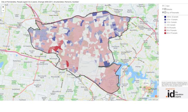
City of Parramatta, People aged 0 to 4 years, Change 2006-2011Just south of the Perth CBD, the Town of Victoria Park saw rapidly increasing population density between 2006 and 2011.

There are just a few among the thousands of stories you can tell using the social atlas tool and its new change over time feature, for all our clients across Australia and New Zealand.
Some maps do not show change over time
Whenever you use .id’s demographic information tools, you can trust we have already applied our expertise as demographers and population experts before we release these resources to the public.
One such check-and-balance is that not all datasets (in social atlas and our other community tools) are designed to be compared over different time periods. For that reason, you’ll notice the change over time feature isn’t available for all maps in social atlas.
Here are some of the reasons why…
Nominal values
Not all maps are numerical! For example, if you’re looking at Housing Tenure data in social atlas, you can calculate a change in the percentage of ‘home owners’ in a given area (therefore, you can calculate the change in that percentage over time). However, if you’re looking at the Dominant tenure type for an area, you can’t subtract ‘Being purchased’ (the dominant tenure type in 2006) from ‘Renting’ (the dominant tenure type in 2011)!
Some data sets aren’t designed to be compared
The Socio-Economic Indexes for Areas (SEIFA) index of disadvantage is an ABS product that ranks areas in Australia according to their relative socio-economic advantage and disadvantage, based on information from the Census.
However, the variables and inputs used to calculate the SEIFA index change with every release, so it isn’t useful to map the change in an area’s SEIFA index rating from one period to another.
Changing Geography: the perennial trap for young players!
Whenever you’re looking at change over time, it is imperative you ensure the geographies match. In other words, the boundaries of the area you’re looking at should be the same for both data sets. This is one of the most common mistakes made (accidentally and otherwise) when people attempt to craft the narrative of change (I wrote about this after the media coverage of the last census release).
The ABS changed geographic boundaries of areas between 2006 and 2011, from Census Collection Districts, to Statistical Area 1 (SA1) units.
We have made adjustments so that the populations can be accurately compared, but for areas undergoing rapid development, the exact location of the change may be slightly different to that displayed. Where the boundary has changed, we have had to average across the two areas. This makes a difference to the numbers at a very local level (perhaps to the level of which side of a road the growth is on), but does not affect the pattern of change, which is what the change over time maps are really designed to show.

.id are population experts who analyse, enhance and present Census data through demographic web tools and consulting services. You can access our free social atlas tools online to see how the results from 2016 Australian Census relate to your local area.
Glenn Capuano - Census Expert
Glenn is our resident Census expert. After ten years working at the ABS, Glenn's deep knowledge of the Census has been a crucial input in the development of our community profiles. These tools help everyday people uncover the rich and important stories about our communities that are often hidden deep in the Census data. Glenn is also our most prolific blogger - if you're reading this, you've just finished reading one of his blogs. Take a quick look at the front page of our blog and you'll no doubt find more of Glenn's latest work. As a client manager, Glenn travels the country giving sought-after briefings to councils and communities (these are also great opportunities for Glenn to tend to his rankings in Geolocation games such as Munzee and Geocaching).