The ABS Census is a critical resource that offers us invaluable insights into our communities and how they are changing.
More than just a set of numbers and tables, census data tells us a powerful story about people and places. This story is never more profound than when we visualise it spatially.
In a recent blog we highlighted the value of viewing census data on a map, to uncover the demographic stories that support informed decision-making. Visualising data on a map helps us to understand the geographic trends characterising a group with a demand for a particular facility or service.
Why is geographic scale important?
Vital to any piece of spatial analysis is an understanding of geographic scale. The patterns revealed by census data vary depending on the scale at which we view it. Often the most robust evidence is available when we delve to the local level, to see how change is playing out in individual neighbourhoods and towns.
Take the example of age structure. Let’s say I’m interested in exploring recent population trends among babies and toddlers. Where did the greatest increase of 0-4 year olds take place between 2011 and 2016?
Using .id’s census exploration tool, .id Placemaker, I can activate a thematic map that shows the change in this age group across Australia.
Change in number of 0-4 year olds between 2011 and 2016, greater capital cities vs. rest of state.

Source: map generated in .id Placemaker.
At the national level, we can see that the greatest increase in babies and toddlers has taken place in our capital cities, which are shaded darker on the map, compared to regional areas. Unsurprisingly, Melbourne and Sydney have accommodated most of this growth over the past five years.
Let’s take a closer look at Sydney to explore this trend in more detail. We can see significant growth in the large LGAs of Western Sydney, especially Parramatta, Camden and Liverpool. Meanwhile, a notable decline in 0-4 year olds tells a story of ageing in the Northern Beaches and around the urban fringe.
With an even more granular perspective, at SA3 level, a small hotspot of growth is noticeable in the Sydney inner city. Here, the population of 0-4 year olds has grown by 825 since 2011, a significant increase compared to neighbouring areas.
Change in number of 0-4 year olds in Sydney LGAs, 2011-2016
|
Change in number of 0-4 year olds in Sydney SA3s, 2011-2016
|

|

|
| Source: map generated in .id Placemaker. |
Source: map generated in .id Placemaker. |
So what are the factors driving the growth in pre-school age children to the centre of Australia’s largest city? Viewing the change at SA2 level, a story begins to unfold. The growth is quite heavily concentrated in the Waterloo-Beaconsfield area, where the 2016 census recorded an increase of 529 0-4 year olds.
The suburbs of Waterloo, Zetland, Roseberry and Beaconsfield have undergone a considerable transformation in recent years, with sweeping redevelopment of industrial sites making way for high-density apartment dwellings. This has changed the urban role and function of this inner city area from traditionally a light industrial precinct to an emerging residential hotspot servicing the growing workforce in Sydney’s CBD.
Placemaker’s reporting tool lets us investigate this even further. Let’s zoom to SA1 level and generate a report on dwelling structure for an SA1 with a high level of growth in the youngest age group.
Change in number of 0-4 year olds in Sydney SA1s, 2011-2016
|
Change in number of 0-4 year olds in Sydney SA1s, 2011-2016
|

|

|
| Source: map generated in .id Placemaker. |
Source: map generated in .id Placemaker. |
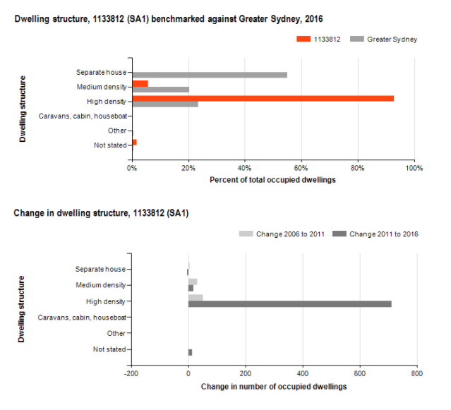
Changing dwelling profile of selected SA1 in Waterloo – Beaconsfield, benchmarked against Greater Sydney

Source: Report generated in .id Placemaker
Sure enough, the overwhelming change in the dwelling profile of this neighbourhood is among high-density dwellings, which have increased from just 50 dwellings to 760 over the past five years! The change chart illustrates that this is a recent phenomenon, with very little growth in any dwelling type between 2006 and 2011.
Until recently, it’s been rare to see families living in dense areas close to the CBDs of Australian cities. The 2016 census indicates that this trend is beginning to change, as high-density residential developments increasingly provide attractive inner-city housing options for young professionals and their children.
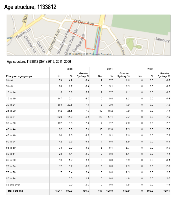
As we can see in the age structure report, the total population of this Waterloo SA1 has sky-rocketed since 2011. Most of its residents are aged 20 to 34, and making the most of the economic and cultural opportunities offered by central Sydney. As these people form couples and reach the homebuilder stage of life, we can expect to see even greater growth in babies and toddlers in the near future. This is an example of the sort of demographic story we can uncover when we explore census data through a map. What’s more, we know that we’ve only told a small part of the story.
Age structure of the same SA1, showing predominance of young workforce and homebuilders

Source: Report generated in .id Placemaker
To understand the growth in families living in apartments, we might like to look at loan and rental payments data to explore whether housing affordability has influenced this trend.
What about the cultural identities of these groups? Have they recently arrived from overseas or migrated to the inner city from a different part of Sydney? Is the national growth in professional jobs reflected in Waterloo – Beaconsfield, an area traditionally associated with blue collar work?
And, why is the trend more pronounced in Waterloo compared to neighbouring areas? What does it mean for Sydney more broadly? Is a similar process taking place in other cities?
These are valuable questions that the census helps us to answer. By investigating demographic data spatially and paying attention to different geographic scales, we can tell important, evidence-based stories about our communities and how they are changing.
To learn more about analysing census data spatially, check out our .id Placemaker census explorer tool or contact .id’s team of location analysis consultants.

.id is a team of population experts, who use a unique combination of online tools and consulting to help organisations decide where and when to locate their facilities and services, to meet the needs of changing populations. We provide free resources to help you make the most of demographic data. Access .id’s demographic resources here.


