Community suite product update – December 2017
This post details the latest data updates we’ve made to the .idCommunity suite – our online tools for local government that are made freely available to the wider community.
Updates to the community profiles
All topics in the community profiles main ‘area profiles’ section are now updated with data from the 2016 Census;
- Employment status
- Qualifications
- Industry and occupation
- Method of travel to work
- LGA migration data
Updates to social atlases
The social atlas tool is a collection of maps, each exploring a different topic or dataset. Maps updated in this release include;
And a small update to economic profiles
- Updated employment by industry and destination zone data

Employment status
We have added employment data from the 2016 Census including unemployment rate, full-time and part-time work, as well as workforce participation data.
Qualifications
Is your community becoming more educated? In what areas? Are the people in your area mostly university-educated, do they have trade qualifications or no qualifications?
Industry and occupation
Health Care is now Australia’s largest industry. See the changing nature of your residential economy: who works in which sectors, and, most importantly, how is this changing?
Method of travel to work
See how your community got to work on Census day. This is important data for advocacy and understanding transport patterns. Australia-wide, there has been a large increase in public transport use, but this has mainly been driven by significant increases in Sydney and Melbourne. Below, we’ve written a detailed demonstration of how this data is also presented visually in the social atlas tool.
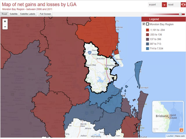
LGA Migration – by age and location
This eagerly-awaited dataset shows in details where your population lived five years ago, who has moved into the area, who has moved out, where they are going and in what age groups.
Use this data to look for trends such as young people leaving your area, migration based on affordable housing, and retirement patterns into and out of an area.
We use maps to visually demonstrate net migration. Scroll down to the table below for detailed figures for inward and outbound migration.
The map below shows net migration gains and losses for Queensland’s Moreton Bay Region
Population highlights
Many of the topics above have been added to the Population Highlights page – the easiest way to get a quick overview of your community. Remember, this page can be easily turned exported as a .pdf – a popular shortcut for marketing and communications teams who need to provide an easy snapshot of a place.
Up next for your community profiles
Next we will be updating the remaining migration summary pages. We will also be updating the in-depth communities of interest module for those of you who subscribe to that feature (Communities of interest gives detailed insights to select subsets of the community that are not available in the standard community profile). For those awaiting updated SEIFA data, this will be released from March 2018.

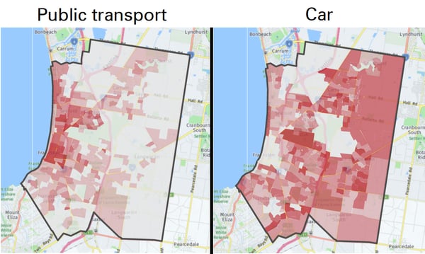
Method of travel to work
Travel to work data is a powerful advocacy tool when visualised on a map.
To find this map, go to your social atlas, click on the map selector and choose the ‘Transport‘ menu item.
Below: two maps showing travel to work data for Frankston City, demonstrating a much higher use of public transport in areas close to the coastal rail line.
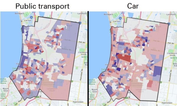
Dig deeper with change over time
This story can be further explored using the new change over time feature in your social atlas.
Use the ‘Year’ drop-down menu to select ‘Change 2011-2016’.
Returning to the Frankston example, we see that the percentage of people along the railway line who travel to work on public transport has decreased in the past five years (with the percentage travelling by car increasing slightly).
Occupation
Maps for Labourers, technicians or trade workers and managers or professionals, among other occupations, are found under the ‘Work’ menu item.
Employment
Also under the ‘Work’ option in the map selector, the Labour force participation rate and unemployment rate maps are both indicators that are often used to identify pockets of disadvantage (that may be otherwise concealed by a more neutral average) when planning service delivery or when preparing funding submissions.
Qualifications
Under the ‘education’ map selector, choose the University qualifications, Trade qualifications, and No qualifications maps to clearly identify the pockets of your community that have post-secondary education.
Up next for your social atlas
We’re now working to update maps showing disengaged youth, unemployment by age, and special maps using cross-tabulated data that show mothers in the labour force.

Employment by Industry and Destination Zone data has been updated to fix a minor error the ABS identified in the original dataset released in October.
Stay up to date
Bookmark our 2016 Census update tracker page, where we announce each new topic release as-it-happens, alongside great insights and analysis from our team of population experts.
Questions?
If you have any questions or are having difficulty accessing any of this updated data, get in touch with us and one of our team will be happy to help. Or, you can leave a comment below, and we’ll be happy to help you out.
.png)
.jpg)