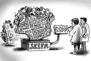
Part 3: Can I compare SEIFA scores over time?
Since the release of the Socio-Economic Indexes for Areas, we have been getting a lot of questions about whether users can compare SEIFA scores over time. It’s a very natural thing to want to do – we all want to know if our area is getting better or worse off over time. Unfortunately, for the socio-economic indexes, the short answer is NO! And this is why.
SEIFA consists of four indexes – which have been the same since 2001.
- Index of Disadvantage
- Index of Advantage/Disadvantage
- Index of Economic Resources
- Index of Education and Occupation
Each index measures general “disadvantage” in a community or a broad aspect of disadvantage (in the case of the last two), and they are designed to have an average of about 1,000, with lower numbers being more disadvantaged and higher numbers less. Various Census characteristics are included such as incomes, education levels, occupations, rent and mortgage payments, family structure and unemployment.
You would think that you could compare the SEIFA score of an area in one Census and see whether it had gone up or down, indicating a higher or lower level of disadvantage in the area over time. Unfortunately this is not the case.
SEIFA is set up to compare between areas at a point in time. It is very good at making comparisons between areas, not so good at tracking change.
For example, take the City of Whittlesea in Victoria. In 2006 the SEIFA index was 978.4. In 2011 it was 988.6. Does this mean that the City of Whittlesea is better off? Possibly. By how much? We don’t know.
The indexes have different contributions from different Census variables over time. Though the questions asked on the Census were the same in 2011 as 2006, the variables included in SEIFA have significant differences. This is due to the way the analysis works. The statistical technique called “Principal Component Analysis” is used to determine correlations between different Census variables from a candidate list, and supplies a final set of related variables which contribute to the index. This group of variables, and the weights they are given in the index is different in each Census year. For example:
- Between 2001 and 2006 entirely different questions were included, such as need for assistance – these were included in the 2006 indexes and again in 2011, but they are not comparable to 2001.
- Even where the questions are the same, some new outputs are available and have been used. In the 2011 SEIFA disadvantage index, for example, a new variable has been included which looks at the percentage of families with children where neither parent has a job. This wasn’t available in 2006 and so areas with a higher proportion in this category will be emphasised by the 2011 SEIFA but not by 2006.
- Some data items are available in both Censuses, but societal change makes them no longer a useful indicator. For instance, in 2006, the percentage of households having broadband internet was used as a measure of advantage. In 2011, with about 80% of all households having broadband, it’s no longer a good indicator and has been dropped (though percentage of households with no internet connection is still used as a measure of disadvantage).
So, due to the inclusion of different characteristics in the indexes it isn’t possible to compare areas directly over time. You can potentially do some broad analysis at the decile level – eg. The City of Whittlesea has moved from the 4th decile in Victoria to the 5th decile. This should be less affected by changes in composition in the index as it will only pick up very large changes, and in general, the index is still broadly measuring “disadvantage”. But you then need to look at reasons why.
One of the really interesting things about the 2011 SEIFA is the apparent dominance of newly built outer suburban areas in the index, particularly the one that measures both advantage AND disadvantage.
For instance, in Melbourne, the most highly advantaged areas are Waterways, Park Orchards and Sandhurst – all areas with well-off families near the urban fringe. In Sydney, the most advantaged area is not on the north shore, but The Ponds, in the City of Blacktown!
There is no doubt that these areas are high income. But the difference in 2011 SEIFA is that there seems to be far more weighting given to characteristics like households with 3 or more cars, dwellings with 4 or more bedrooms, and now the presence of spare bedrooms is included whereas it was dropped out of the 2006 index. Couple this with high income and high mortgage payments both being included, and it’s clear that areas with many dual income families paying off large mortgages for new dwellings will score highly on the index this time around.
So in general, just be careful what you say about SEIFA and be extra careful about drawing any conclusions about change – you may simply be looking at a change in the way the index is calculated.
Fortunately, profile.id has many tools for looking at change over time. SEIFA is great for summarizing disadvantage into a single number, and useful if you need to rank areas to decide which will get funding or not. But if you’re actually supplying services within these communities, you are better off looking at topics in profile.id like income quartiles, educational qualifications and unemployment rates directly, rather than relying on SEIFA.
Still confused? We cover SEIFA in a bit of detail at our staff training sessions for profile.id. These are included with your subscription, and if you’d like to organise one, please contact .id.
Access our online demographic resource centre and get the latest SEIFA data on all our profile.id and atlas.id
![]()
Glenn Capuano - Census Expert
Glenn is our resident Census expert. After ten years working at the ABS, Glenn's deep knowledge of the Census has been a crucial input in the development of our community profiles. These tools help everyday people uncover the rich and important stories about our communities that are often hidden deep in the Census data. Glenn is also our most prolific blogger - if you're reading this, you've just finished reading one of his blogs. Take a quick look at the front page of our blog and you'll no doubt find more of Glenn's latest work. As a client manager, Glenn travels the country giving sought-after briefings to councils and communities (these are also great opportunities for Glenn to tend to his rankings in Geolocation games such as Munzee and Geocaching).