At .id we usually present and discuss demographic information about cities, towns, regions and even countries.
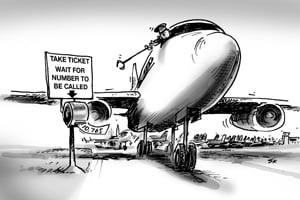
But there’s a growing population of people who are not even on the ground – those people who are currently, at this moment, flying somewhere in an aircraft.
So what is the population of this group – and where can you see all their flights represented on an interactive map?

The advent of budget airfares has dramatically increased the number of flights taken by all types of passengers – people travelling for leisure or business.
At .id we travel a great deal to visit clients and run training on our demographic tools, so we often use air travel. And while the airlines argue that the seats aren’t actually any closer together these days, the legroom can still seem pretty tight on a longer haul!
As an aside, apparently most airline seats were originally designed for an “average person” of 170cm in height and 77kg. This may have been ok back in the day, but according the recent ABS figures, in 2011-12, the average Australian man (18 years and over) was 175.6 cm tall and weighed 85.9 kg and the average Australian woman was 161.8 cm tall and weighed 71.1 kg.
On average, Australians are growing taller and heavier over time. Between 1995 and 2011-12, the average height for men increased by 0.8 cm and for women by 0.4 cm, while the average weight for men increased by 3.9 kg and for women by 4.1 kg – so it’s no wonder the seats sometimes feel a bit squeezy!
As far as the “air” population, it’s estimated that there are around 6000 commercial flights in the air at any one time, and each of these could have anywhere from 50 to several hundred passengers. However, an allowance also needs to be made for the number of cargo aircraft.
So, estimates vary, but the conventional wisdom seems to be that there are anywhere from 600,000 to 1m people in the air at any one time around the world. Oh, and don’t forget to add another 3-7 people (it varies) who occupy the International Space Station in low orbit.
You can check this yourself on a very cool interactive website, http://www.flightradar24.com/, which shows the position of every aircraft around the world that is currently flying – (at least those with an ADS-B transponder) and also where it’s going, and how fast it’s currently travelling.
If you have the time – you could look at them all and based on the aircraft type, make your own estimates of the total population “of the air” – and let us know in the comments below!
Access the Australian Community Profile now. You will find Census results (including SEIFA data) for each Capital City, State, Southeast Queensland and Australia on topics including population, age, country of birth, languages spoken, occupations, industries, employment, disability, income, qualifications, transport and much more…


