BLOG
Where is the elderly population in Australia?
Where is the elderly population in Australia?
Already we’ve seen a strong response from businesses, community groups and individuals who want to support their communities through the Covid-19 lockdown period. We’re all aware by now that the elderly are among the most vulnerable in our society, so questions like ‘How many elderly people do we have in our area?’, ‘Where are they located’ and ‘How old are they?’ are top-of-mind for many people. In this piece, Glenn gives us a refresher on how to use our local area community profiles to identify where the elderly people are in your community.
Skip to:
- Where is the older population in Australia?
- Submit your question for our experts
- See the full list of resources to help you plan for the Covid-19 period
With the news that COVID-19 is most dangerous in elderly populations, this has caused a lot of people to focus on vulnerable communities in the older age ranges. I thought it was worth revisiting age structure – the single most important demographic characteristic – to see just how we compare and where the hotspots of older population are.
Australia’s older population – a refresher
Is Australia an ‘ageing society’?
We often hear that Australia is an “ageing society”. It’s certainly true that everyone gets older (in fact, it happens at the rate of one year every year for most of us – the alternative is not as good). In 2016, Australia overall had a median age of 38, up by one year in the previous 5 year Census period. The proportion of the population aged 65+ was 15.7%, while those aged 75+ made up 6.8% of the population. These were both up from 2011 when they were 14.0% and 6.4% respectively. 75+ is the age range which appears to be most affected by COVID-19, so it’s the critical one to watch in the current pandemic.
These population pyramids show how the population has aged in the last 25 years, since 1991.
Open the animated age-sex pyramid on the Australian community profile.


How has life expectancy changed in Australia in recent years?
Life expectancy has been increasing for centuries, and you can see this in the far greater numbers of those aged 85+ in the charts, particularly for females (who live on average 5 years longer than males). But the biggest change in 25 years has been the fattening of the 50-74 age range, and this is due to the ageing of the baby boomer cohorts.
The baby boom, which officially started after World War II, in 1946, have defined Australia’s population over the past 70 years. There are not yet any baby boomers in the 75+ age range, but the first will enter this cohort next year (2021), and so we should expect to see accelerated growth in the cohort from next Census.
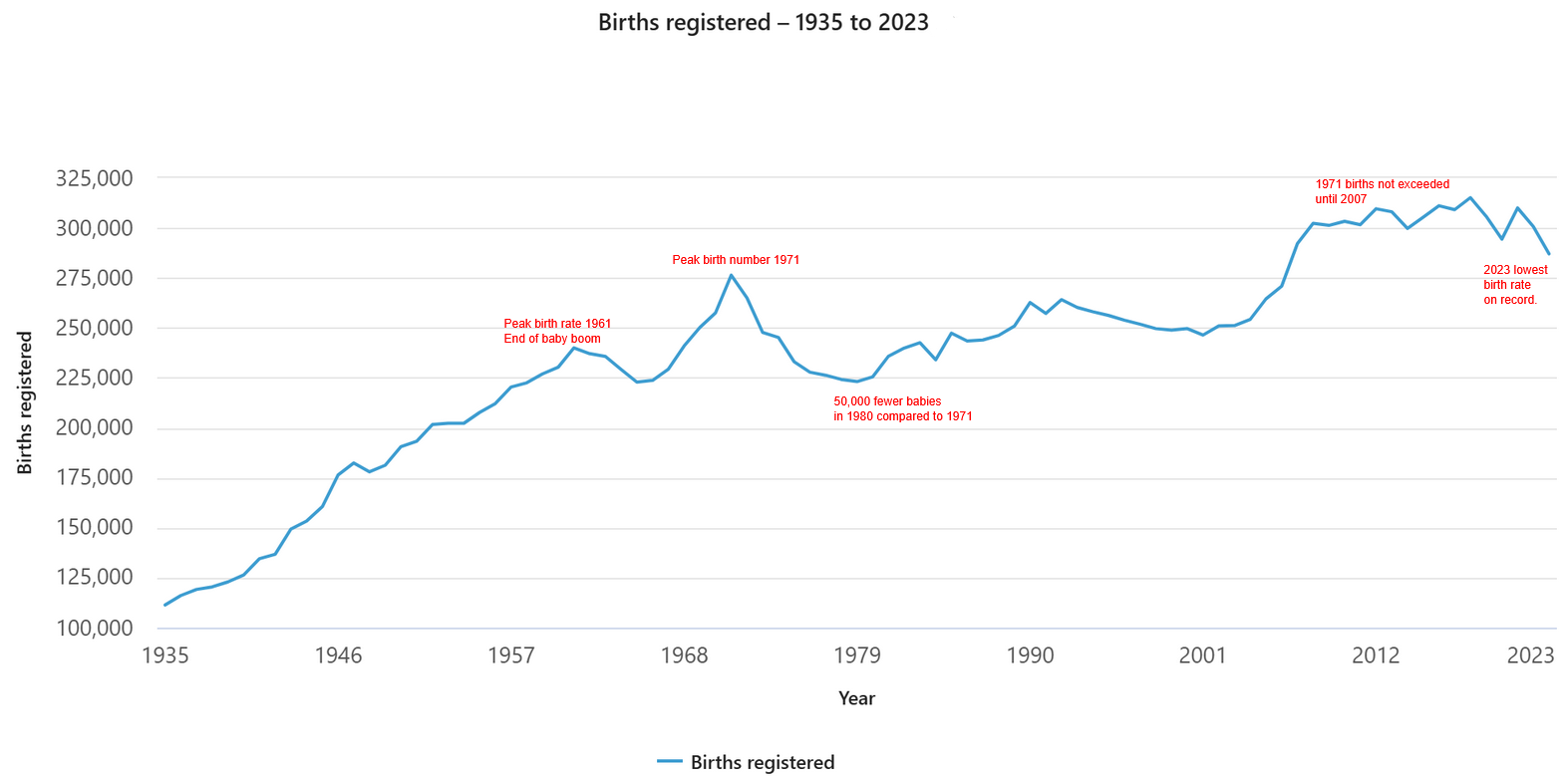
It’s important to note that although the younger age groups look smaller in 2016, this is only in percentage terms – all age cohorts have increased in number over both 5 and 25-year timeframes. In fact, 0-4s was one of our biggest increasing groups, due to the 2003-2014 “baby blip”, which saw birth rates increase markedly. And 25-34 year olds have also increased a lot due to migration.
How does our age structure compare internationally?
Although it is below replacement level, Australia does have a high birth rate compared to other developed countries, and also a relatively high migration rate. This keeps the population relatively younger compared to some places. Here is a table of some selected countries and their percentage of population aged 65+
(Full list from Wikipedia, original source, World Bank, for the year 2017 – so Australia’s total is marginally different to that listed above)
| Country | 65+ population |
|---|---|
| Japan | 27.0% |
| Italy | 23.0% |
| Germany | 21.5% |
| Portugal | 21.5% |
| Finland | 21.2% |
| Bulgaria | 20.8% |
| Greece | 20.4% |
| United Kingdom | 18.5% |
| Canada | 17.0% |
| Australia | 15.5% |
| United States | 15.4% |
| New Zealand | 15.3% |
| China | 10.6% |
| Sri Lanka | 10.1% |
| India | 6.0% |
| Iran | 5.4% |
| Indonesia | 5.3% |
| South Africa | 5.3% |
| Afghanistan | 2.6% |
| Qatar | 1.3% |
| United Arab Emirates | 1.1% |
Japan tops the list by a fairly hefty margin, with 27% of the population over 65 – Japan has a declining population now, a consequence of a low birth rate and virtually zero immigration. Italy, now suffering the most from the Covid-19 pandemic, is the second oldest nation. The relatively high death rate from the disease in Italy is probably due to the elderly population. But Japan seems to have been far better at controlling the virus.
Australia is really in the middle of the list, with an over-65 population that is comparable to other developed countries in the English speaking world – a bit lower than the UK, but a slightly higher than the US and New Zealand.
Where is the older population within Australia?
Which Australian states have the oldest population?
Among Australia’s states and territories, Tasmania stands out as clearly the oldest, with over 20% aged 65+ and 8.4% aged 75+. The Northern Territory is the youngest, with only 8.0% aged 65+, partly due to the large indigenous population, which has a lower life expectancy.
| State/Territory | Aged 65+ | Aged 75+ |
|---|---|---|
| New South Wales | 16.3% | 7.2% |
| Victoria | 15.4% | 6.9% |
| Queensland | 15.7% | 6.6% |
| South Australia | 18.7% | 8.4% |
| Western Australia | 14.8% | 6.3% |
| Tasmania | 20.1% | 8.4% |
| Northern Territory | 8.0% | 2.4% |
| Australian Capital Territory | 13.0% |
5.4% |
Which local government areas have the oldest population?
At the local government level, the oldest LGAs represent coastal retirement destinations within Australia. The top 12 are all in regional Australia. This includes Queenscliffe in Victoria, Victor Harbor in South Australia, and Eurobodalla in NSW. Parts of regional Tasmania and some other more remote communities in SA and WA which lose young people also feature highly on the list.
| Aged 65+ | Aged 75+ | |
| Queenscliffe (Vic) | 40.6% | 18.8% |
| Victor Harbor (SA) | 39.2% | 17.7% |
| Yorke Peninsula (SA) | 32.5% | 13.7% |
| Barunga West (SA) | 32.5% | 13.4% |
| Glamorgan/Spring Bay (Tas) | 32.1% | 10.8% |
| Eurobodalla (NSW) | 30.5% | 12.8% |
| Mid-Coast (NSW) | 30.1% | 13.1% |
| Tasman (Tas) | 29.4% | 10.6% |
| Sandstone (WA) | 29.2% | 3.4% |
| Wyalkatchem (WA) | 29.0% | 14.3% |
| Yankalilla (SA) | 28.9% | 10.4% |
| Alexandrina (SA) | 28.7% | 11.8% |
Where can I find information for my local area?
We have a lot of information on the age profile of your community (plus heaps of other demographic information) in your community profile.
Can I see this information on a map?
The social atlas allows you to pinpoint specific age groups at a highly detailed level, highlighting potential hotspots for vulnerable elderly populations. This one highlights the areas with the highest elderly population in one of our oldest Local Government Areas, Victor Harbor.

Do you have a question?
Age is one of multiple indicators of vulnerability. If you work in local government and need help learning more about vulnerable groups in your community, reach out to us.
More Covid-19 resources
We’ve compiled (and will continue to add to) this page with links to the information tools, blogs and other resources you may find useful at this time, as well as an outline of how we’re responding and how you can reach us during the Covid-19 period.
Glenn Capuano - Census Expert
Glenn is our resident Census expert. After ten years working at the ABS, Glenn's deep knowledge of the Census has been a crucial input in the development of our community profiles. These tools help everyday people uncover the rich and important stories about our communities that are often hidden deep in the Census data. Glenn is also our most prolific blogger - if you're reading this, you've just finished reading one of his blogs. Take a quick look at the front page of our blog and you'll no doubt find more of Glenn's latest work. As a client manager, Glenn travels the country giving sought-after briefings to councils and communities (these are also great opportunities for Glenn to tend to his rankings in Geolocation games such as Munzee and Geocaching).


