Bourke Street Primary, a quaint school in Sydney’s inner-city, had 74 students in 2010. Back then official forecasts showed that by 2014 the school would have grown to 112 students, and was making plans accordingly. However, when doors opened at the beginning of the year, 230 students showed up.
All businesses know the pain of misreading their market. Overestimate demand and you over invest in capacity. Underestimate however and opportunities go begging. In the case of public schooling, a miss like this quickly escalates into disgruntled parents and a political hot-potato.
Anticipating school demand has been made extra tricky in recent years by noticeable increases in fertility and overseas migration. Both have significant impacts on school-age projections. Both seemed unlikely just 10 years ago.
What’s more, changes at the macro level feed through unevenly to individual suburbs. Much depends on the kind of housing stock in the area (is it suitable for families), and how established the suburb is. Suburbs with houses full of older children for example won’t be majorly affected by these changes in the short term. The distribution of families is changing across cities too, with more people choosing to stay in the inner areas after having children.
For this reason, the business of education, like any business, needs highly localized, suburb specific forecasts that are able to consistently integrate macro-level changes. This is where .id comes in.
How is your neighbourhood changing?
To give you a sense of what .id do, we have created an interactive map of NSW, based on our Small Area Forecast information, and presented via the powerful idPlacemaker application.
We used this map to drill down from the state-wide picture to individual suburbs, and see how the primary school age population is growing at each level of analysis. This blog focuses on primary school aged children, but if you are interested in secondary schools we have also done this analysis.
You will see that with greater definition comes greater clarity about where markets are growing, and where they are slowing.
For example, let’s see how the picture changes as we zoom in from the state-wide to the micro-geographic view…
Regional pattern
Figure1: Change 5-11 year olds 2014-24 by Region, NSW
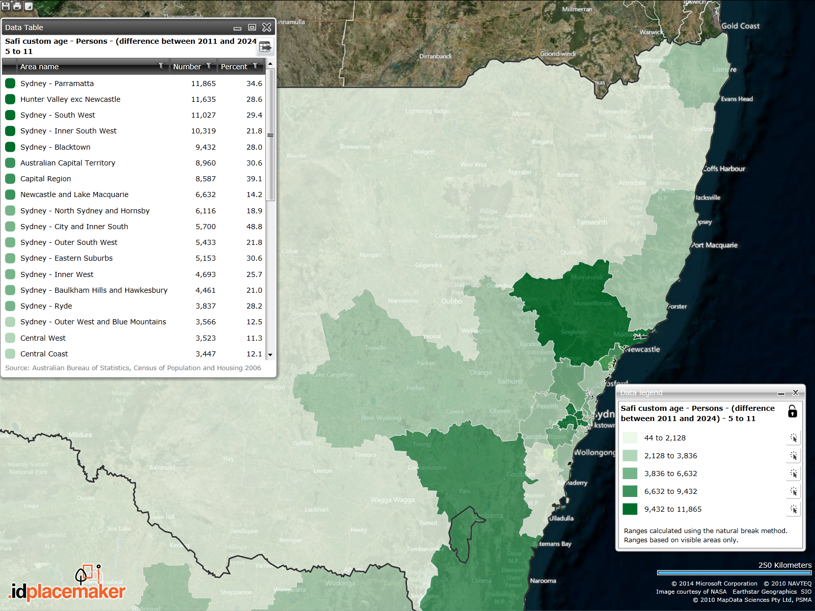
We can see in Figure 1 as we take in the entire state of NSW with one sweep, that the there is strong growth through out the Hunter region, led by Cessnock, Maitland, Port Stephens.
In Sydney, growth is mostly in the west and north, but we can explore that in more detail…
LGA pattern
Figure 2: Change 5-11 year olds 2014-24 by LGA – Sydney-Hunter Valley
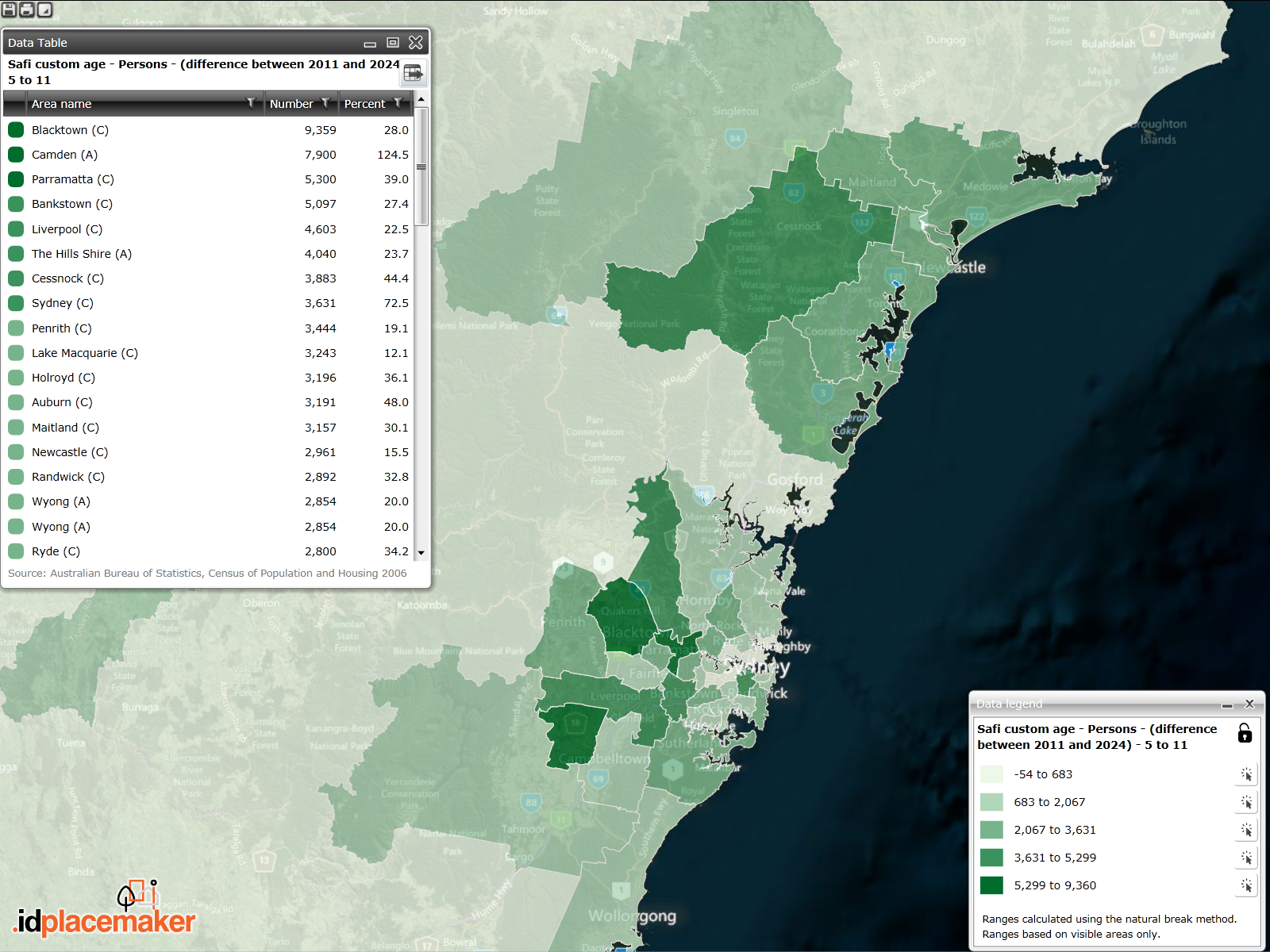
Here we have drilled down to look at Local Government Areas (LGAs) and you can see in Figure 2 that growth in Sydney is dominated by fringe growth areas in Blacktown, Camden and The Hills. However, middle ring areas of Parramatta, Liverpool and Bankstown also showing significant growth – as is the City of Sydney itself.
However, this still isn’t detail enough to build a schools strategy around…
Suburb pattern
Figure 3: Change 5-11 year olds 2014-24 by SA2 – Sydney-Hunter Valley
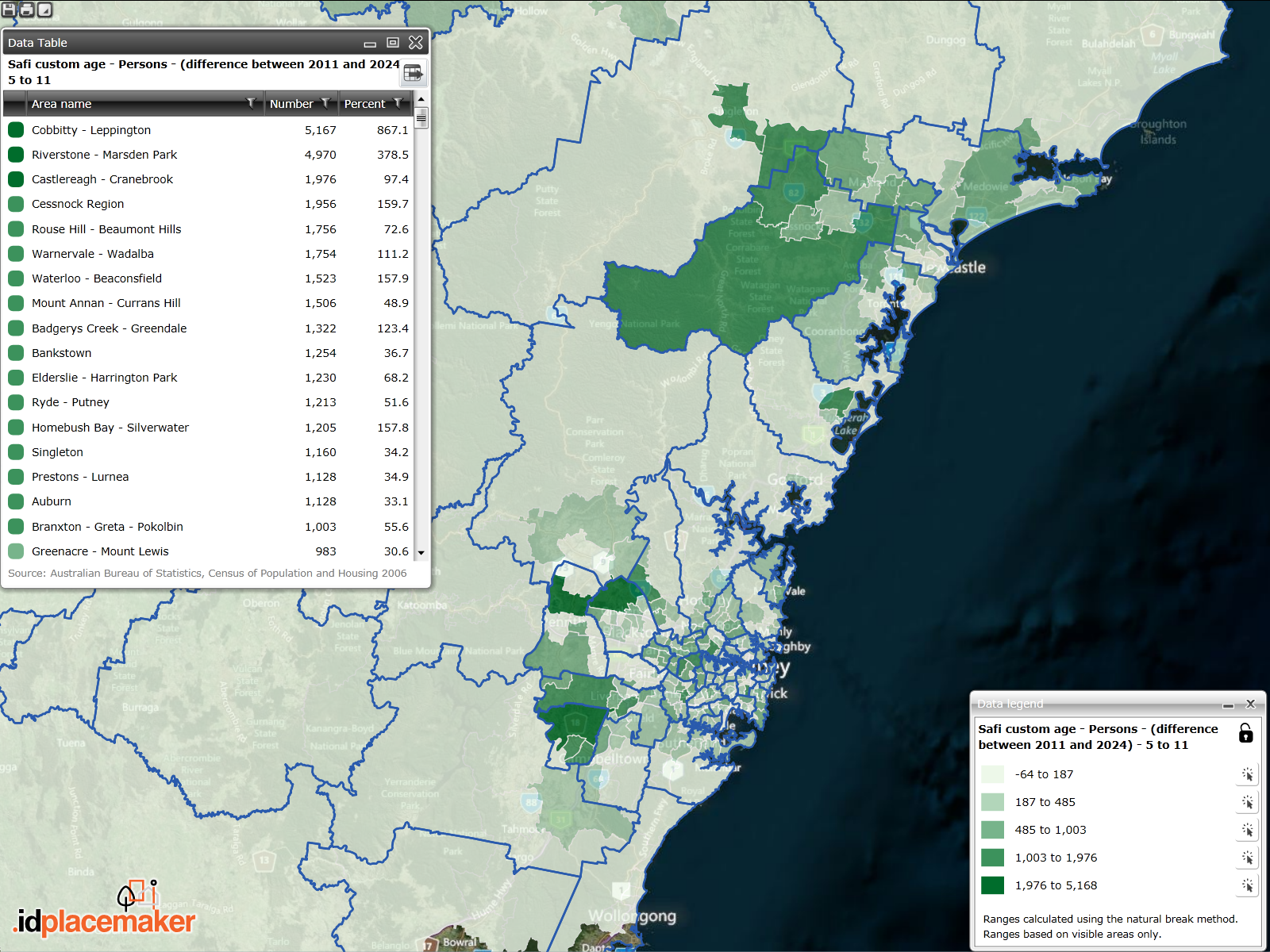
This is where detailed geographic data really starts to add value. We’ve now drilled down to have a look at individual suburbs.
For example, we can see that within the broader LGA of Penrith, Emu Plains-Lenoay is losing 54 primary school aged children over the next ten years. However the suburb of Castlereagh-Cranebrook, which is right next-door, is projected to gain a 1,976 students!
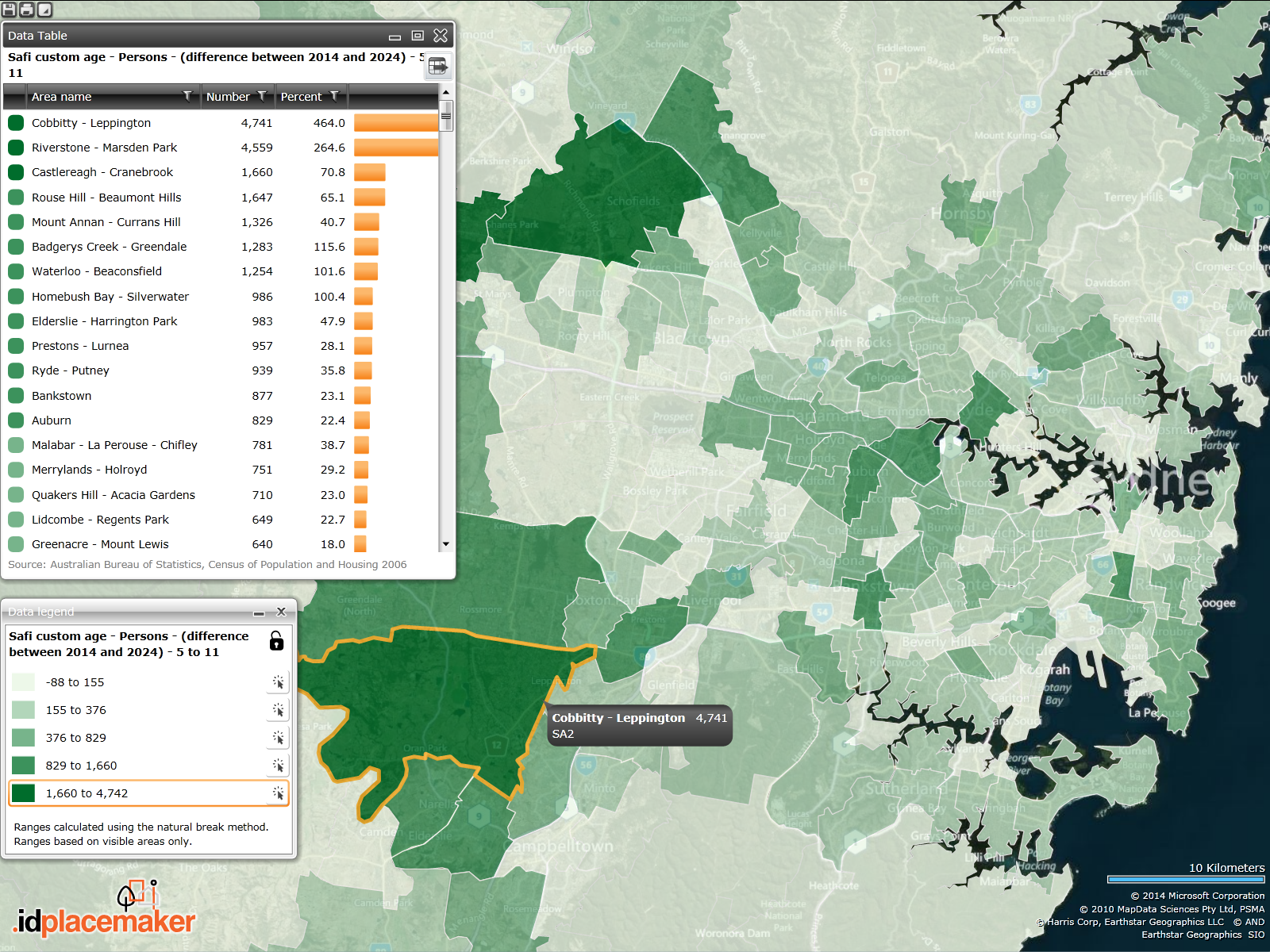
However, we can still do better. And the Placemaker application allows us to drill down a further two levels of analysis, from the suburb (Figure 4)…
Figure 4: Change 5-11 year olds 2014-24 by SA2 – Sydney region
To SAFi micro-geography (Figure 5)…
Micro-geography pattern
Figure 5: Change 5-11 year olds 2014-24 by SAFi micro-geography – Sydney
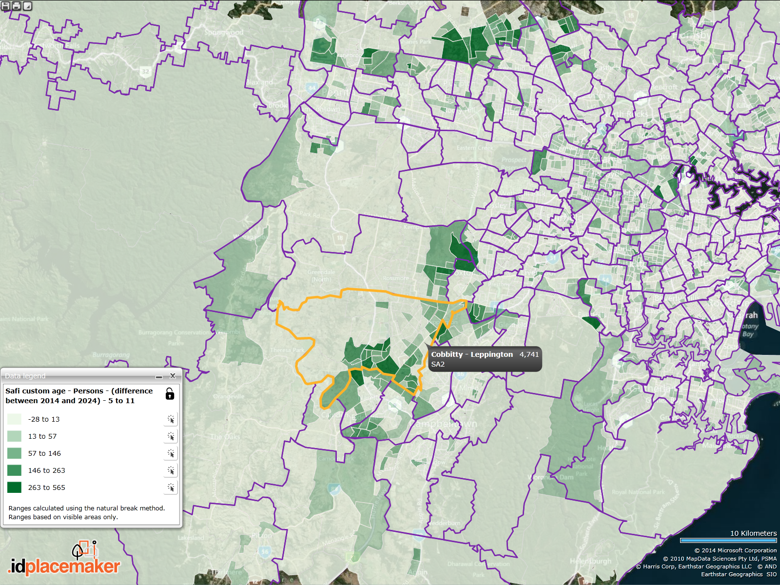
In Figure 4 we see that the suburb of Leppington has strong growth in primary-aged children. However in Figure 5, as we break the suburbdown further, we can see that growth is highly concentrated in particular estates, and totally absent in others. For those people charged with planning for the educational needs of this suburb, this kind of micro-geographic view is essential.
So how is your suburb growing? Now it’s your turn.
We’ve built you an interactive map of your own to show you the number of primary-school aged children in your suburb, and how many there will be in the future.
At .id we specialise in demographic forecasts – from the big picture to the micro-geographic. Many businesses find the insights available to them through our data invaluable. We hope this gives you a taste.
.id is a team of population experts, who use a unique combination of online tools and consulting to help organisations decide where and when to locate their facilities and services, to meet the needs of changing populations. Access our free demographic resources here.


.png)


