How to map population change in forecast.id
forecast.id is a great tool for understanding how your area’s population is changing, and what are the likely future outcomes of demographic trends and housing development. Many users are unaware that forecast.id contains a comprehensive mapping section, which is a great way of visualising how population is changing within your local government area. It allows you to pinpoint areas with the greatest change, and target your local government services over the next 20 years.
The “Data mapping” section is available for all clients who subscribe to forecast.id (over 100 at January 2012). It enables you to map the forecast population and characteristics by each suburb within the LGA.
This is a fantastic resource resource for planning in local government, as the mapping makes this already valuable forecast data more accessible and presents it in a way that lets you see the spatial relationships.
Case study example
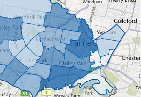
For example, have a look at the City of Fairfield’s population forecasts.
Fairfield overall is expected to grow from about 190,000 people now, to about 220,000 by 2031. But this growth is not evenly distributed amongst the suburbs, as different suburbs are at different stages in their suburb life cycles, some attracting more young families, some with ageing retirees, others building high density housing and attracting young singles or migrant groups. The map lets you visualise this.
Suppose you are looking at which areas will need more aged care in the next 20 years.
Go into the Fairfield forecast, and click on the Data Mapping tab. A map will come up, showing, by default, the 2006 base population of 0-4 year olds. Use the Data Options box to change this.

For age groups you have a wide variety of choices. You can map by 5 year age groups, service age groups (0-4, 5-11, 12-17 etc.) or custom age groups. Let’s select custom age groups, and choose the population aged 80+, and hit Update map. Note that choosing 85 as your “Age to” field actually means 85+. See the screen grab.
The map then displays the number of 80+ year olds by suburb in the first selected year (2006 by default).

A good way to visualise this data is to select Percentage, to map the proportion of total population in this age group by suburb. You might also want to change the first year to this year, 2012.

The resultant map and data table to its left show that the current highest proportions of people aged 80+ are in Carramar and Villawood, while the lowest proportions are in the more recently developed western parts of Fairfield, including Abbotsbury and Edensor Park.

Now select the Change (numbers) 2012 to 2031 button. The map changes to show the suburbs expecting the greatest increase in people aged 80+ between 2012 and 2031 (you can change the final year to get a shorter time period if required).

This shows that the largest increases are expected in Bossley Park and Bonnyrigg, both of which are likely to double in number. These are the suburbs which are likely to need new or expanded aged-care facilities over that time frame. In contrast, the suburbs of Cabramatta West and Guildford show slight declines in those age 80+, as young people return to the area, fueled by high overseas migration rates, and movement out of empty nesters.
Your turn
Now it’s over to you. You can map:
- Total population
- Age groups (any combination of ages)
- Household types
- Dwelling stock
You can choose to show:
- The current year or any year back to 2006.
- The future, for any year to 2031.
- Characteristic as a proportion of the current population.
- Future proportion of total population at any year to 2031
- Forecast change between any two years between 2006 and 2031.
The map functions are the same as those in atlas.id. You can zoom and centre the map, turn on an aerial view, change the opacity to bring out the spatial patterns, and hover over a suburb in the list to the left which highlights the same suburb on the map. The is also the option to export the map to a JPG image to include in your own reports.
If you need more detail on the age distribution in different suburbs, you can always go to the Detailed Data tab for this information. And the assumptions on development, birth rates and migration which feed into the forecasts are available on the Assumptions tab.
You can use the same methods with the Household Types and Dwellings tabs, to show maps of change in these characteristics as well.
For a list of .id’s forecast clients, please see the client list on our website. If you are interested in population forecasting in your local area, please contact .id by email (info@id.com.au) or by phone (03) 9417-2205.
Glenn Capuano - Census Expert
Glenn is our resident Census expert. After ten years working at the ABS, Glenn's deep knowledge of the Census has been a crucial input in the development of our community profiles. These tools help everyday people uncover the rich and important stories about our communities that are often hidden deep in the Census data. Glenn is also our most prolific blogger - if you're reading this, you've just finished reading one of his blogs. Take a quick look at the front page of our blog and you'll no doubt find more of Glenn's latest work. As a client manager, Glenn travels the country giving sought-after briefings to councils and communities (these are also great opportunities for Glenn to tend to his rankings in Geolocation games such as Munzee and Geocaching).

.png)
.jpg)


