At training sessions for profile.id and economy.id, we often get asked how to interpret some of the data presented in these tools. We suggest a simple but powerful technique called “dominant-emerging” analysis as a really good way to make sense of the data. It is based on asking two questions about any area.
- What role does it play within its region? 2. How is it changing?
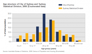
profile.id and economy.id are set up to make this form of analysis very easy, with the tables of data, and two charts on every page answering these questions. Each topic in profile.id (and many of the topics in economy.id) has two charts attached to it. The first compares the area of interest to its benchmark, which we call the “dominant” chart. The second looks at how the characteristic has changed over a selected time period (either 5, 10 or 15 years in the current version of the profile). We call this the “emerging” chart.
What’s dominant?
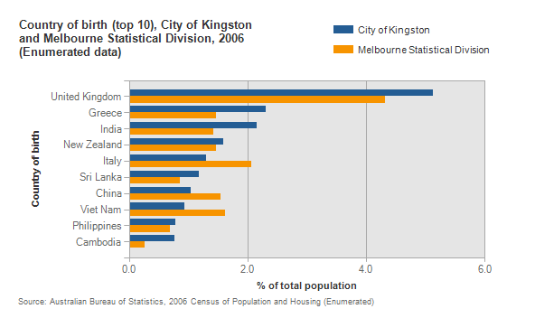
For example, take the dominant birthplace chart for the City of Kingston, below. It shows that, compared to the Melbourne Statistical Division (the wider region in which the City of Kingston is located), dominant countries of birth are the UK, Greece and India. Italy is the fifth largest group, but it’s well below the Melbourne average, meaning it’s not dominant when compared to Melbourne. Cambodia on the other hand is the 10th largest group, but present in much higher numbers than the Melbourne average, so it is also a dominant group within the City of Kingston.
It’s important to look at the benchmark you’re using. The concept of a dominant group only applies if the benchmark is a wider region containing the area. All local government areas with .id’s community profile have a default benchmark set as the region or State in which the area functions.
Some have additional benchmarks, which can compare the area to another – for example, a neighbouring LGA, or a similar region in a different state. While this can be useful, it should not be used for a dominant analysis.
If you’re looking at an individual suburb or town it can make more sense to compare to the LGA as a benchmark for your dominant analysis rather than the region or state. This enables you to analyse the role of the suburb in the context of the LGA.
What’s emerging?
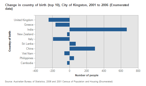
Now, in the emerging chart for Kingston birthplaces you can see which birthplace groups are emerging or declining in Kingston over 5 years. In this case the two groups we identified as most dominant, the UK and Greece, are declining, while India is a large emerging group, as is China, though it’s not dominant (see first chart above). The emerging groups represent those groups which you will need to plan for in the future.
Dominant-emerging analysis works across a range of Census topics included in profile.id, and works at the suburb level too. Take this dominant chart showing the size of households in the Perth suburb of Ocean Reef (benchmarked to the City of Joondalup). Clearly, Ocean Reef has some pretty large households compared to Joondalup (and if you benchmark to Perth SD, it appears to be an even larger difference).

But the emerging chart shows that 1, 2 and 3 person households are emerging – they are the ones that increased over 5 years – so the City of Joondalup will need to plan for smaller households in this suburb in the future. This is fairly common, and related to the position of the area in the “Suburb life cycle” – see Ivan Motley’s post on this coming soon.
So dominant-emerging analysis is an effective tool in planning for change at the local level. To finish up, here are a few good examples for you to look at yourself:
- Age structure in Palm Beach, Gold Coast, Qld
- Educational attendance in the Mays Hill area of the City of Holroyd, NSW
- Size of industry (value-added) in Knox, Victoria between 2005 and 2010
- Household incomes in Doubleview, City of Stirling, WA (great example of income polarisation too)
If you enjoyed this article, sign up to get updates via email or twitter (above), and feel free to share it.


.png)


