Quartiles - a technique for comparing incomes across time and place
Income data is one of the most important indicators of socio-economic status. One of the most useful analysis tools in profile.id (and also used in economy.id) are income quartiles. They enable you to compare incomes (or housing payments) over time, to see whether they are increasing or decreasing in your area relative to a benchmark. Though relatively simple to calculate and even simpler to use, many users of .id’s community profiles aren’t aware that they are available. Read on to see how to use quartiles.
The problem with income data
The ABS has collected income information in the Census for many decades. It is one of the more frequently used topics in the Census, and is used to identify low income groups for targeting welfare and support services, as well as being a favourite of marketers looking at the potential market of higher income goods and services. It’s also a major component of housing stress analysis.
The difficulty with income, and indeed any information on finances collected over many years, is that it doesn’t take account of inflation. In 1991 and 1996, the income ranges used on the Census form were quite different to those in 2006. Even between Censuses where the ranges were kept the same, as in 2001 and 2006, you can’t really compare incomes over time, because the simple effect of inflation, devaluing the dollar each year, means that 5 years on, more households will be in higher ranges – it doesn’t necessarily equate to any meaningful increase in their standard of living.
One way of adjusting for this would be to apply a deflation factor such as CPI – to adjust for inflation. The modeled data in economy.id do exactly that, adjusting all years’ data to constant dollar terms of 2007-2008 dollars. In profile.id, we take a simpler approach, and use quartiles, which let you see how an area is doing in relative terms, compared to a benchmark.
What are income quartiles?
Statistically, quartiles just mean ordering the population from lowest to highest and splitting into 4 equal groups. The 25%, 50% and 75% points of income equate to the break points between 4 quartiles. In profile.id we calculate the quartiles for the primary benchmark (usually the Statistical Division) and then we can compare each LGA and suburb to the benchmark to see its relative position.
For example, all our Sydney LGA profiles use the Sydney Statistical Division as their benchmark. For a great example see the City of Canterbury household income quartiles. In 2006, the top 25% of household incomes in Sydney were over $107,007 per year ($2,058/week), while the bottom 25% were on $31,066 p.a. or less ($597/week). The City of Canterbury had 35.6% of incomes in the bottom quartile, 29.6% in the lower middle (25% to 50%) quartile and far less in either of the top 2 groups. You can see at a glance that the City of Canterbury is a low income area compared to Sydney SD, and what’s more, when these quartiles are re-calculated for each of the previous Census years, you can see that incomes have declined over time.
Now remember that the actual dollar value of the incomes haven’t necessarily declined over time – the cutoffs we use for Sydney in 2001 are different, but they are calculated on the same basis – 25% of population in each group for each Census year. So what they do show, in this example, is that the City of Canterbury’s incomes haven’t kept pace with Greater Sydney’s – between 2001 and 2006 they had a large increase in the lowest income quartile, only small increases in the two middle quartiles and a decrease in the top quartile (those earning more than $107,007 in 2006 or $87,757 in 2001). Comparing back to 1991 shows the trend even more strongly. There can be many reasons for this effect – people ageing and retiring, an influx of humanitarian migrant groups, or just higher income populations leaving the area.
How to compare incomes across neighbourhoods
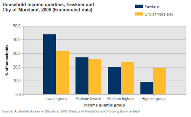
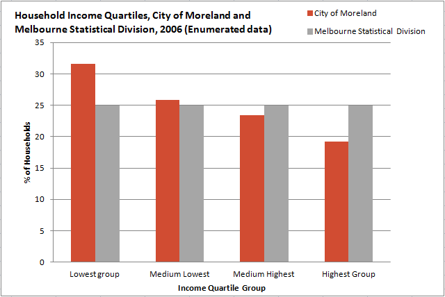
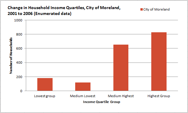
Of course it doesn’t just apply to Local Government Areas – you can see these income trends at the suburb/small area level in profile.id as well. In some cases particular suburbs may be going against the trend of the LGA overall. For example, the City of Moreland, in Melbourne’s northern suburbs shows a really strong gentrification trend, with lower incomes than Melbourne (first chart), but all the increase in the upper two quartiles (second chart).
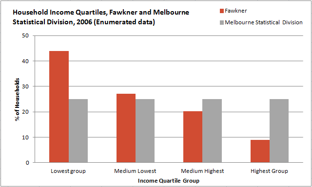
But look a little deeper and you’ll see that the suburb of Fawkner shows exactly the opposite – it’s low income and getting lower.

You can view City of Moreland’s household income quartiles for each suburb here).
So quartiles really enable you to apply the techniques of dominant-emerging analysis to incomes, without having to worry about inflation. You are comparing change in incomes in your area to a broader measure of change in your benchmark area.
Some interesting patterns
Here are a few interesting patterns in income data you can observe using income quartiles:
- Gentrification, such as Northcote (Vic), Rivervale (WA), Ashgrove (Qld), Newstead (Tas)
- De-gentrification (increases in lower incomes in well off areas), such as Endeavour Hills (Vic), Glen Alpine (NSW), Hallett Cove (SA).
- Polarisation (incomes at either end of the scale, but also often gentrifying) – Woolloomooloo (NSW), South Melbourne (Vic)
More uses for quartiles
Quartiles don’t just apply to household incomes. They also are also used for individual incomes, rent and mortgage payments, anything in profile.id which is presented in dollars. Comparisons of these are very useful. For example, some areas have low relative incomes but high relative mortgage repayments (often first home buyer areas), and others the opposite.
Income and payment quartiles – all part of how profile.id helps to tell the story of your area.
Found some interesting patterns in the data using income quartiles? Why not share with us? Please feel free to leave a comment.
.id is a team of demographers, population forecasters, spatial planners, urban economists, and data experts who use a unique combination of online tools and consulting to help governments and organisations understand their local areas. Access our free demographic resources here
Glenn Capuano - Census Expert
Glenn is our resident Census expert. After ten years working at the ABS, Glenn's deep knowledge of the Census has been a crucial input in the development of our community profiles. These tools help everyday people uncover the rich and important stories about our communities that are often hidden deep in the Census data. Glenn is also our most prolific blogger - if you're reading this, you've just finished reading one of his blogs. Take a quick look at the front page of our blog and you'll no doubt find more of Glenn's latest work. As a client manager, Glenn travels the country giving sought-after briefings to councils and communities (these are also great opportunities for Glenn to tend to his rankings in Geolocation games such as Munzee and Geocaching).