Telling the local story of migration in the COVID era
With international migration on hold, population pundits are paying close attention to internal migration around Australia. Glenn takes a look at the trends in the latest data and showcases how to tell this story using your Community Profile.
The COVID-19 pandemic is changing many things in Australia. Our international borders are closed so there is no longer any significant overseas migration. There has been minimal health impact here from the pandemic, but it’s changing the way we live and move around.
Population trends in capital cities vs regional areas
One of the more subtle changes which has received quite a bit of publicity is a clear net shift in population from our capital cities to regional areas. This is not affecting all areas equally – it tends to favour areas which were already popular tree-change and sea-change destinations. And in some parts, it’s comprised not of more people moving in, but less people moving out. (People who traditionally left regional areas for the cities are doing so less, while those from the cities are coming in at a similar rate to prior to the pandemic.) December quarter 2020 figures have just been released for this, and they show accelerating net movement from Sydney and Melbourne to regional areas and to interstate.
For the first time in Australia, you can now analyse these trends on Community Profile (profile.id). We have recently added to all our Community Profile sites a page showing Annual Migration by Location, starting from the 2016 Census, and going up to June 2020. We’ll be rolling out annual updates, so you can see year on year how the migration patterns within Australia for your area are changing. This is courtesy of a new dataset from the ABS, which has not been publicly released before, called RIME: Regional Internal Migration Estimates. It’s a component of the annual population estimates and is derived from Medicare records and Defence force records, among other sources.
You can find this new page on your Community Profile here:

It sits as part of a broader set of pages which look at migration, the rest of which are based on Census data. Census is great at showing where people are moving to and from but, as always, has the downside that it’s only every 5 years. Annual updates can give you a better handle on what’s happening now. And there have been some changes.
Case study: Wellington Shire population trends
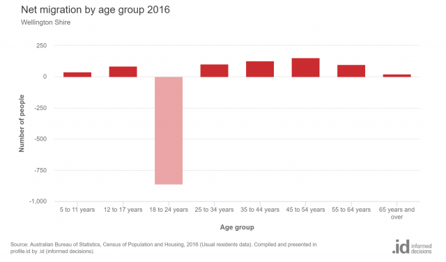
This example is for Wellington Shire Council, a recent addition to the .id community and located in central Gippsland, in regional Victoria. It’s a mix of a large regional centre (Sale), farming districts (such as Maffra and Heyfield) and coastal retirement communities (Loch Sport, Seaspray), which swell in population in the summer months. The Census showed that over 5 years 2011–2016, like many regional areas, Wellington loses young people in quite large numbers, with modest movement in of mature families and retiree/empty nesters.
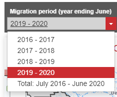
Wellington Shire’s annual migration page shows that the patterns set in the 2016 Census have continued since, to some extent. The page defaults to a 4-year total migration map covering 2016-17 to 2019-20. This shows strong movement in from the eastern and southern parts of Melbourne (LGAs like Casey, Frankston and Yarra Ranges), with losses to inner Melbourne and larger regional centres like neighbouring Latrobe, as well as Geelong.
However, in 4 years the net movement to Wellington Shire was almost even. 11,536 movements in, and 11,304 movements out, for a net gain of 232 movements. (Note that technically this is not “people”, as when you’re adding up multiple years like this, a person may be counted more than once if they move more than once over that time. That’s why you’ll notice the overall movement numbers in and out are higher in the RIME data added up over multiple years than in the Census, which looks at a 5-year difference only.)
For a more recent picture, we can use the drop-down to select 2019-20. This is the only year which contains some of the COVID-19 pandemic period (albeit only about 4 months of it).
In 2019–20, Wellington’s migration turned significantly positive. There was a movement of 3,090 people in and 2,886 people out, for a net gain of 204 people. This is not huge, but this last year alone accounts for most of the growth of the previous 4, indicating an accelerating trend. We are seeing the start of the outward movement from Melbourne from the pandemic.
This is pretty clear from the map. While the loss to nearby Latrobe City (-111) is still significant, almost every LGA in Greater Melbourne contributed population to Wellington Shire in net terms in the 2019–20 year. Quite a different picture to previous years.
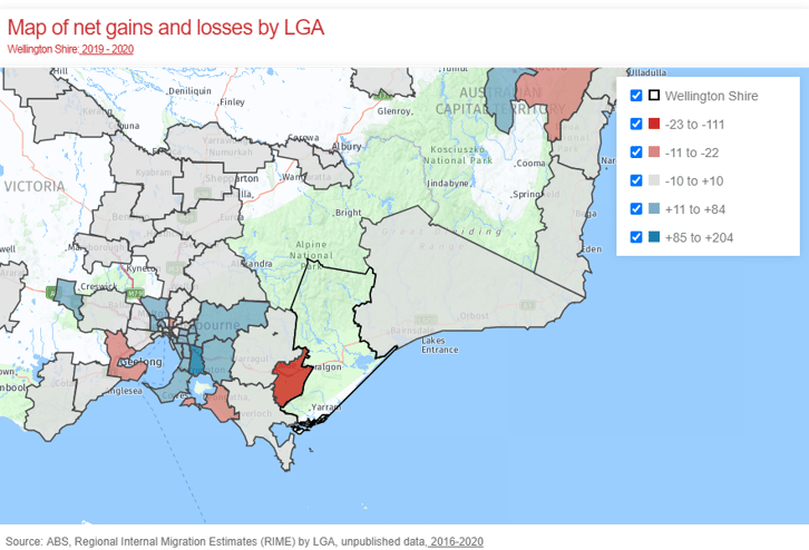
The largest positive net movements were from Casey (+107), Yarra Ranges (+84), Frankston (+54) and Kingston (+44). These are quite large net movements for one year. Age structure is not inlcuded in this new dataset, but if Census trends are anything to go by, what we’re most likely seeing is movement in of families with children and empty nesters, and some movement out of home-leavers in their early 20s, but at a reduced rate due to the pandemic.
Regional differences
Not all regional areas are experiencing this strong migration in. More remote areas are in many cases still seeing population loss. There is a clear movement to areas with a coastline or lifestyle areas within a 2-hour drive of Sydney and Melbourne here. One of the strongest growth rates in regional Australia is Surf Coast, south of Geelong, which is now getting net migration (largely from Melbourne) of over 1,000 people per annum. December 2020 numbers at the state and capital city level show accelerating movement out of our big cities.
New data, further insights
The 2021 Census will add more insight to this, including age and other breakdowns. We’re only 3 months away from Census day now, and we’ll get the data from mid-next year. Stay tuned for my blog on what we can expect to see, and predictions for the Census results.
In the meantime, we’ll be annually updating the migration page (we get the new data each March), along with the population estimates. If you have any queries about the new page or would like a demonstration as part of a wider training session, please contact demographics@id.com.au.
Glenn Capuano - Census Expert
Glenn is our resident Census expert. After ten years working at the ABS, Glenn's deep knowledge of the Census has been a crucial input in the development of our community profiles. These tools help everyday people uncover the rich and important stories about our communities that are often hidden deep in the Census data. Glenn is also our most prolific blogger - if you're reading this, you've just finished reading one of his blogs. Take a quick look at the front page of our blog and you'll no doubt find more of Glenn's latest work. As a client manager, Glenn travels the country giving sought-after briefings to councils and communities (these are also great opportunities for Glenn to tend to his rankings in Geolocation games such as Munzee and Geocaching).