COVID vaccination rates and SEIFA
As many of us breathlessly review the daily vaccination rates, Glenn takes a look at how vaccination rates differ between LGAs – and how this difference bares a strong resemblance to areas of advantage and disadvantage
Over the last year and a half, many of us have become “armchair epidemiologists”, checking the news every day for the numbers which have become so important to our daily lives: new COVID cases, deaths and, more recently, vaccinations. I’m not an epidemiologist but I am a demographer, and one map on the Fairfax sites a few days ago caught my eye. It shows fully vaccinated population by Local Government Area for Greater Melbourne and Victoria. What caught my eye was its similarity to a map of advantage and disadvantage.
The SEIFA index
Quite a bit has already been written about the correlation between rates of vaccination and socio-economic status – ie. the higher socio-economic areas having higher vaccination rates. The SEIFA index of advantage/disadvantage, derived from the 2016 Census, is the best indicator of overall socio-economic status in Australia. We’ve written about it before. Derived from a weighted average of measures such as income, unemployment rate, skill level of occupations, internet access, English proficiency, size of housing and access to vehicles. If I’m not familiar with an area, the index is the first place I look on a community profile to understand it. It’s been shown to be closely related to health outcomes, crime rates, school retention and a host of other indicators. A higher score means a lower level of disadvantage.
At first glance, it’s not obvious that it should be correlated with vaccination rates in Australia. After all, until recently, access to vaccines was largely determined by age: older people were eligible first, and it’s only just started moving down the age groups.
Yet these two charts struck me as almost the same: one is from The Age, showing vaccination rates (% of 16+) in Melbourne at the end of August 2021; the other is our SEIFA map from profile.id for the same area. (Note that vaccination rates are moving quickly, and the rates in all areas are now higher than this, one week later – however it’s the correlation with SEIFA which is of interest here, not the absolute level)
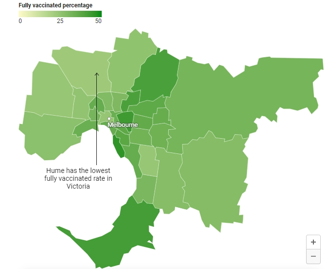
Source: The Age, August 31, 2021, by Craig Butt. Original data source Department of Health
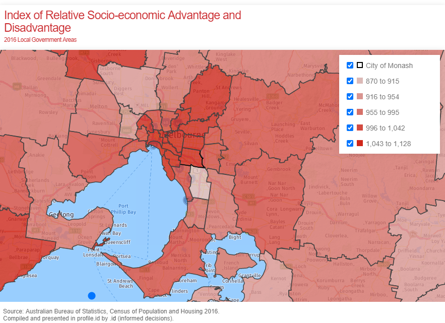
The areas with the highest vaccination percentages are the highest SEIFA scores, and vice-versa. The LGAs of Hume, Brimbank and Greater Dandenong are the lowest SEIFA areas, and the lowest vaccination rates.
SEIFA is great for visualising socio-economic disadvantage, and within a local area, it’s great to pinpoint places of significant disadvantage at a very local level (you can do this within the social atlas). Many areas have a lot of diversity, with high and low within the same LGA; the map above really averages across each LGA, hiding a lot of the differences within.
Does correlation equal causation?
Why would there be this strong a correlation? After all, the vaccine is free for everyone. As I said, I’m not an epidemiologist, so I don’t have all the answers here.
Education level is a strong part of SEIFA, and various studies have shown the level of vaccine hesitancy decreasing with higher education levels (negative correlation – eg. this study from the UK). There’s also the question of access: people in casual, insecure employment – more prevalent in areas of high unemployment rates (a contributor to SEIFA) – may have difficulty getting time off work to get a vaccine. None of these are the full story though.
In late August, Australian Council of Social Service CEO, Dr Cassandra Goldie, addressed that organisation’s concerns that high-risk groups were being left behind in the vaccination rollout.
There are many barriers that make accessing vaccinations harder for different groups of people. This can include where vaccines are available, whether they are being delivered by trusted people and communities, work or home responsibilities that limit access and more.
There is an age correlation, as expected. The one outlier in the above maps, not fitting the pattern, is the City of Melbourne: it has a high SEIFA index of 1,071, but one of the lower vaccination rates. That’s because the median age is 28, by far the youngest LGA in Victoria, with a high percentage of students and young adults who just became eligible. The Age article’s accompanying map of regional Victoria (reproduced below) shows a stronger correlation with age. The most vaccinated LGA in the state is Queenscliffe, which is the smallest, the oldest (median age 60) and the highest SEIFA outside Greater Melbourne (1,070). Younger people have only recently become eligible for vaccines in Australia, so expect these to even up over the next month or so. After this, we may find the vaccination rates overall align even more closely to SEIFA.
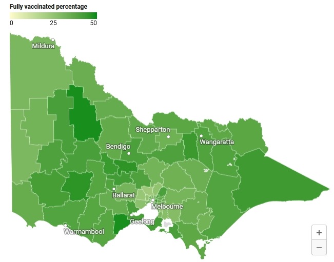
Source: The Age, August 31, 2021, by Craig Butt. Original data source Department of Health
Unfortunately, the virus is also most prevalent in these communities with the lowest rates of vaccination. The highest numbers in Melbourne are in places such as the City of Hume, which The Age article points out as having the lowest vaccination rate.
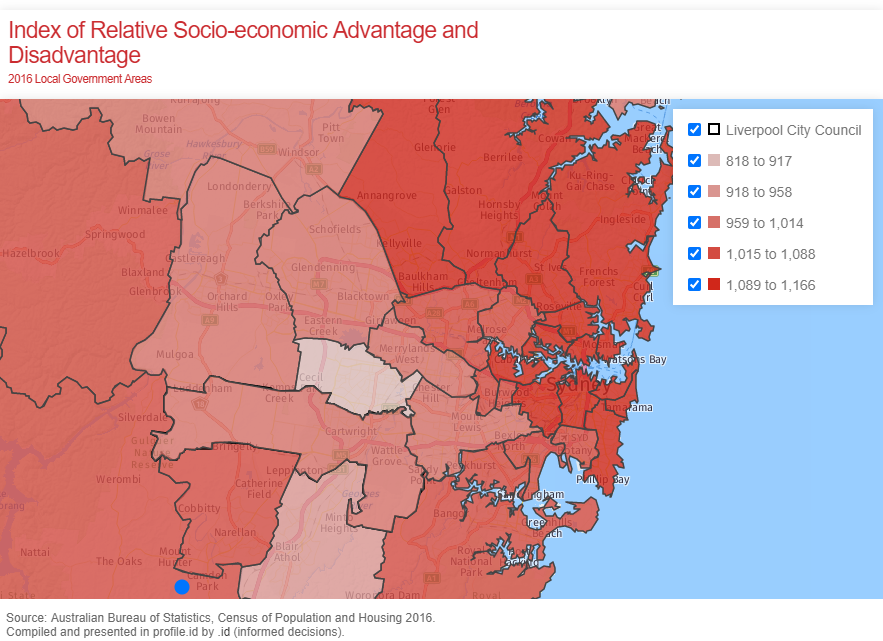
A similar story in Sydney
While Sydney vaccination data is generally given via postcode rather than LGA, the same pattern emerges. The lowest socio-economic areas of Fairfield, Canterbury-Bankstown and Liverpool have been “LGAs of concern” for the current outbreak – and they have the lowest three SEIFA scores in the Greater Sydney region. Overall vaccination rates are higher, but geographically they show the same pattern (worth noting that the South-West Sydney region has had the largest increase in vaccination in the last week though – public health measures can target areas to remove some of this correlation.
An ongoing challenge
While this correlation is interesting to muse over, it represents an all-too-real challenge. Understanding why certain geographic areas and demographic cohorts are lagging behind is essential not just to hit vaccination goals, but also to ensure some of the most vulnerable in our communities are not further disadvantaged. It would also have implications for ongoing healthcare and future health alerts.
SEIFA is such a versatile tool, and it’s really helpful in identifying vulnerable communities. That’s why we have the two main indexes on the community profile and the social atlas for all our clients. It also features strongly in much of the bespoke demographic analysis we do. Interested in learning more about the SEIFA index and how to use it? Get in touch.
SEIFA will be one of the last datasets updated from the 2021 Census – while much of the Census data is expected from June 2022, SEIFA is likely to be updated around March 2023.
Glenn Capuano - Census Expert
Glenn is our resident Census expert. After ten years working at the ABS, Glenn's deep knowledge of the Census has been a crucial input in the development of our community profiles. These tools help everyday people uncover the rich and important stories about our communities that are often hidden deep in the Census data. Glenn is also our most prolific blogger - if you're reading this, you've just finished reading one of his blogs. Take a quick look at the front page of our blog and you'll no doubt find more of Glenn's latest work. As a client manager, Glenn travels the country giving sought-after briefings to councils and communities (these are also great opportunities for Glenn to tend to his rankings in Geolocation games such as Munzee and Geocaching).