Mortality in demography – when, how and where do people die?
Of the three components of demographic change, the least discussed is mortality. After all, who wants to sound morbid talking about death? But as demographers, we need to understand when, how and where people die because it impacts on our population forecasts in terms of our assumptions about future levels and rates of mortality. In a statistical sense, death rates are similar to birth rates in that there are not huge fluctuations from year to year, but gradual changes over time, including the age at which people die and how they die, provide an insight into social change.
In 2014, there were 153,580 deaths registered in Australia, the highest number on record. As our population grows and ages, an increase in the number of deaths can be expected. However the crude death rate has remained relatively stable at 6.5 deaths per 1,000 population for the last decade. There are spatial variations – in 2014 Tasmania recorded a crude death rate of 8.7, and the lowest rates were recorded in the NT and ACT (4.8 and 4.7 respectively). Life expectancy continues to make small increases, and reached 80.3 years for males and 84.4 years for females for those born in 2012-14.
At what age do people die?
It might sound obvious, but the majority of deaths in Australia are at the upper end of the age spectrum. In 2014, the median age at death was 81.8 years, meaning that half of deaths were under this age, and the other half over. The graph below is essentially an age pyramid of death, indicating the age at which people died in Australia in 2014. It clearly shows that until the age of around 50, the number of deaths are quite small, after which time they increase rapidly. About one in ten deaths in Australia are persons aged 55 years and under, but by age 65 it’s one in five, and around one-third of deaths are people aged about 73 years and under. The increases in life expectancy (at all ages) mean that many more people are reaching their 80s and 90s, but it also means a corresponding increase in the number of deaths at these older age groups. Almost half of all deaths in 2014 occurred between the ages of 80-94 years of age.
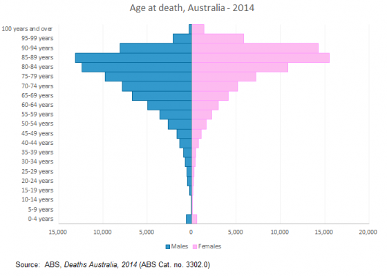
There are however major differences in the age composition of male and female deaths. From the age of 15-19 to 80-84, there are more male deaths than female deaths – it’s not until after the age of 85 that females “catch up” with respect to their mortality. The difference in the number of deaths is particularly acute at age 20-24 years, when there were around two and half times more male than female deaths. Sadly, ABS data confirms that the leading cause of death for 15-24 year olds is “intentional self harm” ie suicide, followed by motor vehicle accidents. The cause of death does vary by age, but it’s not until after the age of 45 that conditions such as heart disease and cancers (the leading causes of death overall) account for the most deaths in each age group. In other words, older persons are more likely to die from illness and other conditions, rather than deaths that are largely preventable.
The geography of death
As with most things demographic death rates vary by location and at .id we consider this in our forecasting work. In general, rates are higher in rural and remote areas, which is partly a function of their older age structures and relative lack of access to health services. The ABS publishes data on the number of deaths for small geographic areas, but the number of deaths in an LGA can be quite small and subject to year on year fluctuations. As such, we tend to utilise deaths data at the SA3 level as it provides more of a regional perspective on death rates and numbers (note that some SA3s equate to LGAs, especially the larger ones).
The map below shows the standardised death rate (SDR) for SA3s in the Sydney metropolitan area and surrounds. The lowest SDRs tended to be on the north shore and outer north west with some smaller pockets in the south and south west. Manly had the lowest SDR (3.8 deaths per 1,000 standardised population), with Eastern Suburbs – North, Ku-ring-gai and Pennant Hills – Epping recording 3.9 deaths per 1,000 standardised population. These were also the lowest rates recorded in NSW.
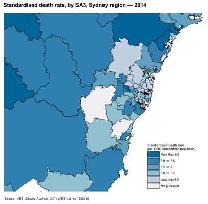
In contrast, Mount Druitt recorded one of the highest rates in NSW, with 7.2 deaths per 1,000 standardised population. Parts of outer western and outer southern Sydney recorded higher SDRs, as did some parts of Newcastle and the Central Coast. These higher SDRs relate to the age structure and other socio-economic factors that impact on health outcomes.
Although not shown on the map above, the highest SDRs recorded in NSW tended to be in the far west and northern inland regions. Bourke – Cobar – Coonamble recorded the highest SDR in NSW, at 7.8 deaths per 1,000 standardised population.
It is said there are only two certainties in life – death and taxes. From a forecasting perspective, this certainty means that we have to consider the inevitable, but part of .id’s strength is the consideration of the spatial variations, and different and changing age structures to formulate our assumptions around mortality futures. As the Australian population ages, the one thing that is certain is that the number of deaths will continue to increase but some key questions remain. For example, how much more can life expectancy increase? What will we die of in the future? But perhaps these are topics for another blog….
.id is a team of population experts, who use a unique combination of online tools and consulting to help organisations decide where and when to locate their facilities and services, to meet the needs of changing populations. Access our free demographic resources here.
You may also be interested: Biggest, fastest, slowest – latest population growth and change in Australia
Simone - Myth Buster
Simone has a rich background in human geography, demography and urban planning – a background that was useful in her previous roles in the Commonwealth and State Governments, and now as part of the forecast team at .id. From the Queensland coast to the southern suburbs of Perth, Simone produces population and dwelling forecasts that help local governments make informed decisions about future service and planning needs. She is a regular contributor to .id’s blog and has spoken at several conferences on how our cities and regions are changing. She is a big advocate of evidence-based planning and how Census and other data can inform this. Outside of work Simone is a keen traveller and photographer – interests that tie in well with her professional life and help her to understand “place”.