Australia’s newest migrants – where are they coming from?
The 2006 Census showed that about 4.4 million Australians were born overseas (22% of the population). In the last 5 years, we have had very high overseas migration, and everyone is now awaiting the 2011 Census results to see how the make-up of Australia has changed. My recent “Crystal Ball Gazing” article gives 10 predictions about the Census results. Many of those predictions aren’t outright guesses, but are based on some hard evidence we already have. The total population growth (#2) and the origin of migrants (#5) are among these.
So, before the Census data become available, it’s worth having a look at where these migrants are coming from, which state they’re going to and how they are changing the cultural makeup of Australian society.

The Department of Immigration and Citizenship collects detailed information on settlement of long-term migrants on an annual basis. Anyone can access this data on the DIAC website, but the system is technical and a bit cumbersome to use. To help with this, we’ve extracted the raw data and in this article will be having a look at the breakdown by state and country of birth. Upcoming blogs will look at where these migrants have settled in each state.
How many migrants are there?
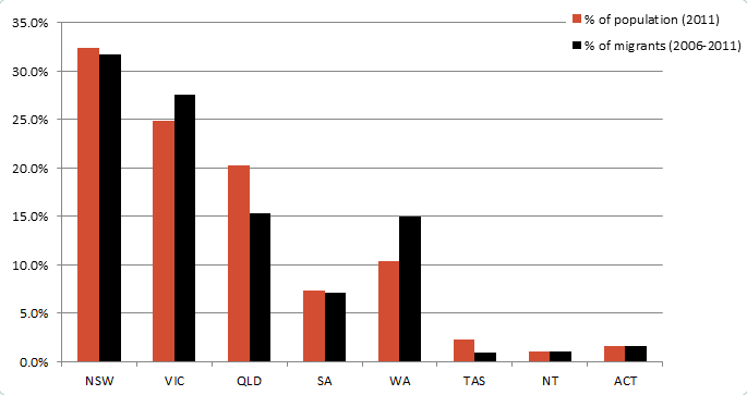
So, firstly, between the date of the 2006 and 2011 Census, a total of just under 850,000 permanent migrants settled in Australia. The breakup by state is similar to population size, with NSW and Victoria having the most settlers. But in the last 5 years, Victoria and Western Australia have added more migrants relative to their population, while NSW and particularly Queensland have added less. Queensland in particular is a state that relies more on interstate migrants (from NSW) for their population growth than overseas migrants. Victoria’s population has been booming and it’s attracting almost as many people from overseas as NSW is.
Most migrants to Australia come under the “skilled migration” stream – they are granted visas based on having skills which are useful in the economy. This accounts for 519,000 or 61% of migrants in the last 5 years. The next largest category is family reunion migration – people applying to join family members in Australia – 261,000 (31%). Finally we have the humanitarian stream, at just under 68,000 or 8% of total migrant intake. This includes Australia’s UN-approved refugee intake, and a small number of asylum seekers arriving by boat or plane, processed through the immigration detention centres. Those whose claims are approved for Australian residency are included in the figures. Though generating a huge amount of national debate and air-time in the media, the number of boat arrivals is about 11,000 over 5 years, or about 1.4% of Australia’s total migration intake if all asylum claims are approved.
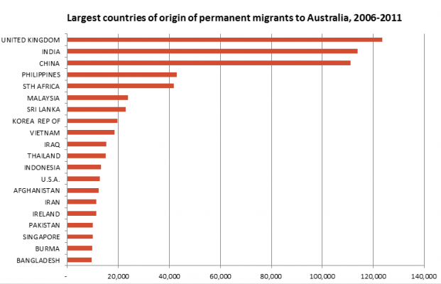
Where do our migrants come from?
Despite many changes to Australia’s immigration program, the United Kingdom still tops the list of arrivals, with 123,600 arriving in the last 5 years, continuing to represent around 15% of Australia’s migration intake. The UK migration alone is almost twice the total humanitarian stream and about ten times the number of asylum seekers arriving by boat.
The UK is closely followed by India (114,000) and China (111,000), then it’s a long way back to the next two countries, the Philippines (43,000) and South Africa (41,000). The top 20 is shown below.
Local governments probably already have many resources (eg. interpreter services, assistance with living in Australia) in place to assist these established population groups. The smaller emerging groups are of interest, because although the overall numbers are still fairly small, they have increased the most relative to their existing population size in Australia, so they may not have the support services and resources in place at a local level already.
Which are the fastest growing groups?
So another way of looking at the data is to look at how many people from that country of origin were in Australia in 2006. Eg. There was a lot of migration from the UK and China but on the other hand, there were already a lot of people from these countries here before. The following chart shows the largest migrant groups relative to their existing populations in Australia (2006 Census count). The number in brackets gives you the actual number of migrants from that country, to give context – ie. a large percentage increase doesn’t necessarily mean a large population – the largest percentage increase, from Bhutan, represents just over 2,000 migrants in 5 years.
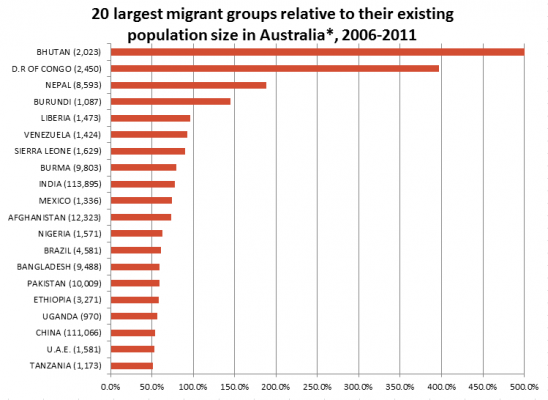
* Note that this chart excludes countries of birth with less than 1,000 new arrivals and less than 1,000 people in Australia at the last Census. This is to remove extreme variation due to very small population size.
Both India and China, two of the three largest countries of origin in raw numbers, also appear in the top 20 by percentage of existing population. These countries of birth had large increases in most areas between the 2001 and 2006 Censuses, and we can expect a similar or even larger increase in the 2011 results. It is also worth noting that many people from these countries arrive on temporary student visas, and so are not included as permanent settlers in this list. The Census will give us the best comparison.
Note the dominance of African countries in the list. Many African countries of birth, such as DR Congo (formerly Zaire) Burundi, Liberia, Sierra Leone, Nigeria, Ethiopia and Uganda are in the top 20. The actual sizes of these communities are pretty small Australia-wide, most numbering only a few thousand, but they have had lots of migrant arrivals.
Bhutan is in first place because the 2,023 migrant arrivals in 5 years dwarf the existing 138 people who were in Australia in 2006 from this mountainous Asian country (I had to truncate the chart so the other countries would show up – Bhutan is actually a 1,466% increase). Other Asian countries with large increases are Nepal (some of these are likely to be the children of refugees from Bhutan), Burma, and Bangladesh.
So, though it only makes up 8% of total migration, the humanitarian stream does have the effect of increasing the cultural diversity of Australia’s population. Twelve of the 20 countries in the chart above had the majority of their arrivals through the humanitarian stream. These tend to be countries which have had recent or ongoing wars (Afghanistan, Sierra Leone, Congo, Liberia), oppressive regimes (Burma), programs of the expulsion of particular ethnic groups (Bhutan), or large refugee camps with long term populations of children born there (Ethiopia, Nepal). I am not an expert on international politics, and don’t want to get into the complex and difficult circumstances which have brought many of these refugess to their new home in Australia. Everyone’s situation is a little different, and web searches can reveal more information about the situation in each country. Eg. This article in Wikipedia on the Bhutanese refugees.
Some of the emerging countries, such as Venezuela, Bangladesh, Mexico and the United Arab Emirates, have most of their arrivals in the skilled migration stream.
Some countries, which were significant emerging groups in the last Census have dropped right off in migrant numbers. These include Indonesia, Singapore, Taiwan, Turkey and Fiji, as well as the largest emerging group from 2006, Sudan. The Sudanese population almost quadrupled, from under 5,000 in 2001 to 19,000 in 2006, but only about another 6,000 have arrived since. The 2011 Census will recognise the new nation of South Sudan, though it will need to be combined with Sudan for comparison to earlier years.
So there is no doubt that the Census will show a change in the cultural makeup of Australia’s multicultural society, when the results are released next June. The Census measures a slightly different population to the migration figures, as it also counts people on temporary visas, students etc. – as well as of course our trans-Tasman neighbours from New Zealand – who don’t need a visa to settle here and so aren’t included in the DIAC figures.
While this is the national picture, many of these newer migrant groups are settling mainly in one state, and in particular local areas. The data go into a lot of detail, right down to local government area of settlement, and my next series of blogs will look at the changing cultural landscape of each of the major states.
.id is a team of demographers, population forecasters, spatial planners, urban economists, and data experts who use a unique combination of online tools and consulting to help governments and organisations understand their local areas. Access our free demographic resources here
Glenn - The Census Expert
Glenn is our resident Census expert. After ten years working at the ABS, Glenn's deep knowledge of the Census has been a crucial input in the development of our community profiles. These tools help everyday people uncover the rich and important stories about our communities that are often hidden deep in the Census data. Glenn is also our most prolific blogger - if you're reading this, you've just finished reading one of his blogs. Take a quick look at the front page of our blog and you'll no doubt find more of Glenn's latest work. As a client manager, Glenn travels the country giving sought-after briefings to councils and communities (these are also great opportunities for Glenn to tend to his rankings in Geolocation games such as Munzee and Geocaching).