Common mistakes in demographic analysis
We often write blogs that give context to data, so you can clearly understand how its collection, coding and manipulation impacts your analysis and the conclusion of your research. In this piece, Glenn summarises some of the most common challenges and pitfalls you should be aware of when working with popular sources of publicly-available data.
With almost any type of analysis, you get to the point where you encounter complexities you hadn’t anticipated.
Sometimes, this complexity can be overcome with a bit of excel wizardry. Other times, changes in how data is collected, coded, and manipulated before you’ve received it presents challenges you couldn’t anticipate until you’re knee-deep in spreadsheets.
At the core of our work, we take publicly-available resources (such as Census data) and apply our expertise as economists, demographers, forecasters, software developers and mapping experts to present that information in an accessible way, so people who might only search for that data once-in-a-while can find what they’re looking for and apply it appropriately.
If you’re in an area where our information tools are made available by your local council or regional authority, the challenges outlined below have been taken care of. If our tools aren’t available in your area, this is a simple guide to some things you should be aware of.
Traps to avoid in demographic analysis
There’s a lot of work which goes on behind the scenes at .id to produce our community and economic profiles and population forecasts. These are designed so you can get on with telling the story of your area, without needing to worry about the issues outlined below.
So here’s my selection of the top ten things we encounter that you might want to look out for;
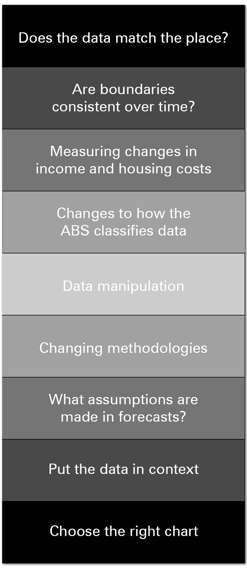
Does the data match the place?
One of the most common problems people find when analysing Census data (in particular), is the information doesn’t match the area they care about.
The ABS code data to standardised geographic units, but these don’t always fit neatly with the borders of the suburb, town, postcode (etc) that you need to report on, so you’re left trying to fit a square peg in a round hole.
We handle this by manually allocating data either side of a border wherever the output geography doesn’t match the areas our local government clients care about (the main output on profile.id and forecast.id are suburbs, towns, districts, and other areas that people identify with).
These match the actual gazetted locality boundaries in most cases, rather than being a best match of standard ABS areas. The areas also have logical names, which identify which places are in there. This can sometimes result in relatively long place names, but you are left in no doubt as to which areas are included in them!
Another good example is Agricultural data. The ABS no longer outputs Agricultural data for Local Government Areas; instead, it now released only at the SA2 level.
As the councils who subscribe to our tools are mainly interested in LGA level data, so we have applied a Census employment-based concordance of SA2s to LGAs to adjust the data to match the LGA boundaries. While not perfect, this gives some useful information to fill the void left by the ABS no longer producing this.
Other datasets, such as Business Register counts, have similar issues but are adjusted to match LGA boundaries using slightly different methods.
Are boundaries consistent over time?
As our communities grow and change, the boundaries of places change with them.
This can present a major challenge if you’re analysing data. If you’ve seen a large increase in population, was that a significant demographic trend (eg. people moving to your area), or simply caused by the change in boundary meaning your area now includes a neighbouring suburb?
We handle this by going back to smaller geographic units (eg. SA1s, CDs) in previous Census years, and matching them to the current boundary to keep the population consistent. If the boundary cuts through one of the smaller units, we will look at old satellite photos to determine how much population is on either side of a boundary and make that adjustment. We call this process splitting – you can read more about it here, and we touch on it again below.
This is quite difficult to do – but our profiles go right back to the 1991 Census – that’s 6 time periods of change.
On our social atlas, we make SA1 boundaries comparable over time, by aggregating and splitting the data as required. This allows us to implement features like change maps, showing detailed increases and decreases in particular characteristics.
This means you don’t have to worry about whether the boundaries are comparable, or even if the area existed 25 years ago -all that work has been done for you, so you can get on with telling the story.
Measuring changes in income and housing costs
Measuring trends in income and housing costs over time is an important piece of work to identify which parts of a community might need support.
However, factors such as inflation can make comparing data from two different periods very challenging.
We address this issue by using our quartile methodology. This splits the incomes for the state or territory into 4 equal groups, of equal relative size in each Census, but the $ value cutoffs for those groups changes over time, tracking inflation.
This enables you to look at change over time in real terms, relative to the benchmark, of income and expenditure levels in your area.
On a related note, where definitions require a hard cutoff, for example, “Low-income households”, we define this differently each Census to get a smooth transition and adjust for inflation. We also use Equivalised Household Income, which adjusts for the effects of household size, to define low and high income on things like our Communities of Interest module.
Changes to how the ABS classifies data
With each Census, the ABS make changes to how data is collected and categorised. The best way to keep up with this change is to subscribe to our blog.
For example, in 2011, the ABS split the language category “Persian” into “Persian” and “Dari” (Dari is the Afghan dialect of Persian). We recombined that category to ensure that users can correctly see change over time on the site.
When we noticed that Census Collectors often mistakenly identified villa-unit style dwellings as flats one Census, but the other way around the next Census, we came up with a new classification of dwellings into medium and high-density categories, to eliminate this issue and allow consistent viewing of this important topic over time.
Data manipulation
The ABS make random adjustments to datasets for small areas and populations, to avoid accidentally identifying individual details, which are confidential. This has the drawback that different tables don’t necessarily add up to the same totals (even if referring to the same population).
There isn’t a lot we can do about this, but the smaller the population and the more disaggregated the dataset (such as single-year-of-age, which has over 80 different categories), the more the tables will vary.
Tables adding up a lot of categories and smaller areas will also appear to have a lower population than the equivalent larger area, due to suppression of very small numbers.
We can reduce the effects of this by:
- Requiring a minimum population size for a small area in profile.id (usually 1,000 people).
- Using standard geographic areas such as SA2s and LGAs where possible rather than adding up smaller areas (which won’t add up to the total).
- Showing totals derived separately rather than adding up categories (for example, the data on Need for Assistance are broken down by individual age groups, but we have sourced the total numbers as well – so, while the individual age groups will add up to a lower number, the total shown should be close to the correct figure)
Changing methodologies
Sometimes, good guidance is about what you don’t show.
In 2016, the ABS changed the way they code Place of Work data in the Census. They now take the “Not Stated” category, and “impute” a likely place of work based on other characteristics.
This means if you are comparing 2016 place of work data to 2011 raw Census data, you will think that employment has gone up substantially more than it has, because the 2011 data still has a “Not stated” place of work category (Keenan wrote a great blog about this at the time).
When we found out about this, we took 2011 Census data off the site so users weren’t making incorrect comparisons. We also arranged to get 2011 Census data from the ABS which was experimentally imputed using a similar methodology. This dataset is not widely available but is now included in the Worker Profiles section of economy.id.
We are currently sourcing a comparable 2011 dataset for the “Self-containment” and “Self-sufficiency” pages which look at the number of residents who work locally. We know it is important for our clients to be able to see how this is changing over time, but it is a very difficult dataset to get, as this experimental imputation was not done by ABS at the Local Government level, and it’s not a publicly available dataset. So 2011 datasets have been removed for the time being.
In a similar vein, the methodology used in SEIFA changes every Census. So while it may be tempting to compare the socio-economic indicators for areas over multiple Census years, it’s not recommended, and we don’t show time series for this on the page.
What assumptions are made in forecasts?
If your work involves planning for the future, there are a number of publicly-available population forecasts you may reference.
In the forecasts we produce for local governments, our assumptions about dwellings and development are very specific and completely transparent.
That means our forecasts are not “projections”, but are based on an assessment of the land supply, building industry capacity and demand for dwellings in the area. These assumptions are explicit, so you can see which specific sites have been included or not in the future population growth.
When a growth area runs out of the land, the changing population reflects this. We don’t just assume that the population will continue to grow at the same rate, or decline – it’s about how areas go through cycles and how the types of development impact on this (the City of Armadale is a great example).
Putting data in context
You have 200 people in your community who are unemployed. Is that a lot?
To give any piece of data meaning, you need to give it context.
‘Unemployment has doubled in the past five years’ or ‘..20% lower than the state average’ are powerful statements because they tell a story about people that is relative to another place or another point in time.
For this reason, we display all datasets in a consistent format, showing the comparison to a benchmark area and change over time.
These are called the “Dominant” and “Emerging” charts, and represent a simple but powerful way of analysing data. “What role does this particular area or sub-population play within the wider region?” (dominant chart) and “How is it changing over time?” (Emerging chart). The emerging groups are those you are likely to need to plan for in the future, and can now be viewed in either absolute numbers or in percentage terms.
Choose the right chart
Finally, while everyone knows that a picture tells a thousand words, choosing the right chart for the data you’re referencing is important. Because everyone consumes data differently, we display all data as tables, charts, but other times mapping data with some textual analysis is the best way to communicate the story you’re trying to tell.
Stay up to date
As experts in demographic and economic data tools, we make a point of staying across the latest changes that might impact your analysis. Subscribe to our blog to stay across the changes you need to know about, plus some helpful tips from our experts to get the most out of the tools available.
Glenn - The Census Expert
Glenn is our resident Census expert. After ten years working at the ABS, Glenn's deep knowledge of the Census has been a crucial input in the development of our community profiles. These tools help everyday people uncover the rich and important stories about our communities that are often hidden deep in the Census data. Glenn is also our most prolific blogger - if you're reading this, you've just finished reading one of his blogs. Take a quick look at the front page of our blog and you'll no doubt find more of Glenn's latest work. As a client manager, Glenn travels the country giving sought-after briefings to councils and communities (these are also great opportunities for Glenn to tend to his rankings in Geolocation games such as Munzee and Geocaching).