Updated population figures & new population highlights page
Following last week’s small area update, we have now released two small but important updates to your community profile.
Your new population highlights page
If your community profile tells the detailed story of your area – this is the blurb on the back page!
The population highlights page has all the vital figures you need to understand your population at a high level, and how it compares to the wider region, the state, and national averages.
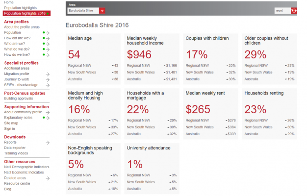
The population highlights for Eurobodalla Shire, on the New South Wales South Coast
Why are there two population highlight pages?
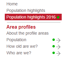
You will notice your community profile has two population highlights pages:
We’ve done this because the information on these pages is released from the ABS in two stages, with the second release not arriving until October.
All the figures on the Population highlights 2016 page are from the 2016 Census, whereas the figures on Population highlights are from the 2011 Census.
You can access both pages from the side menu in your community profile. If you’re not sure how to access your profile, you can find it in our directory.
Updated ERP Figures
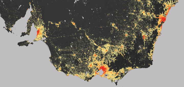
While we’d previously released ERP figures for primary areas, we’ve now released updated ERP figures for small areas. To put it another way, while you previously had the population for your entire local government area, now you know the population of your suburb (we’ve given an example of small areas here).
Population is popular
When we look at how people use our community profile tools, the most common questions people want to answer is ‘What is the population of ______________’.
Our population pages get six times the traffic of the next most popular topic (which is employment, if you’re interested!)
When it comes to understanding a place, ‘How many people live there’ is the first question we ask.
So why ERP?
You can measure the population of your community in a few ways.
We put Estimated Resident Population (ERP) at the top of your community profile because it’s the most universally used (and, in many instances, the most appropriate) measure of the number of people who live in a place at a given time.
We’ve written previously about why the ERP changes around the time Census results come out.
Glenn also wrote a great piece last week, looking at some places with significant discrepancies between how the population was estimated to have changed in the last five years (ERP), and how much it actually changed, according to the Census (and some of the very interesting reasons why that happened).
Why is ERP being updated now?
If you look at your community profile often, you may have noticed we already had a figure for ‘2016 Estimated Resident Population’.
Put simply, this is the 2011 population for your area, plus (or minus) five years of adjustments for major influences on population (births, deaths, migration etc). Now, it’s the 2016 Census count, plus these adjustments.
This updated ERP was released on July 28th – a month after their first release of Census data – so we have been working to update this information at the same time.
Stay up-to-date
Bookmark our 2016 Census update tracker page, where we announce each new topic release as-it-happens, alongside great insights and analysis from our team of population experts.
Questions?
We want you to feel confident using these updates to understand the story of your changing community.
If you’re still not sure about any of our updates, leave a comment below and we’ll be happy to clarify.