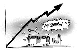
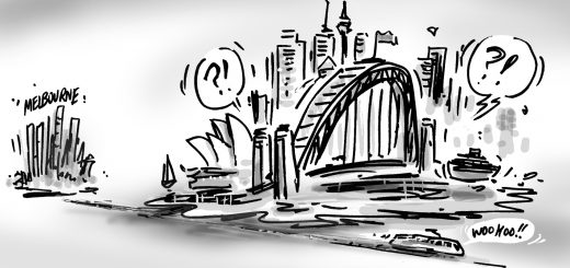
Tag: ‘Australia Demographics
Previously we have looked at the size of Australia’s cities in a variety of ways. The top 33 urban areas in Australia has been one of the most popular blogs on this site, and I keep being asked to update it with the 2011 Census results. That’s not so easy, because the ABS has changed the geography and split up some of the areas into smaller centres. So I thought we could look at another way of sorting the list, which actually may make more sense to most people. This is the ABS :”Urban Centre or Locality” structure.
A client contacted us recently to request a calculation of the centre of population for their local area. Steve quickly responded to this request, and some discussion and speculation within the team followed on where Melbourne’s population centre is.
So – what is the centre of population and why does it matter? …
Each year, around this time, the ABS releases data on births in Australia. As we blogged last year, not only is this interesting information, but it provides our forecast team with very up to date data to inform our assumptions. What are the highlights of this year’s release?
A few years ago the ABS estimated the population of the Shire of Melton to be 100,000. Not 100,001 or 99,999 – exactly 100,000. Now of course it was a preliminary estimate which has since been changed, but it did get me thinking about population milestones. This blog will highlight some of the population milestones that have been reached in the last 5 years, but also look at the reverse situation – population millstones – where a population has fallen below a particular benchmark.
In an earlier article, I looked at the rise of India, Nepal and Malaysian communities, with falls in older European migration, and spectacular increases in some of the smaller sources of immigrants, like Bhutan and Congo. But how is this increasing diversity distributed across Australia? In areas of high diversity, a large proportion of council services need to be devoted to helping recent migrants settle into Australian society, and areas with large increases may not yet have these services in place.

Perhaps because it is the smallest State, Tasmania is often neglected in population analyses yet there are some significant demographic trends occurring. Data from the 2011 Census shows that on the measure of median age, Tasmania ranks at the top of the list of all States and Territories with a median age of 40 years. This compares with 37 years for Australia as a whole. In 2011, a total of 10,240 persons were aged 85 years and over in Tasmania. Though this represents just 2.1% of the Tasmanian population, this age group has particular service needs relating to health and housing.

How old are you? Some would consider this a personal question but there’s no getting away from the fact that our age is part of who we are. The age structure of a population is an important determinant as to services demanded, policies implemented and consumer behaviour. This blog will examine how Australia’s age structure has changed over the last three Censuses and what this might mean…

With the Census results released yesterday, lots of people, organisations and governments are looking up their local area’s population using the Quickstats feature on the ABS website. The headline number on Quickstats is people, and many viewers take this to mean the official population. Believe it or not, these are not the same thing and this is leading to some confusion.

Many people are eagerly awaiting the first release of Australian 2011 Census results. Us and our clients more than most! As a licensed intermediary of ABS Census data, we take the raw Census data and convert it into online information tools that are used in communities across Australia to inform decision makers, access funding and advocate for services. This blog will tell you all you need to know about 2011 Census release dates, .id’s schedule for updating our online demographic resources and how to register for notification of updates.
The Australian Census 2011 results are imminent, so I thought it would be worth revisiting some of the predictions I made for the Census results, around the time the Census was actually being collected. I promised I would review them after the Census release and see how well I did, but a few things have changed in the intervening (almost) year, so I thought I’d take this opportunity to explain the predictions a bit more, and modify a couple.


The term “generations” often gets used these days, and the difference between people of different ages is attributed to when they were born, and which letter of the alphabet has been assigned to them (X, Y etc). While there is an element of subjectivity as to how you define a generation, the “baby boomers” are a group which is very important in understanding the demographics of Australian society. Those born immediately after World War II when the birth rate was very high have had a substantial impact on Australian society, and still shape the demographics that come out of each Census.
Fertility trends have changed considerably in Australia over the last decade. Australia’s fertility rate had been falling steadily since the baby boom of the immediate post World War Two period. Many developed nations of the world (such as Germany, Italy, Japan, Canada and Korea) have low or very low fertility rates, in most cases well below the replacement level of 2.1 babies per fertile woman and notably lower than Australia. The dominant thinking of demographers was that Australia would follow this trend and could have a fertility rate in the range of 1.5 or 1.6 babies per fertile woman by 2016. However, fertility rates have increased in most parts of Australia since about 2002, which has radically challenged this perspective.
No, it’s not a rhetorical question from a 1960s folk song, though the answer is based in that era. It’s a question we often get asked when we make presentations to local communities around Australia. It seems many local areas had decreasing populations of 25-34 year olds in the 2001-2006 Census period. Because people aged 25-34 are a key demographic with a high participation in the workforce, this sometimes causes some angst. The usual reason suggested for the decline is a “lack of affordable housing”, and it is true that in that age range many people are looking for housing, particularly to buy their first home. While there may be different reasons in different areas, the main source of this change is actually a bit simpler.
We are living longer than ever before but there is significant controversy regarding the likelihood of continued increases in life expectancy. In general terms, survival rates (share of persons living to next year by age) have increased in all age groups leading to higher life expectancy for both men and women. How much older can we get?
Australia’s population grew in the year ended June 2011 to 22,620,600 people, a growth of 320,800 for the year (1.4%). This is the lowest growth for any year since 2005-06, but it’s still relatively high in historical terms. The growth isn’t evenly spread between the states, either. The surprises from this year include Victoria having larger growth than NSW, and the ACT growing faster than Queensland!
One of the more anticipated publications released by the ABS is Births, Australia (Cat. No. 3301.0) – click here to view publication, which is produced on an annual basis. The data contained in this publication is of great importance for the planning of children’s services such as education, and from an .id perspective it provides a detailed insight into the fertility behaviour of populations in different geographic areas across Australia and allows our forecasting team to review their assumptions about fertility. 2010 proved to be a record year for births in Australia.
We often need to produce population forecasts for future growth areas where, at the last census, few people were living but, once construction starts, the population will grow significantly over a short space of time. There are many such places: Point Cook (in Melbourne’s outer south west), Rouse Hill (in Sydney’s outer north west) and a large number of suburbs in Perth, (Southern River, Success, Piara Waters, Byford etc). Given there is only a relatively small population (if any) living in such areas to start with, how do we know what type of people migrate into these areas as they start to develop?
The Fleurieu Peninsula is located south of Adelaide, separated from the state capital by the southern Mount Lofty Ranges. Australia’s longest river, the Murray, ends its journey here. Traditionally, the Fleurieu Peninsula has played a role as a holiday and retirement destination, but towns in the north are increasingly becoming part of Adelaide’s commuting belt. With the recent addition of Victor Harbor to the .id community (view profile page here), we now have online profiles for the three municipalities that make up the Fleurieu Peninsula in South Australia (the other two are Yankalilla and Alexandrina). What are the characteristics of this interesting part of South Australia?

The Land Values Research Group, an economic blog which looks at things like monetary policy, taxation and housing investment, recently published an interesting article, which said that dwelling turnover rate is at a 16 year low. It shows that sales of dwellings across Australia are at their lowest rate since 1995. In 1995, house prices were depressed and didn’t start to rise until about 1998, which was the beginning of the enormous rise in house values that we’ve seen over the past decade or so. What does Census data show about the change to this point and what demographic impacts it may have?
Being an Arts student who barely turned 21, statistics and numbers can be mindboggling – worse still, intimidating. I never thought one day I’d be working with a spatial and demographic analysis company like .id. When I applied for the job, I honestly didn’t even know what ‘spatial analysis’ was. Sounded like a sophisticated way of saying ‘geography’. But in the short period that I’ve worked here (here comes the cliché but earnest part), I learnt a lot about why these (horrendous) numbers matter to our society. And why I think everyone should be excited about the census. On a sadistic (and of course, joking) note, don’t you feel happy that 30minutes of your time filling in the census form would torture statisticians and demographers for the next 5 years to translate them into meaningful information for our use?
A common demographic stereotype these days is that suburban empty nesters, whose children have finally left home, are downsizing into the inner parts of our cities, particularly being attracted to large apartment developments such as Docklands in Melbourne or Darling Harbour in Sydney. This leads to articles such as Domain’s “Downsizers feeling the squeeze” about the price expectations of empty nesters moving from the suburbs. But how realistic is this? For the most part, our inner cities are the domain of young people, so what does Census data show about where those over 65 are moving, and who is living in those inner city apartments?
For much of the past decade, population growth in Western Australia (WA) has been above the national average. This has been particularly the case since 2006, largely driven by the increased labour demands of the mining industry. Over the period 2005-2010, annual population growth in Western Australia averaged 2.6%, compared to 1.8% for Australia. In 2009-2010, the population growth rate in WA was still the highest in the country (2.2%), representing an increase of just under 50,000 people. While much of the focus is on WA’s rapid growth as a state, geographers are well aware that spatial analysis at smaller levels of geography often reveals a different picture.

Residents of Launceston are younger than the Tasmanian and Australian average, but the ageing of the baby boomers is the dominant population trend. The area is relatively low income but with an increasing high income population, and it attracts people into the area from across Northern Tasmania, and from interstate, particularly from New South Wales.
With the user-friendly interface of profile.id, it’s easy to get most information you are seeking, by navigating around using the menu options and tabs. But if you are seeking specific information, data download can get you targeted and accurate information, fast. It is especially useful for comparing between a number of small areas at once, across several Census years, and also has some additional data which is not displayed in the main interface of profile.id.
This week the ABS released its Australian Demographic Statistics. Despite an article in the Sydney Morning Herald highlighting New South Wales’ net interstate migration loss, entitled “We’re out of here say hordes hankering for a state of satisfaction”, the data was noticeable for the continued decline in NSW’s net interstate migration loss.
A crew from .id (Ivan, Simone, Glenn and Lailani) attended and presented at the two day Beyond the Count conference (3-4 March) held by the ABS to promote the use of Census data. We noticed that not so many of our local government clients were able to attend, so we thought we’d provide a quick synopsis of the sessions we attended and the gems we gleaned … not least of all that the Census really is a national treasure.
The Gold Coast is an iconic Australian place, which most Australians have some familiarity with. As of June 2009, the Gold Coast was the largest non-capital city in the nation, and the 6th largest city over all, with 578,000 people (including the Tweed area in NSW), and growing faster than any of the state capitals, and any other city in Australia with a population over 100,000 people, with the exception of Cairns.
Who is moving to the Gold Coast? Most people will tell you it’s retirees. What does the data reveal? Read the rest of this entry
One of the funny things about doing population forecasting is the response you get from clients about certain issues. One such issue that cuts close to the bone is this vexed issue of when will the children leave home?
Share of population aged 25-29 by relationship in household, 2006, selected locations

Source: ABS, 2006 Census of Population and Housing
I was riding my bike home from work in the rain last night, when I came across an unexpected lump on the cycle track. To my amazement, it turned out to be a turtle crossing the road. This was not something I expected to see in the middle of a city of just under 4 million people. I picked the little guy up and moved him off the road – and then spent the rest of the ride home worrying that I’d put him on the wrong side of the road and now he’d have to to through the whole slow process again to get to the other side. It also got me to thinking about the statistics of commuting by bike in Melbourne.
Australia’s record population growth rate has begun to slow, driven by a decline in overseas migration, according to the latest issue of Australian Demographic Statistics published by the Australian Bureau of Statistics on 21 December 2010.
There are likely to be media headlines about a “population crash”, but what is the full story?
One of the most common questions we are asked about Census data is whether it’s best to use Enumerated or Usual Residence data when making statements about populations. Our Census product, profile.id, gives users the option to use either, with both options prominently displayed with radio buttons to select at the top of each table. But which should you use?


